Hoooray!We've got the details.
Don’t wait for our reponse. Choose the best time for a chat with us and let's talk.
Oops! Something went wrong while submitting the form.
Schedule a call:

Edgar Czop
Sales Account Executive
Don’t wait for our reponse. Choose the best time for a chat with us and let's talk.


Fathom develops an AI-driven platform that enables organizations to optimize operations and transform into digital enterprises.
Fathom.io is an well-established company that provides services to big corporations, primarily in the oil industry. The company needed a rebrand to accompany the launch of their new platform. The old branding was somewhat dated and could not support the ambitions of a dynamic and forward-looking fathom.io team.
The fathom.io team wanted to retain some of the original branding but also find new means to make the brand shine in the crowded landscape. We came up with a simple and dynamic branding system that build on brand legacy but introduces new and powerful elements.

The primary logo is the custom “fathom” wordmark. The rounded corners make for a softer and more friendly yet technology-related look and feel.
The chevron-like icon plays only a supportive role. It is a redesign of the original fathom logo icon.
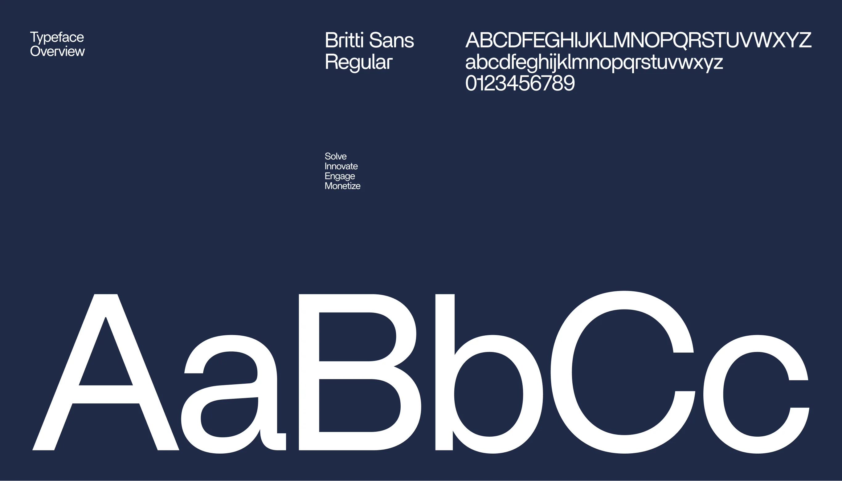
The system needed to be flexible enough to provide for a variety of subbrands fathom has been developing over the years. The wordmarks are based on custom typography.

The new typographic system is simple but not simplistic. Based on just one font, it offers a wide diversity of necessary styles. The brand font features evoke the sense of expertise and technology.


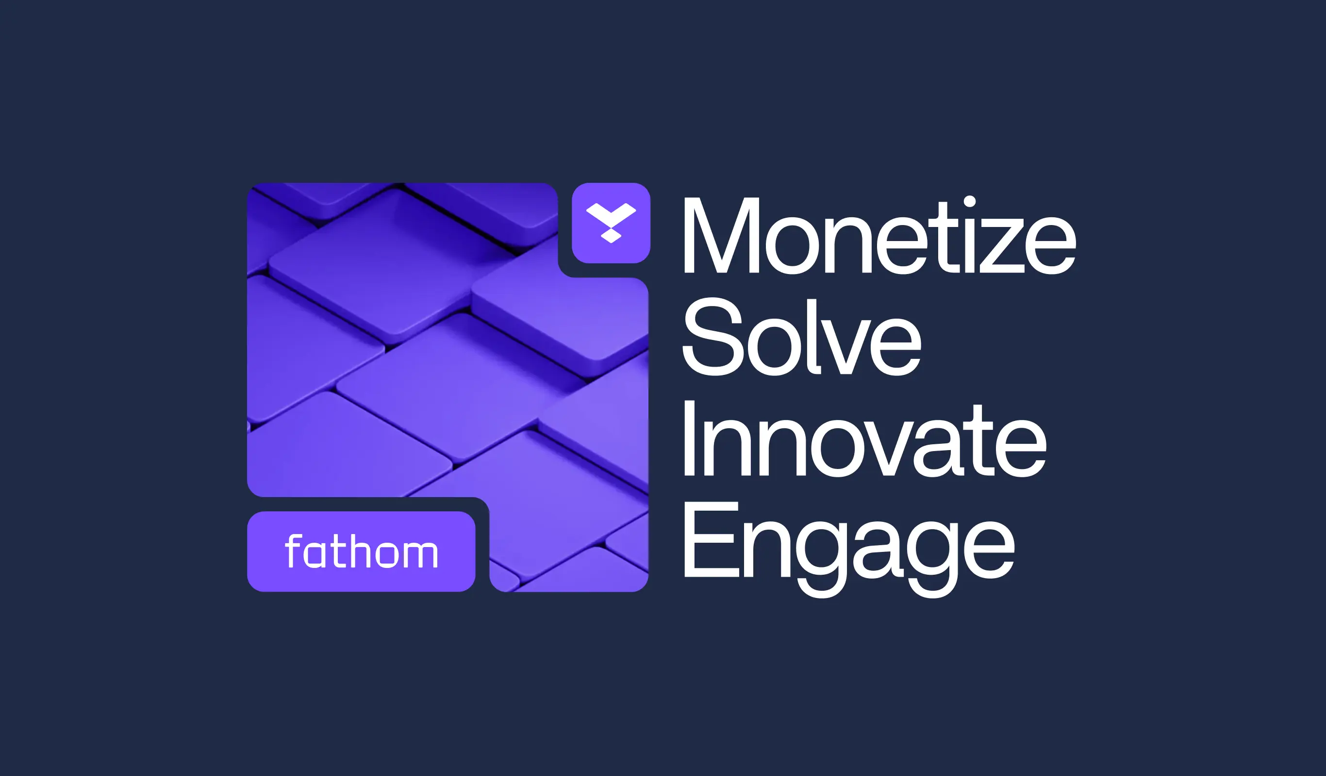
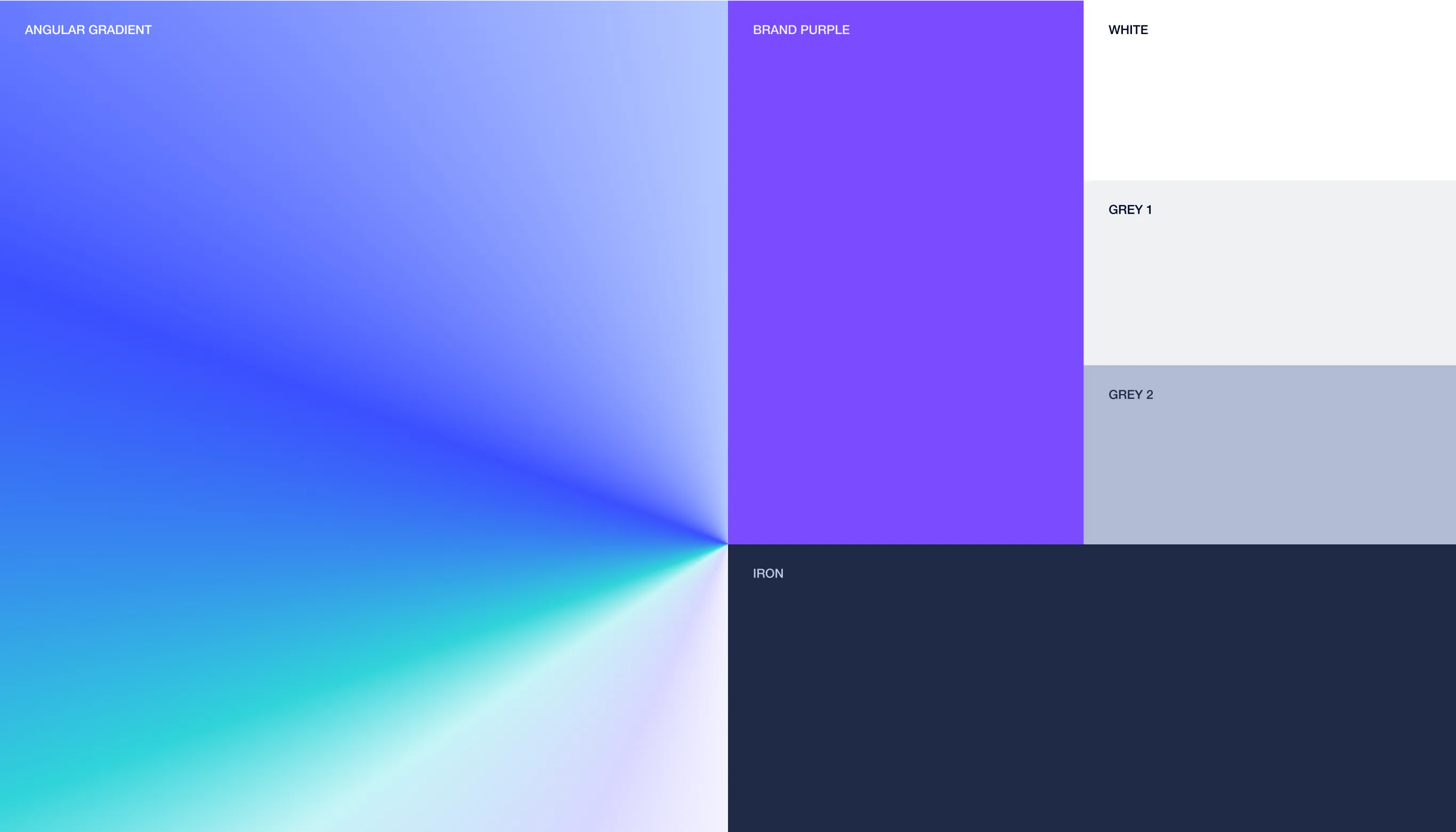
The new color palette is predominantly dark - with dark backgrounds dominating (but not ruling) the styles.
It is accompanied by the angular gradient comprising the basic brand hues. The angular form, a fairly rarely used graphical element, caters for the unique character of the new brand.
.webp)
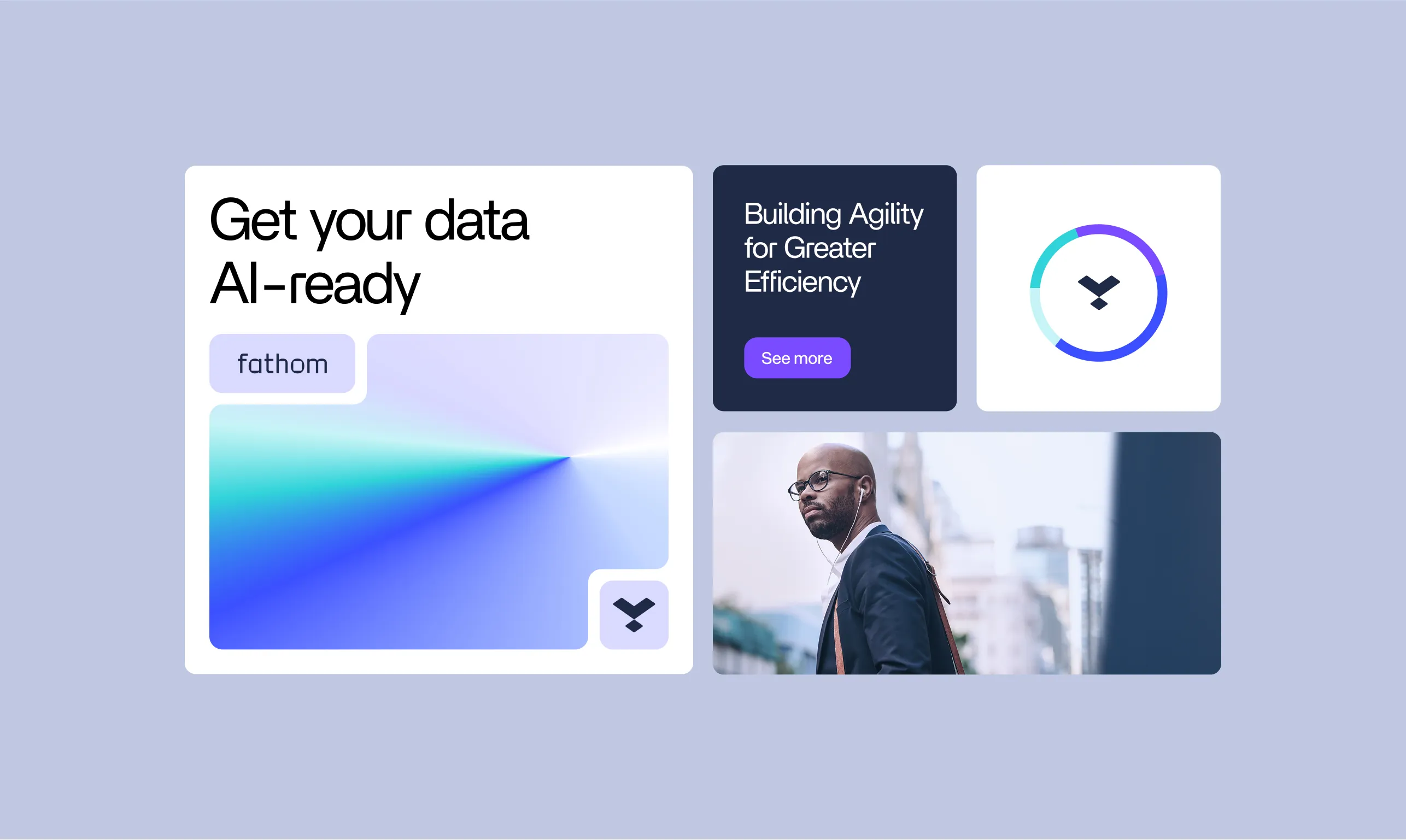
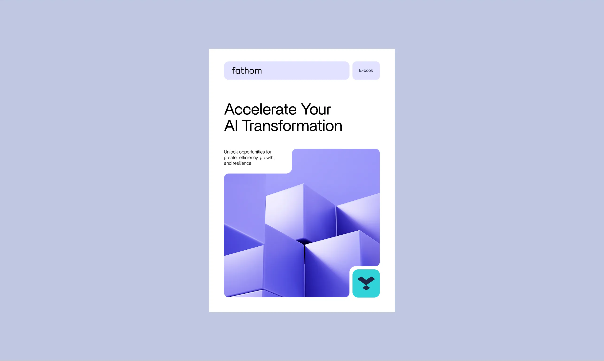
The visuals that the new brand utilises are based on 2 main tropes - people using the platform, paired with 1 or 2-color abstract simple 3D renders that visualise key features of the platform.

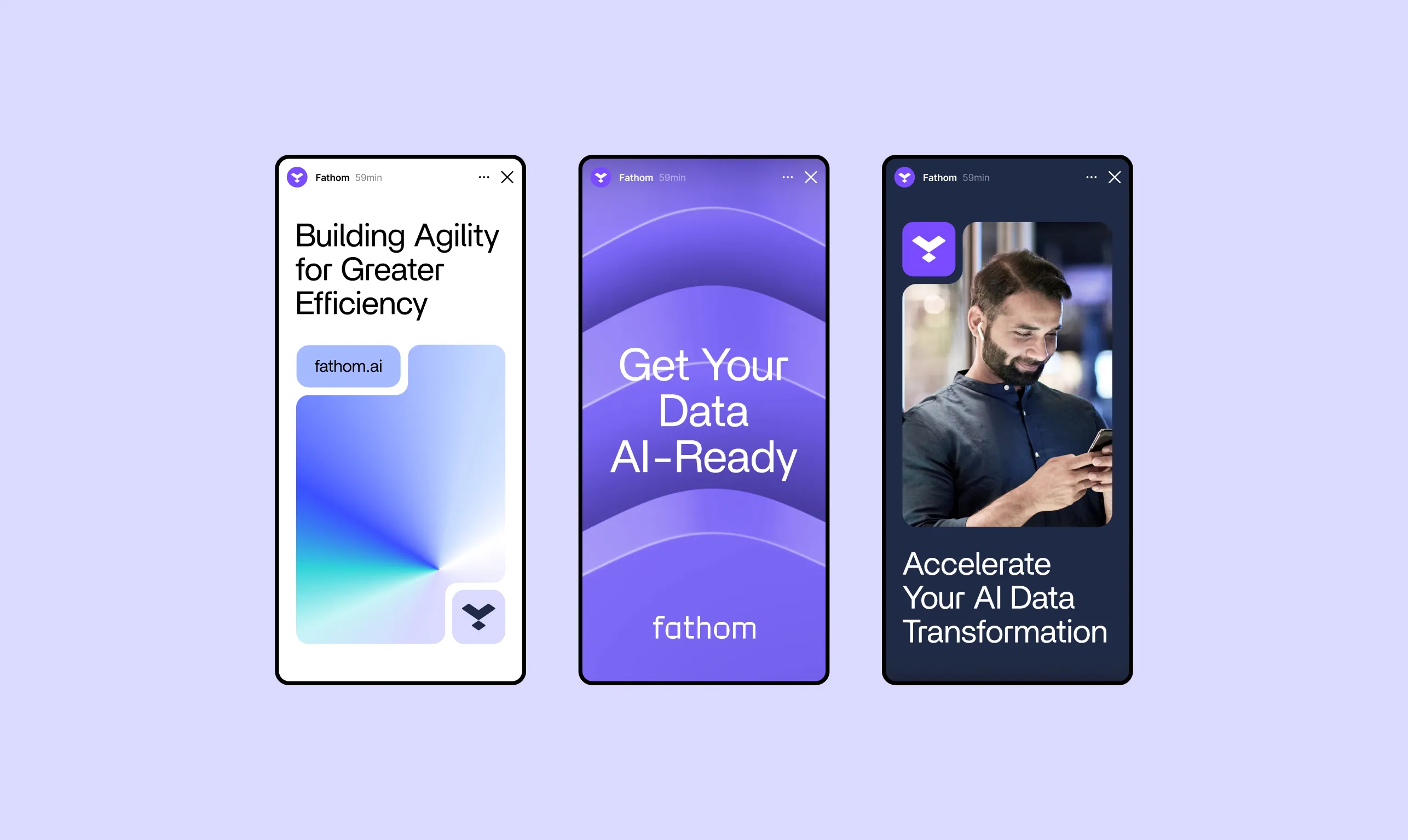
The branding system is based loosely on bento grids. Rounded corners used for almost all elements cater for a soft and modern look. The layouts are predominantly dark but the system is versatile enough to provide for the dark- and the light-mode.
We also created brand guidelines for color mixing, typography, photography, visual elements, and logo use, ensuring a consistent brand impression.
.webp)

.webp)
The new branding system received a very warm welcome for the fathom.io team.


.webp)
