Hoooray!We've got the details.
Don’t wait for our reponse. Choose the best time for a chat with us and let's talk.
Oops! Something went wrong while submitting the form.
Schedule a call:

Edgar Czop
Sales Account Executive
Don’t wait for our reponse. Choose the best time for a chat with us and let's talk.


It automates planning, cuts labor costs, and improves team productivity.
.webp)

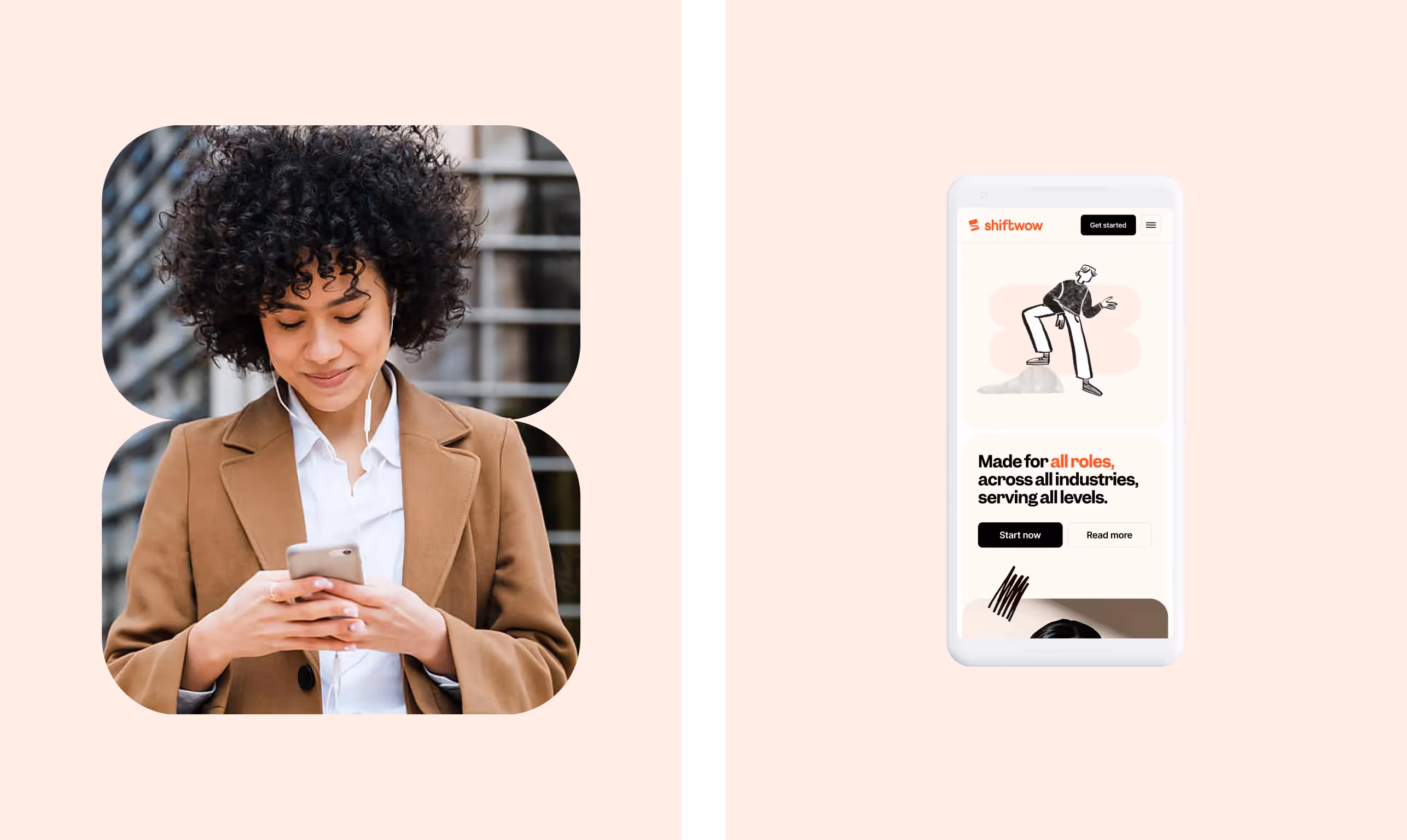
Shiftwow is a smart platform designed to streamline and optimize shift-based workforce operations. It empowers managers to build efficient schedules in minutes, automate planning, cut labor costs, and boost team productivity. With a growing need for intuitive shift management tools, Shiftwow addresses operational pain points in industries that rely on hourly staff and dynamic scheduling.
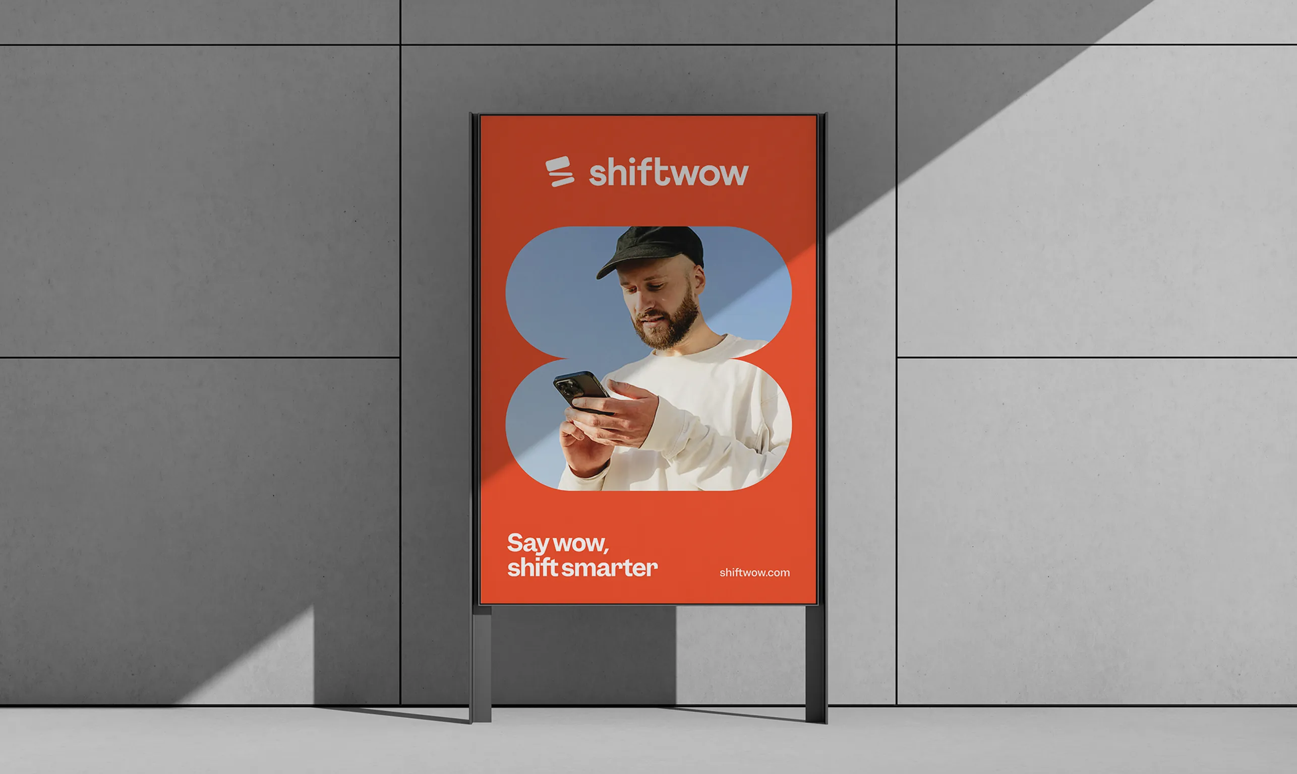
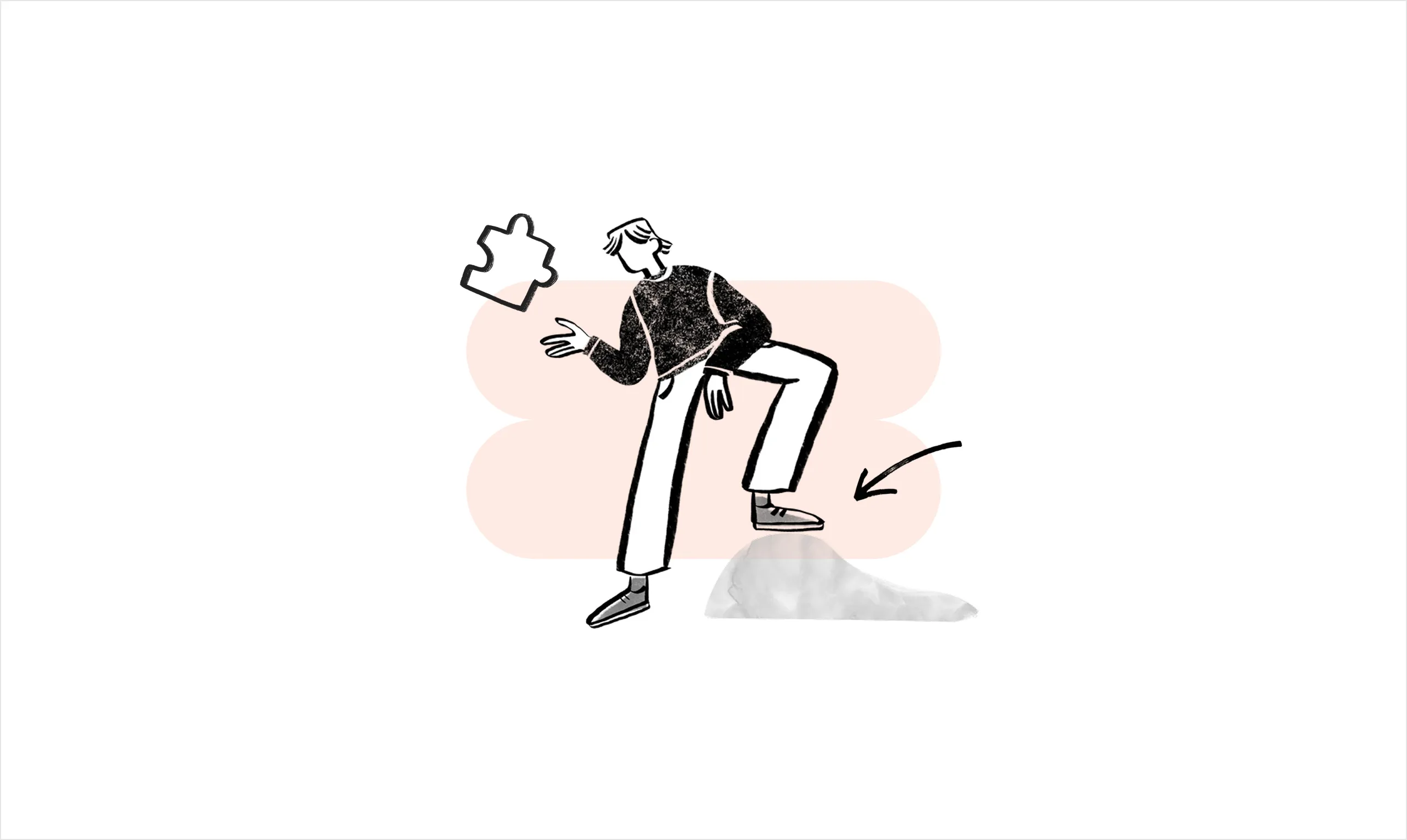
We were tasked with launching Shiftwow’s entire digital presence - from the ground up. The brand needed to feel human yet business-ready, playful but professional. It had to speak to people while staying modular and scalable.This was a full-scale product launch involving branding, motion, website design, product design, and development. A large and multidisciplinary team worked together to bring the brand to life - end to end.
.webp)
.webp)

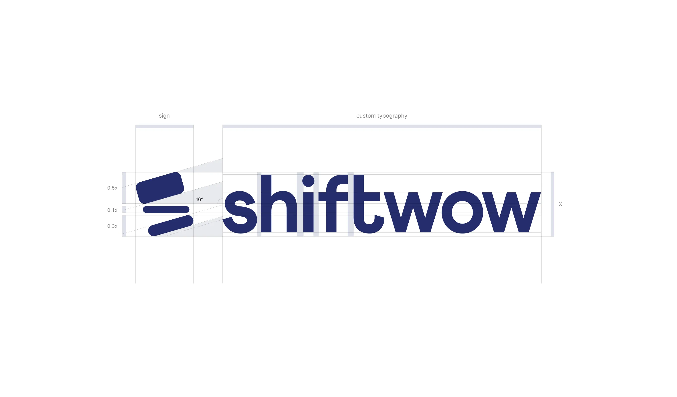
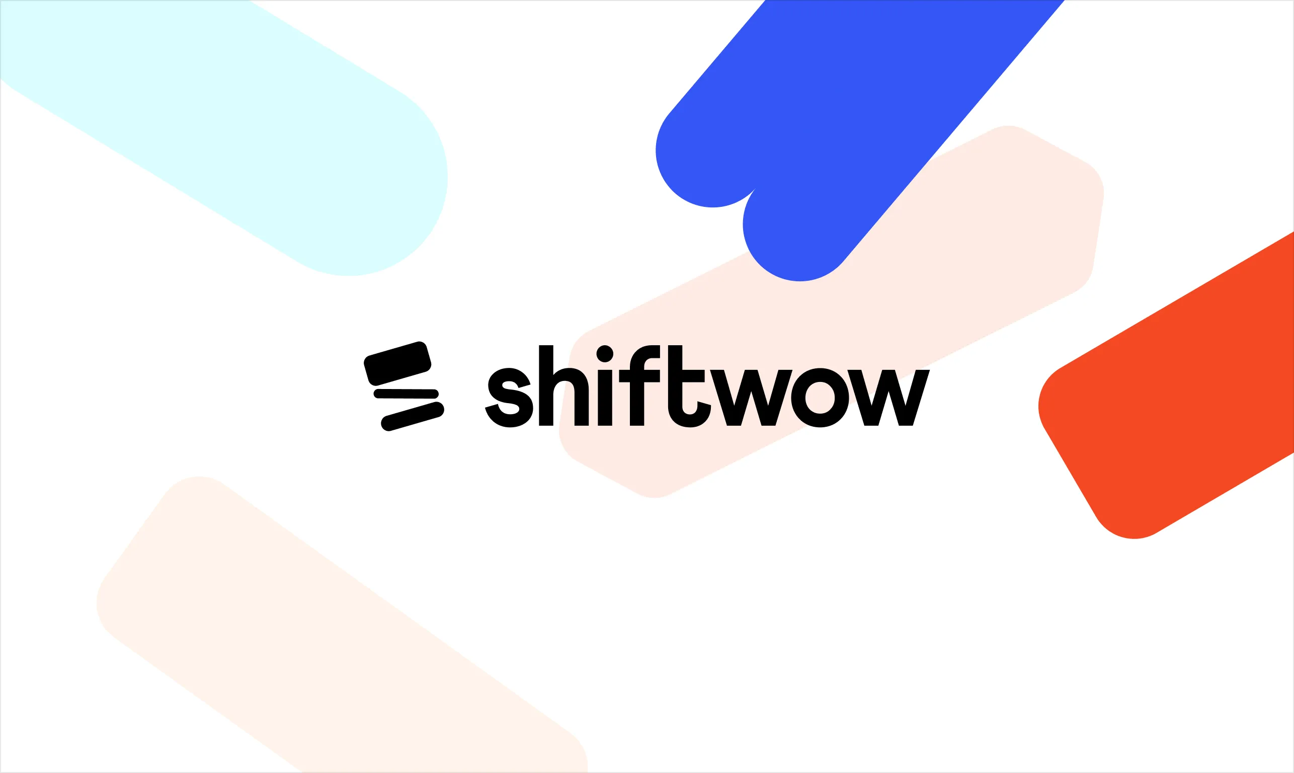
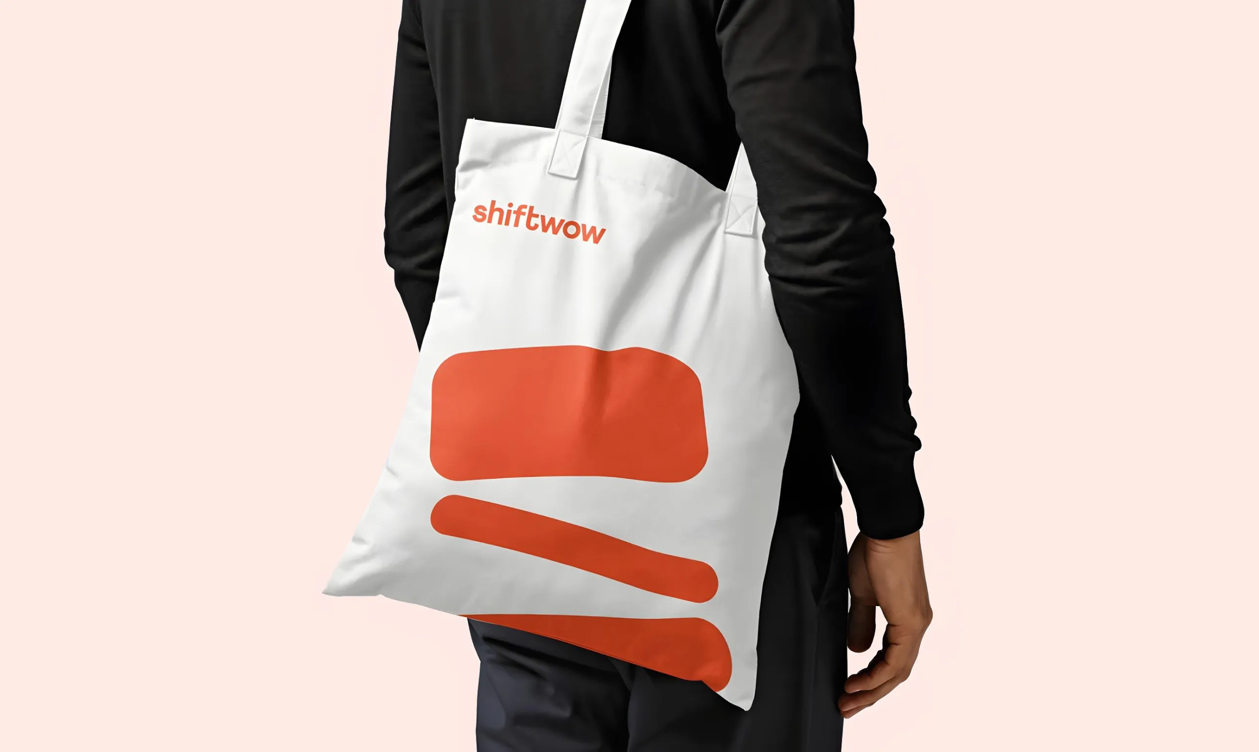
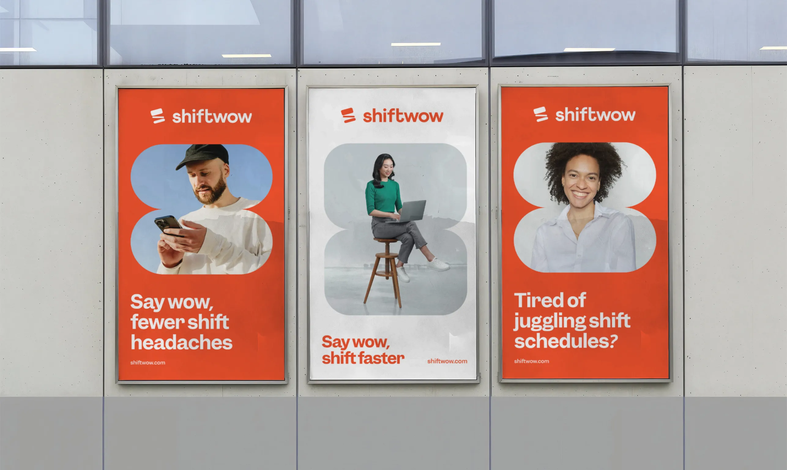
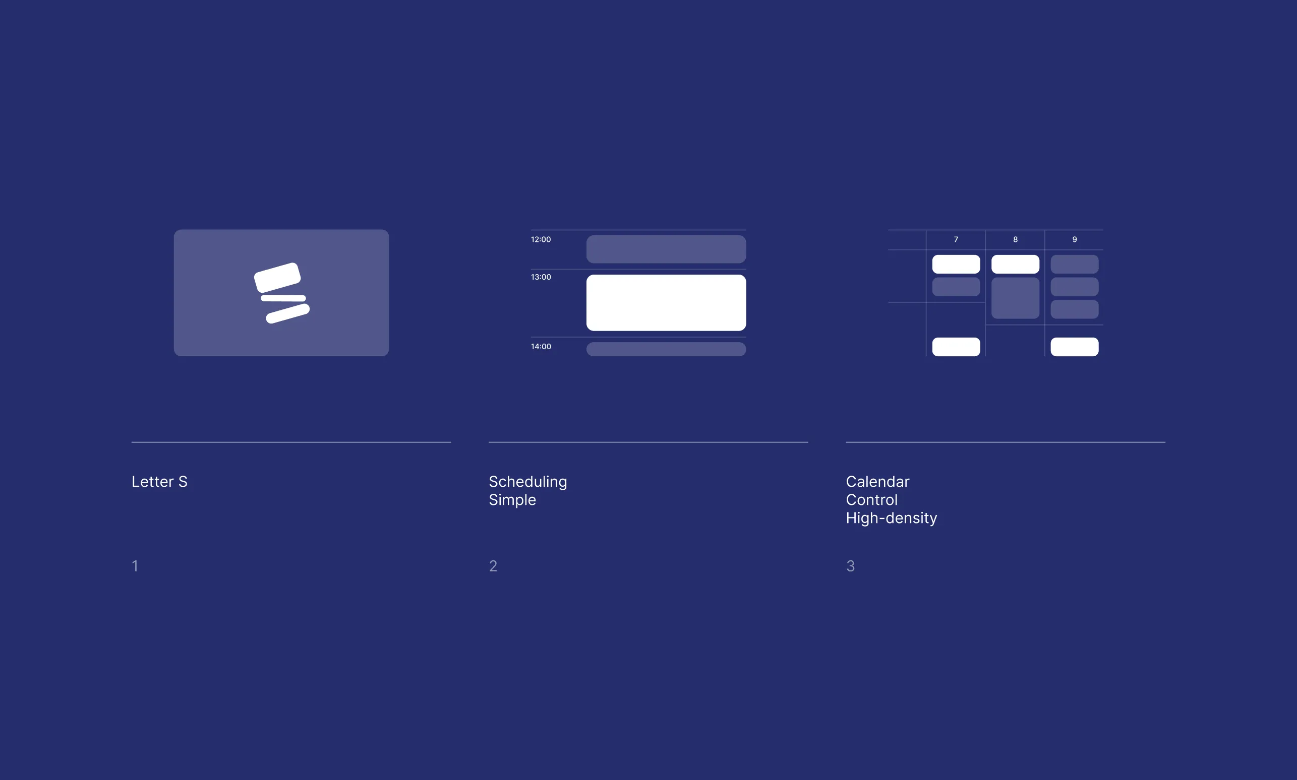
We crafted a custom wordmark that feels contemporary and confident. The symbol blends the letter “S” with calendar-like blocks, referencing Shiftwow’s core functionality - efficient and dynamic scheduling.
Motion was an integral part of the design, visually representing the constant change and flow inherent in shift planning.
.webp)

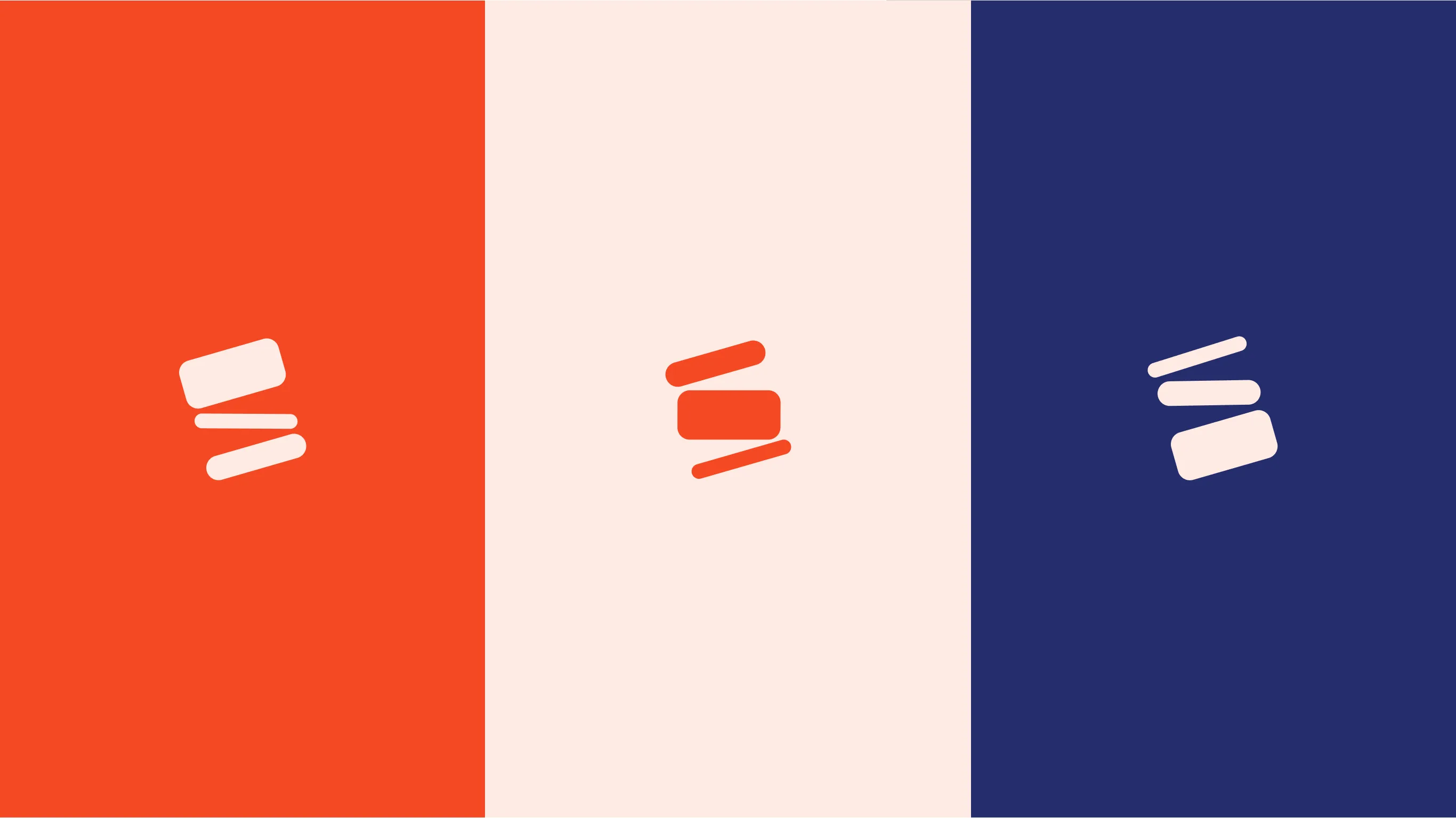
The Shiftwow brand palette combines boldness with approachability. Vivid vermillion adds energy and grabs attention, while deep navy brings a sense of structure and reliability. Soft peach tones and refreshing aqua shades introduce warmth and a human touch.
The overall balance makes the brand feel cheerful, professional, and easy to engage with.
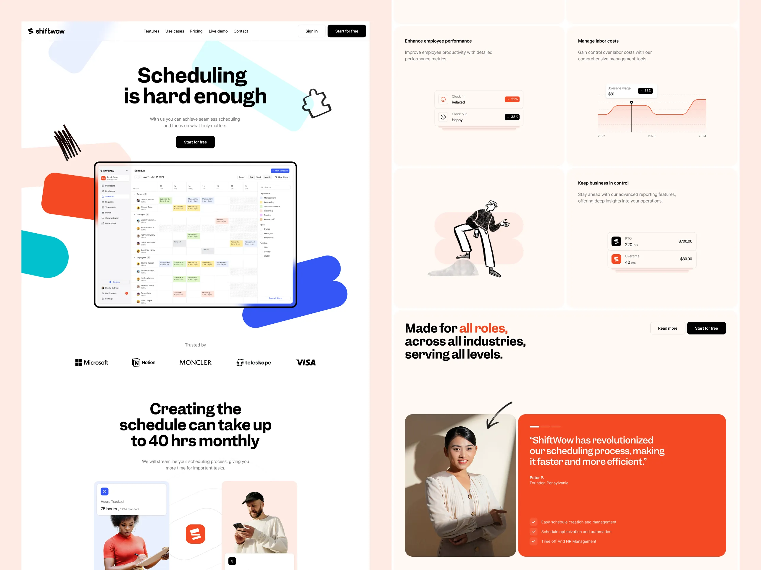

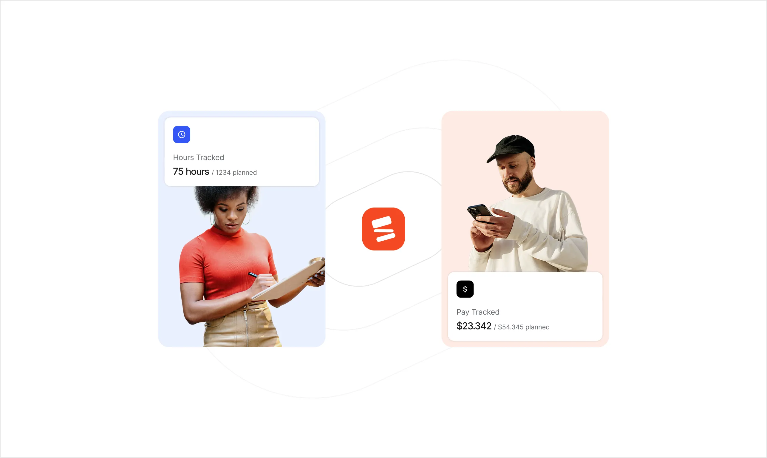
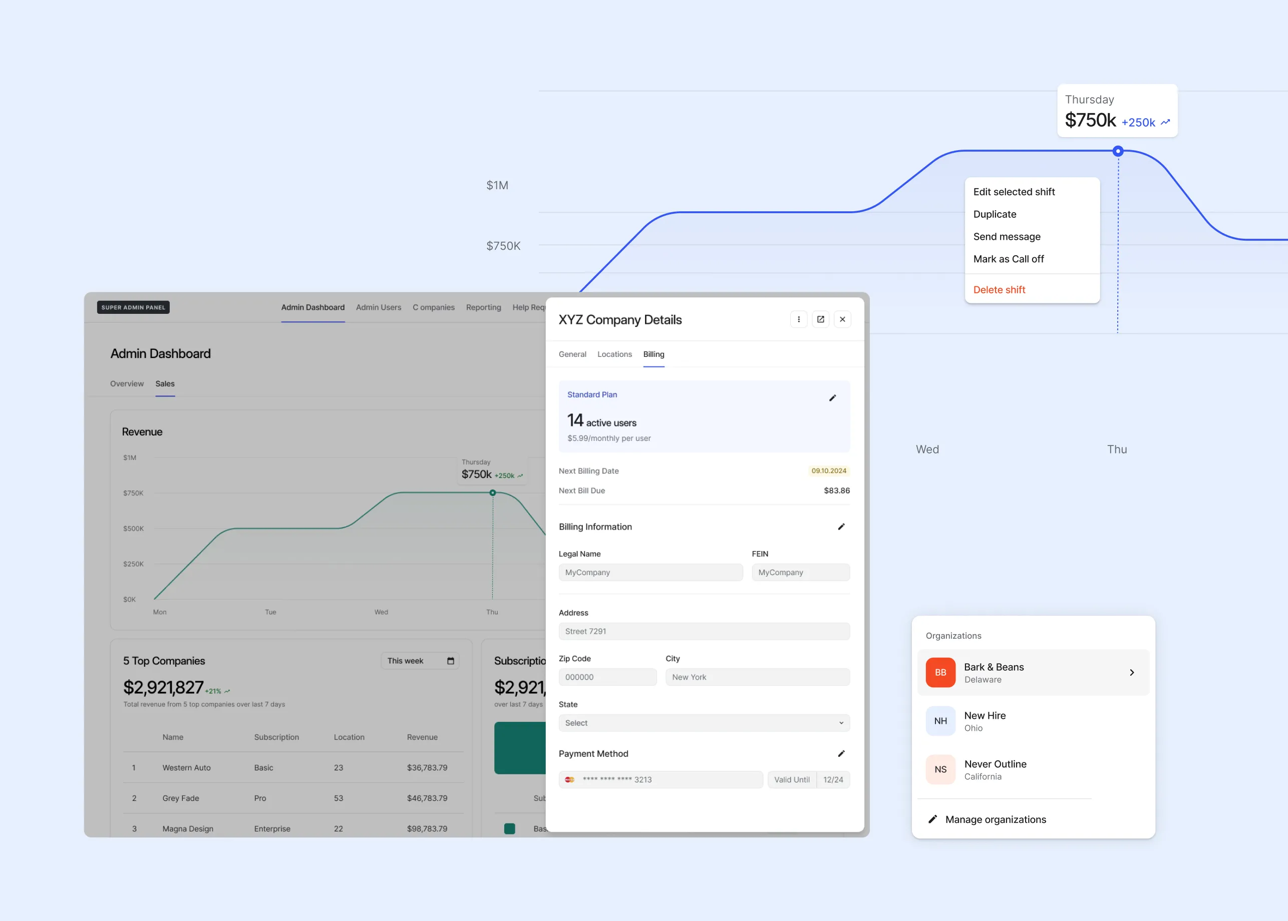
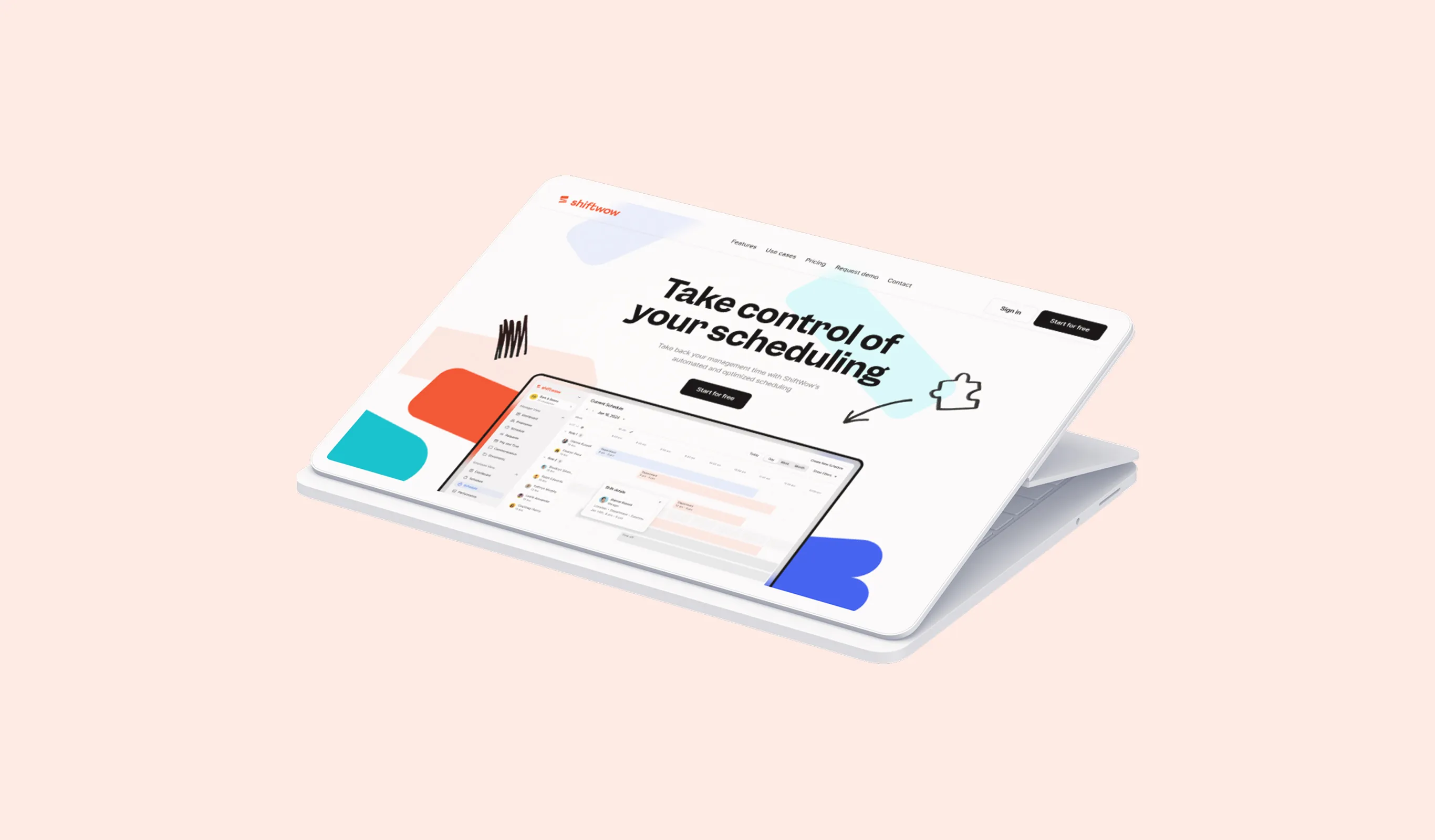
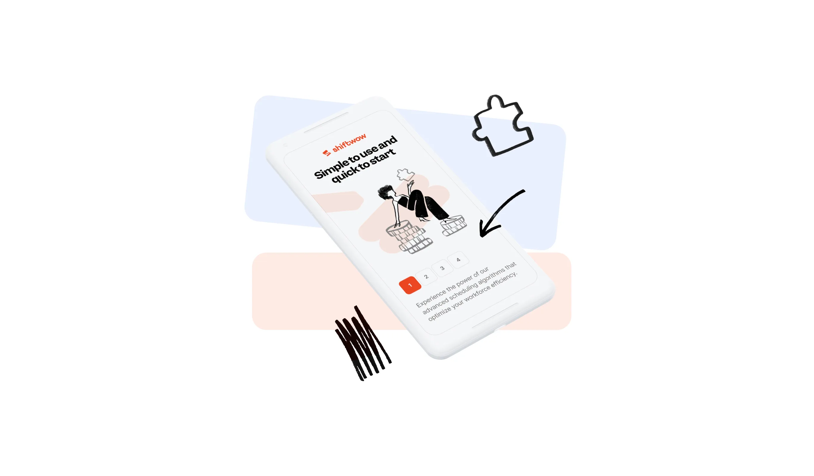
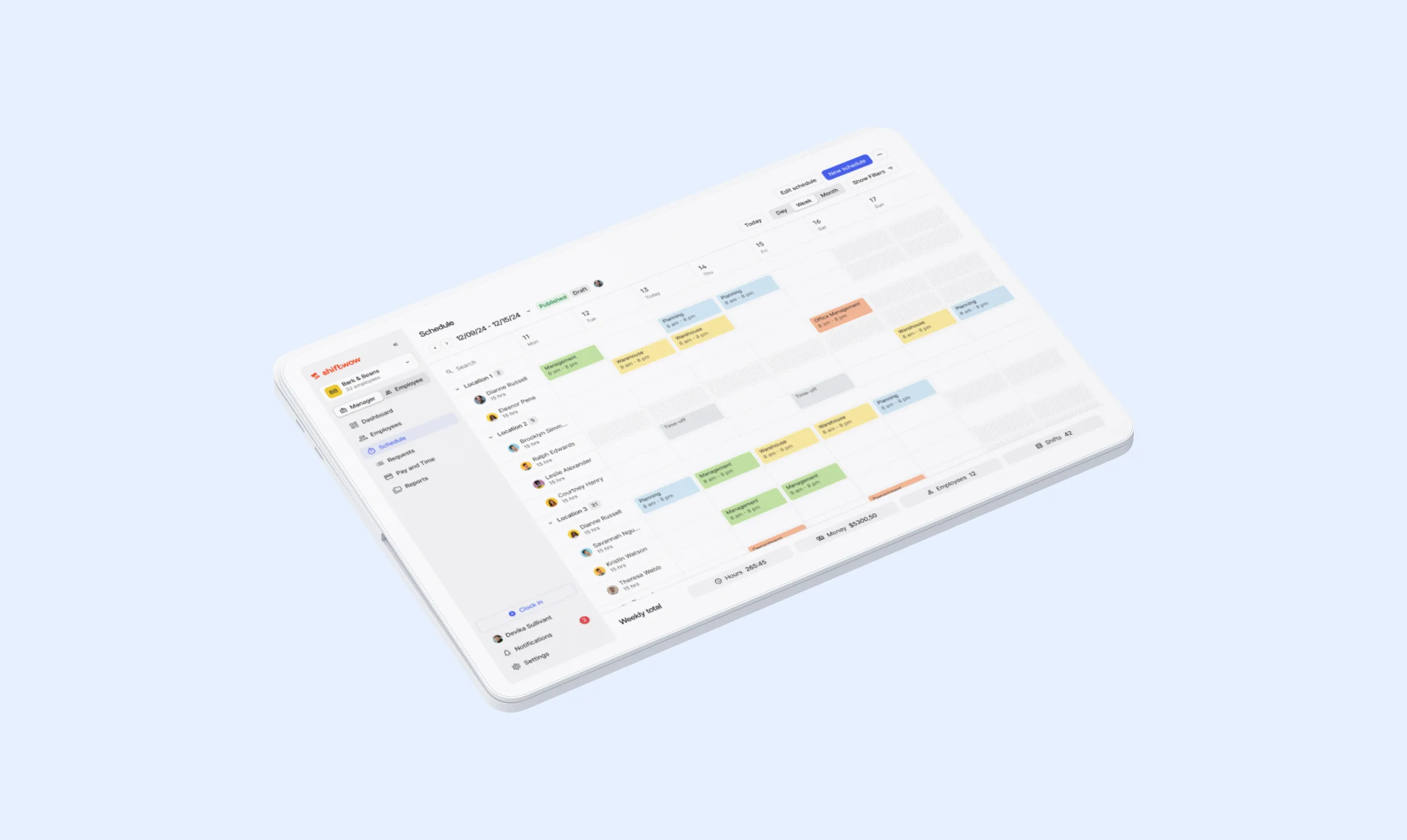
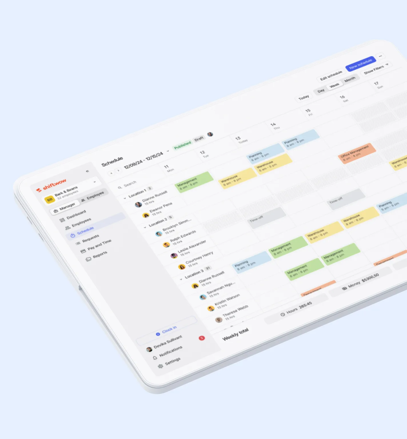
We designed Shiftwow’s product interface from scratch, including a full design system with tokens, RWD principles, and accessibility in mind.
Every component reflects the brand’s visual DNA while prioritizing usability and clarity.
Our team also developed the platform in-house, ensuring seamless alignment between design and implementation, and delivering a consistent, scalable digital product.


.webp)
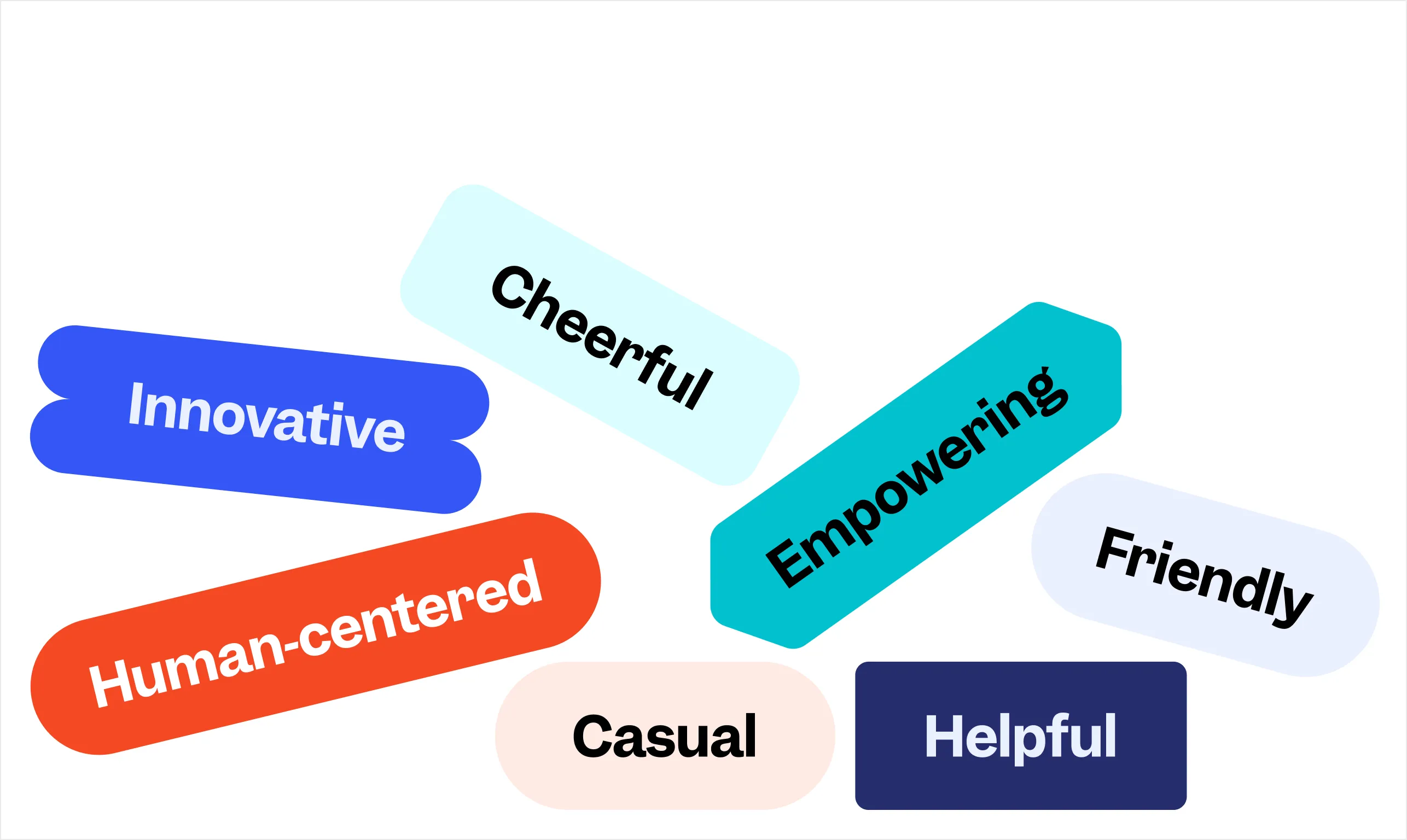
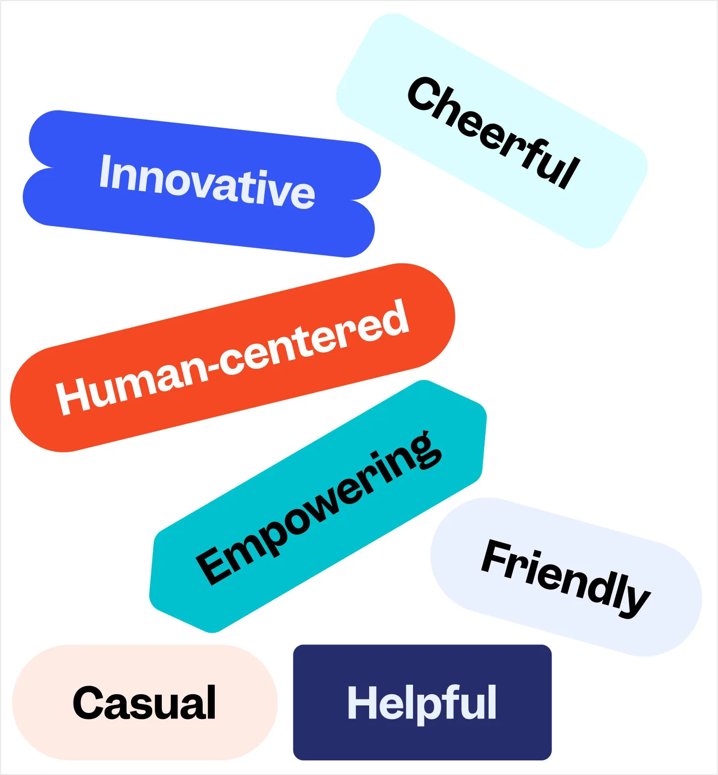
The new branding system embraces and supports the core values of Shiftwow. It is simple, friendly and empowering. It gets the message across with a cheerful vibe.
.webp)


.webp)
