Hoooray!We've got the details.
Don’t wait for our reponse. Choose the best time for a chat with us and let's talk.
Oops! Something went wrong while submitting the form.
Schedule a call:

Edgar Czop
Sales Account Executive
Don’t wait for our reponse. Choose the best time for a chat with us and let's talk.


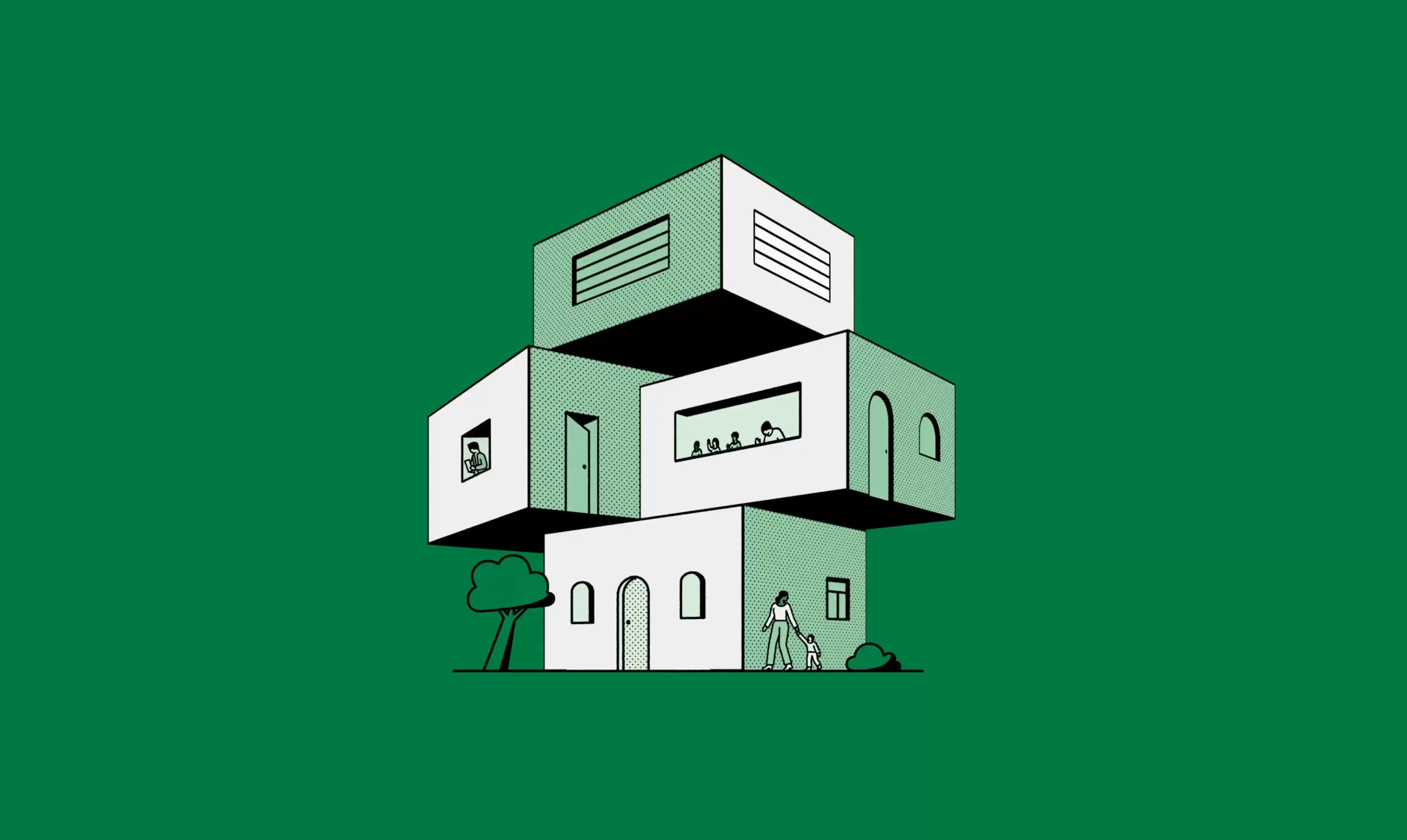
We designed a warm, inclusive brand and custom illustrations that reflect their mission: connecting through care, understanding, and shared experiences.
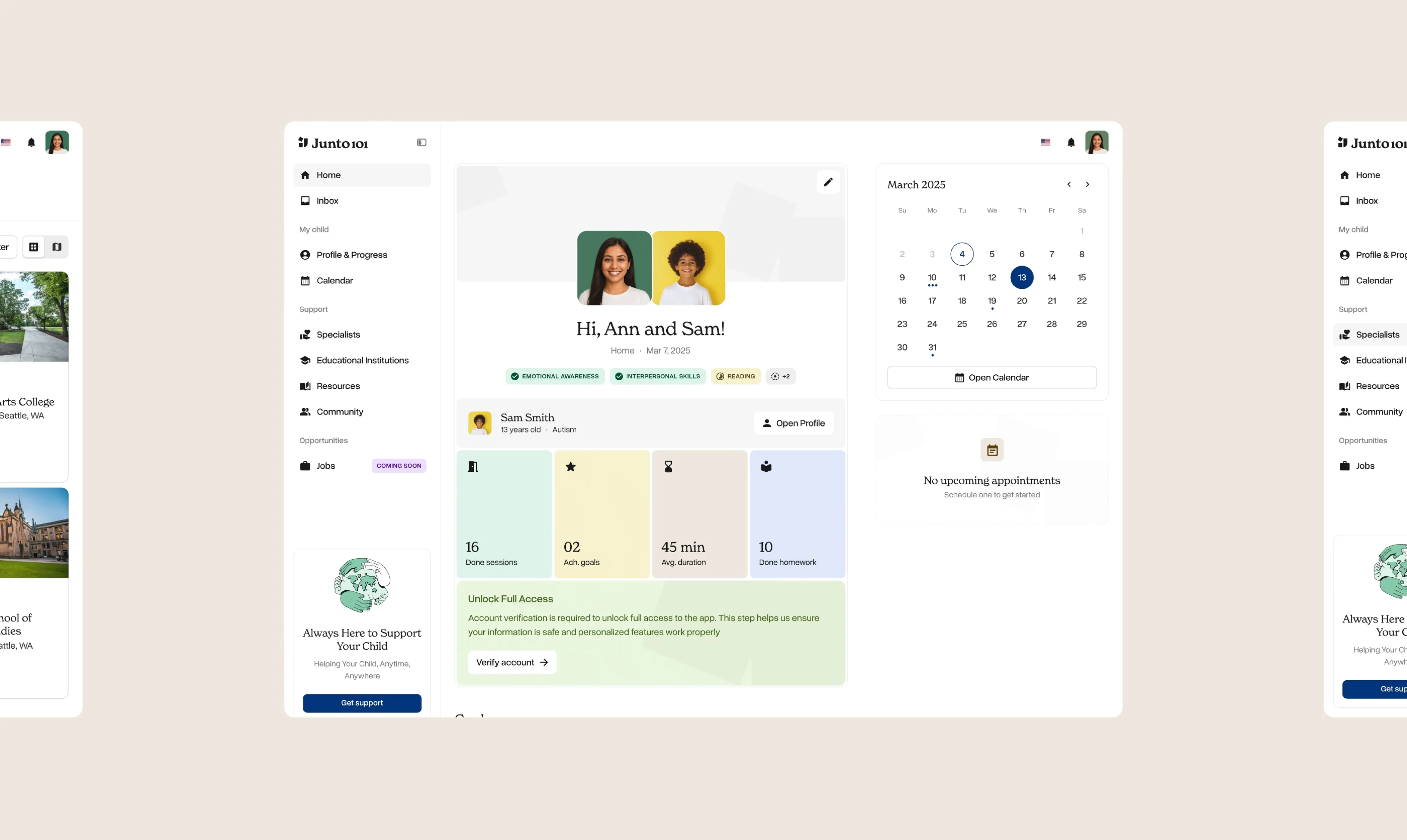
Junto101 was created as a central hub, a single meeting place that brings together trusted information, services, and community support in one accessible platform.
At Widehue, we partnered with the Junto101 team to
bring this vision to life.
The founders of Junto101 identified a clear problem:
finding reliable information and support for children
with disabilities is far more difficult than it should be. Resources exist, but they’re fragmented, hard to find, and spread across disconnected platforms.
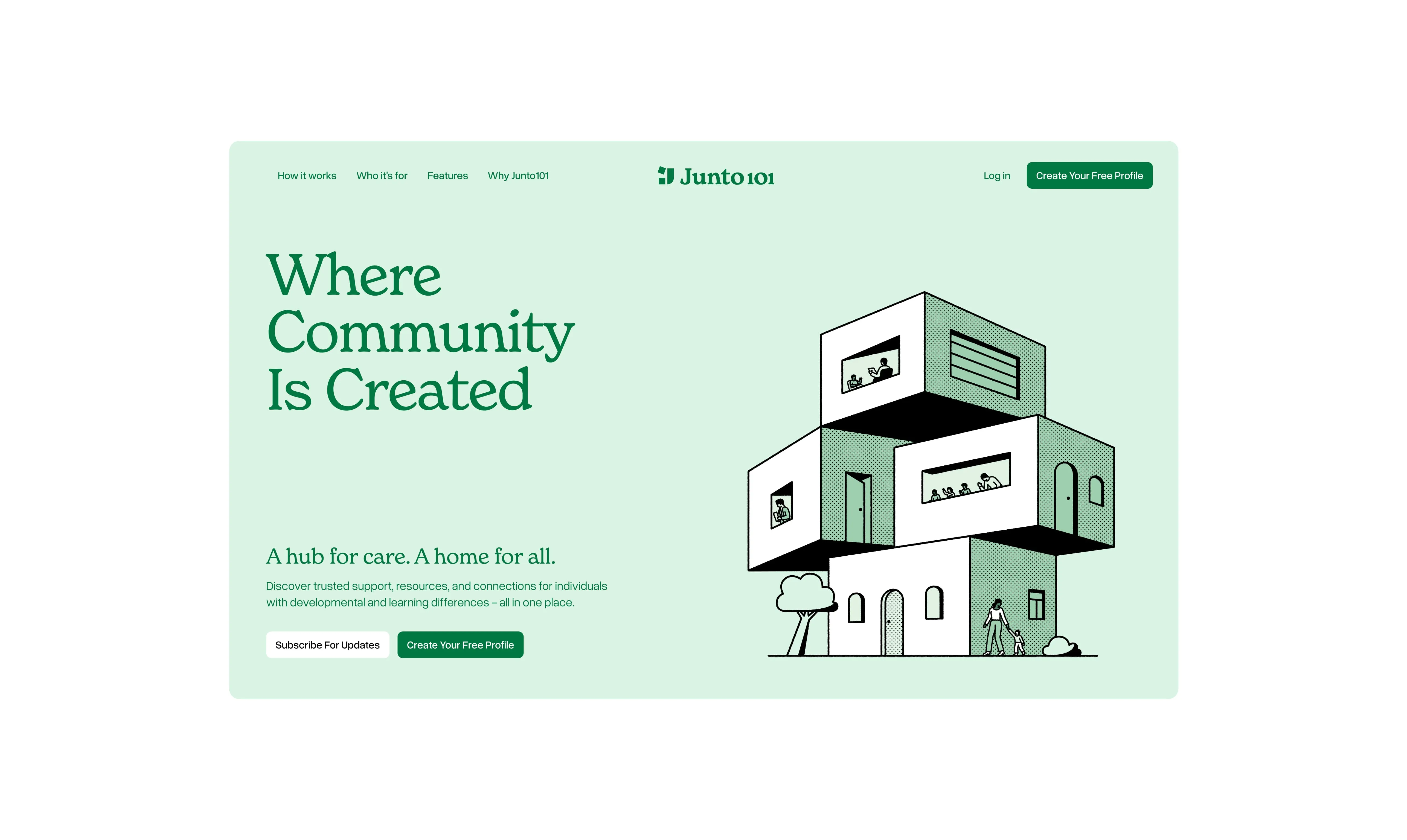
Our challenge was to create an identity, platform, and website that would help users easily bridge this information gap, while maintaining a positive, warm, and community-first narrative.

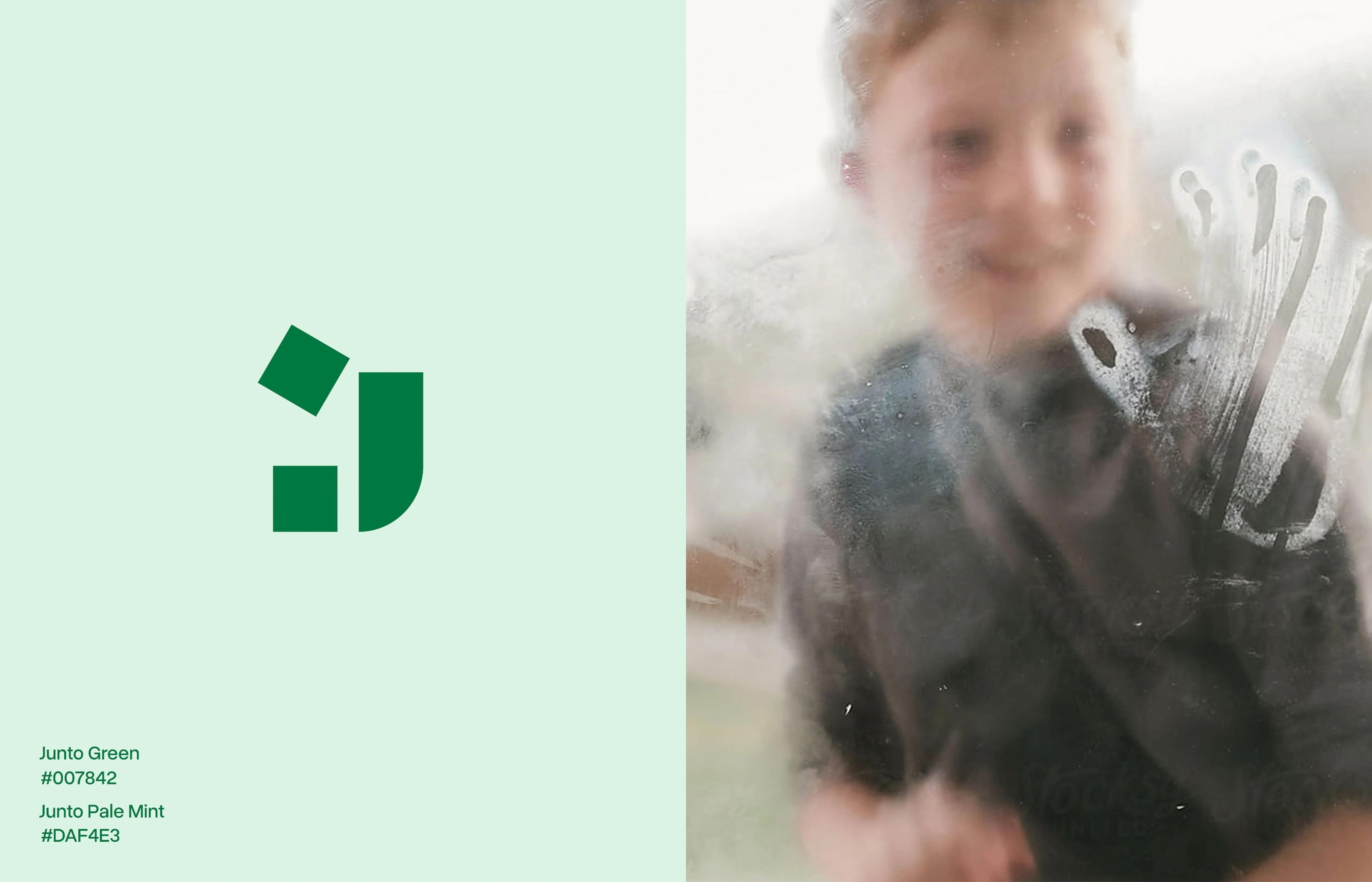
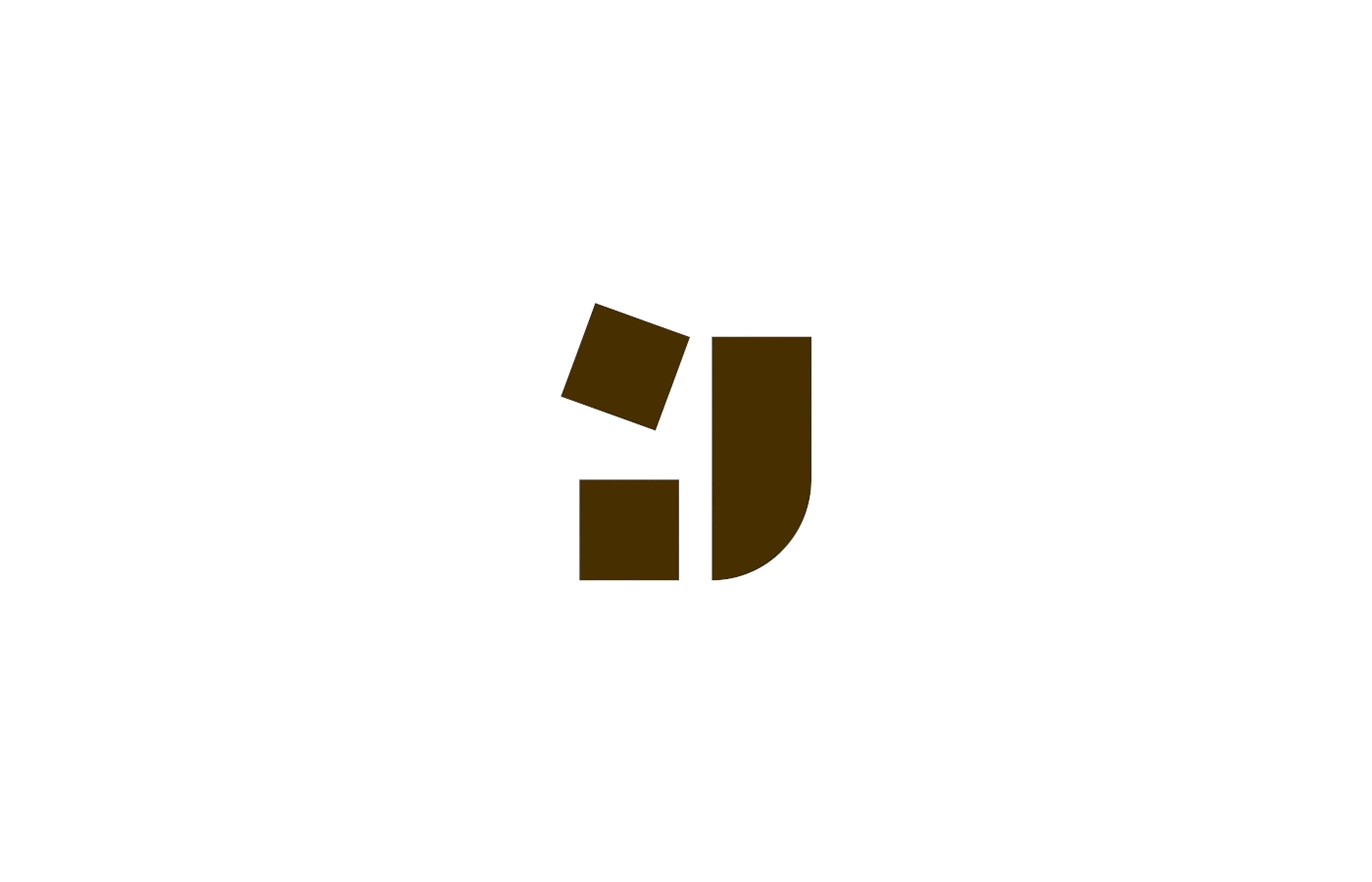
The icon draws from the letter "J," forming two stacked blocks that symbolize unity and mutual support - a visual metaphor for Junto101's mission to bring people together.
The letter-inspired shape acts as the solid ground that connection is built on, while the rounded wordmark complements it with warmth and approachability.
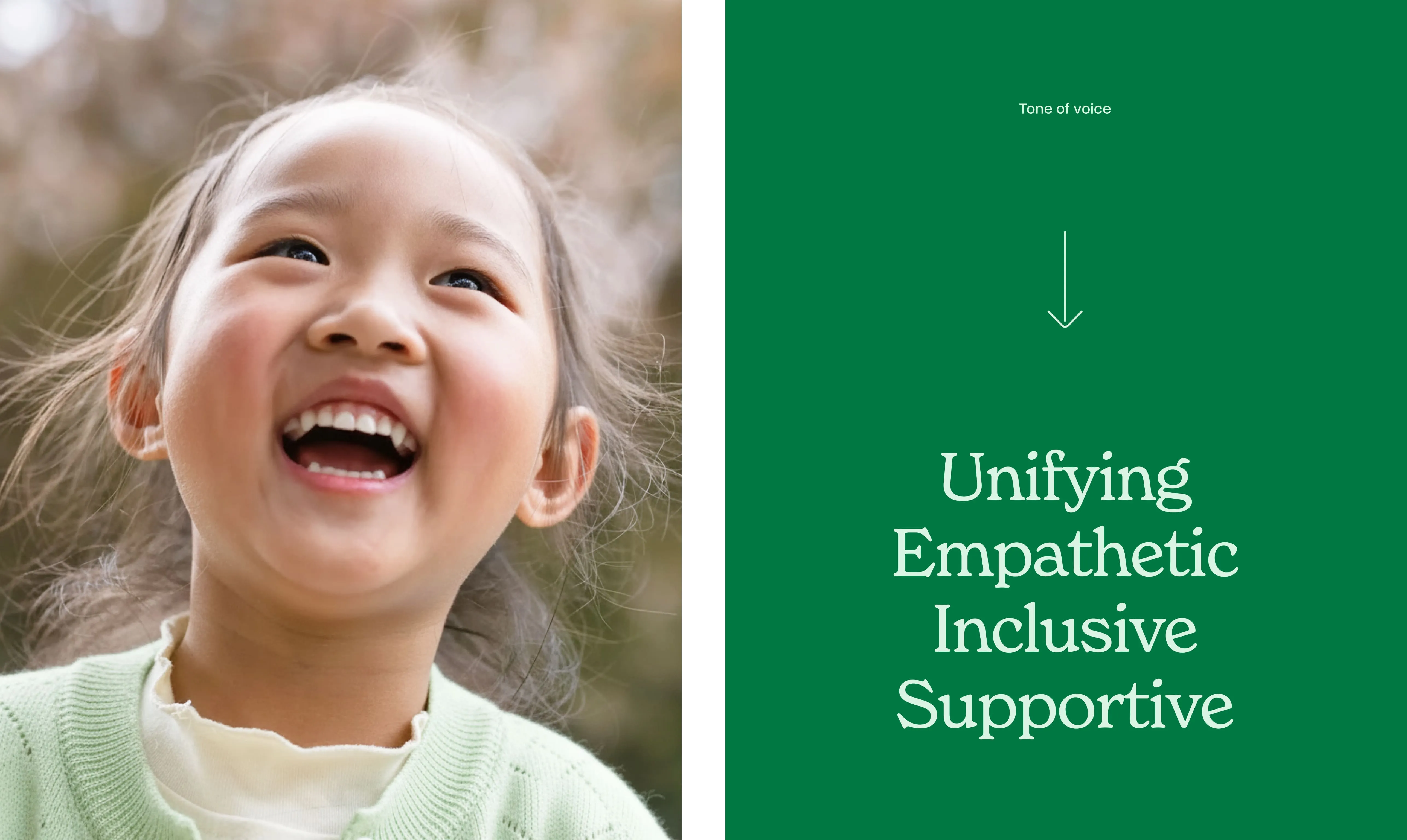
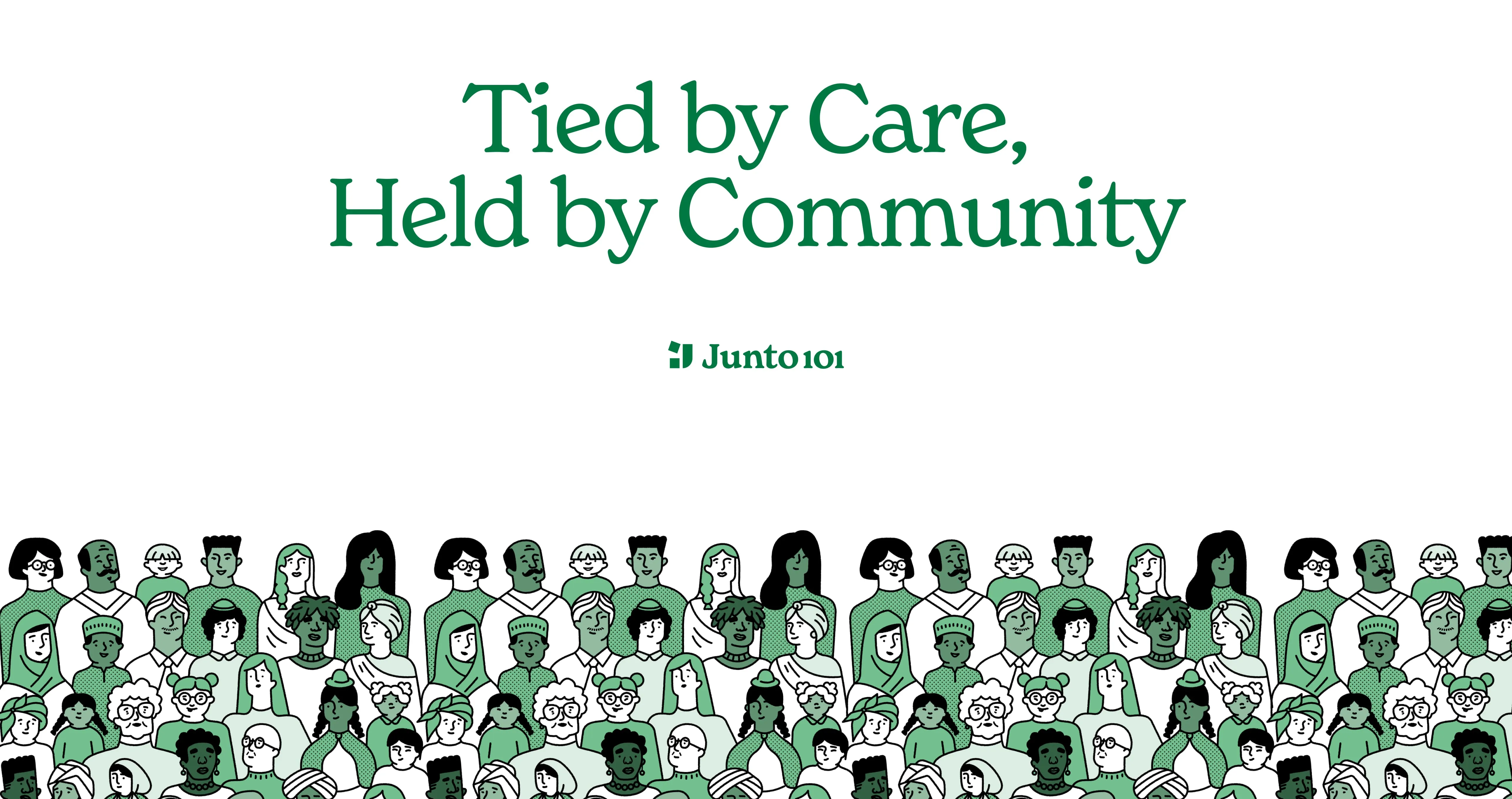
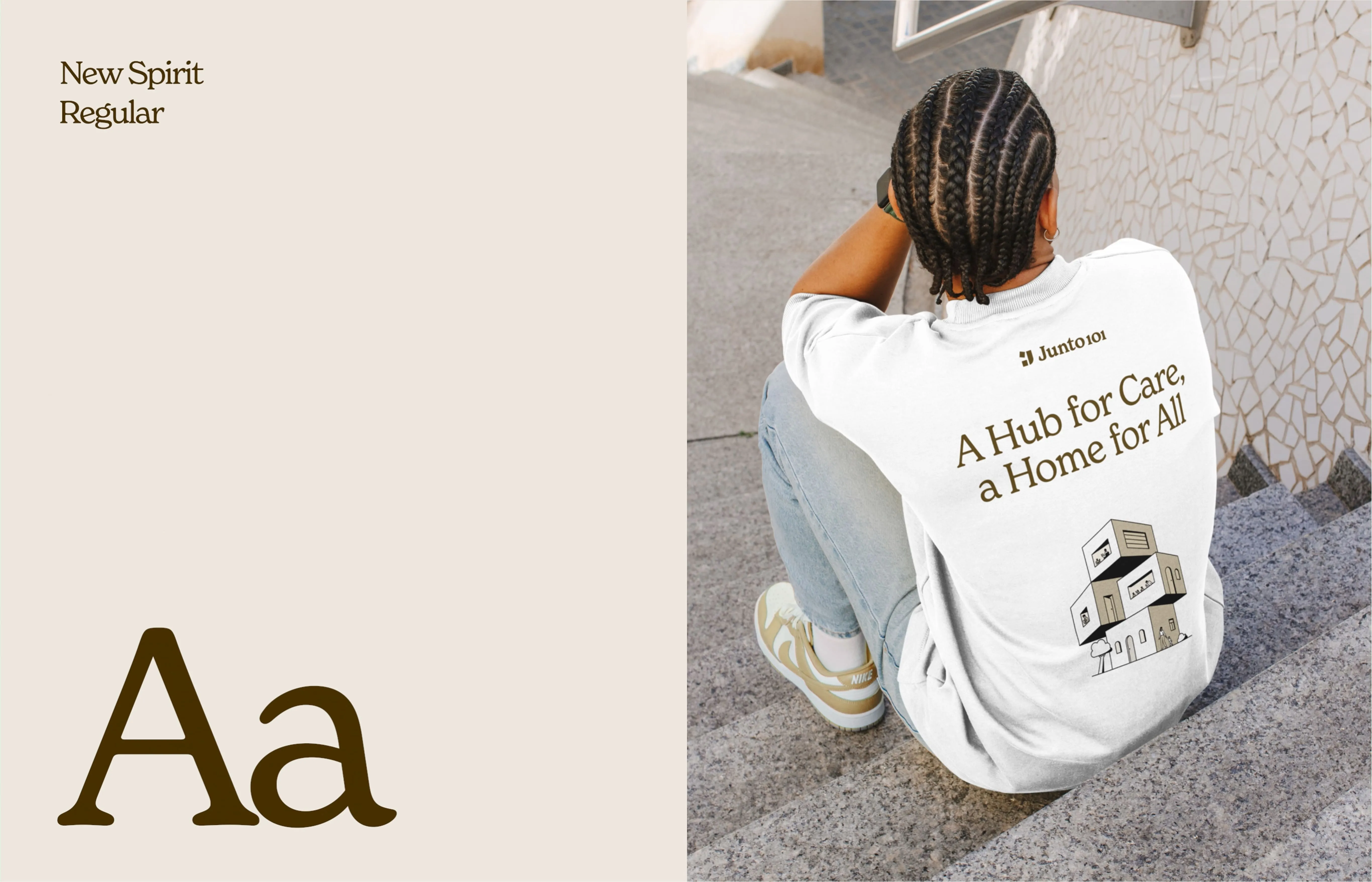
The Junto101 brand system is built around three values: unifying, empathetic, and inclusive. A warm green and cream color palette, two complementary typefaces (the expressive New Spirit and the clean Overused Grotesk), together with a custom illustration library, work together as a cohesive, consistent identity.
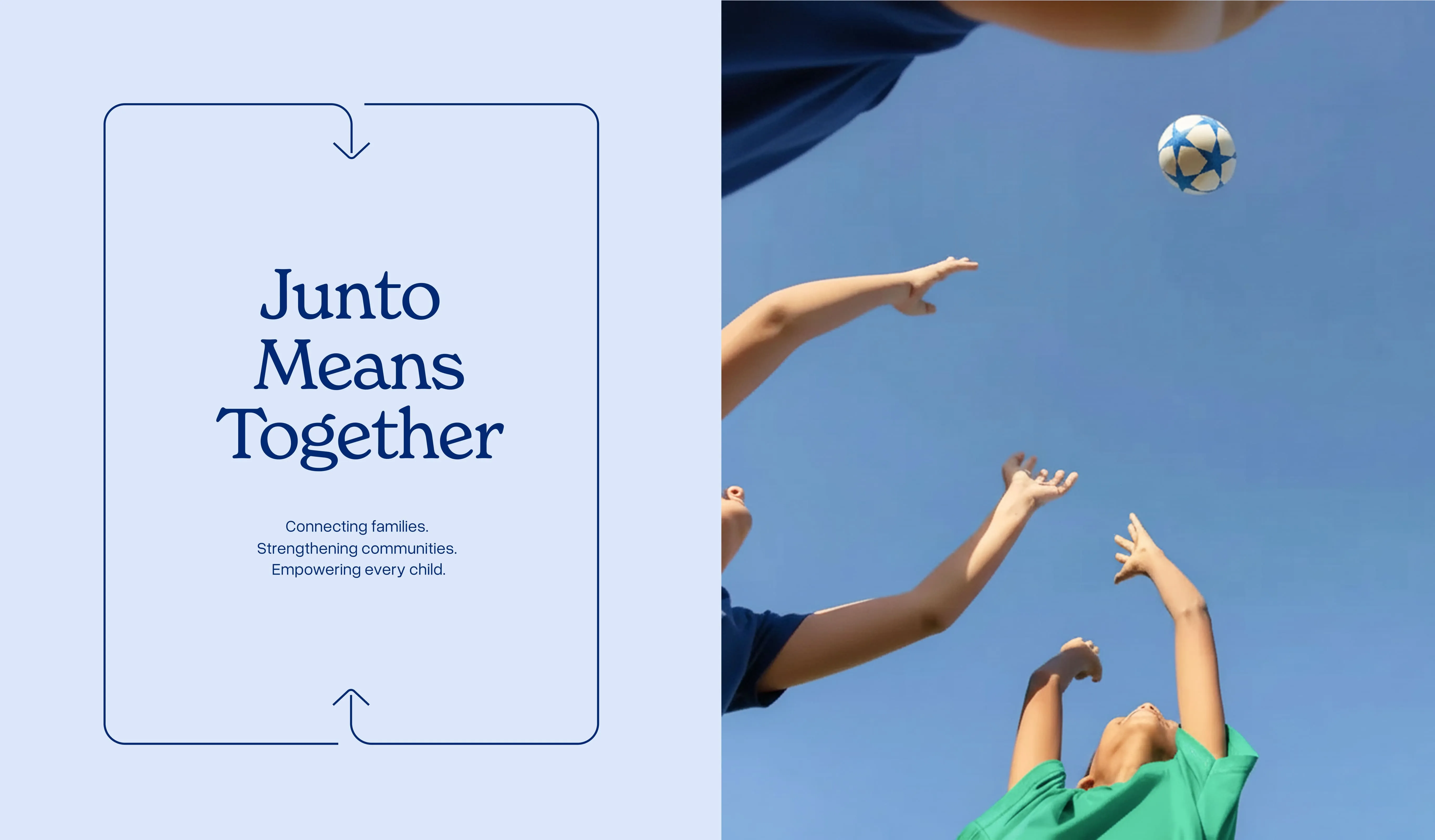
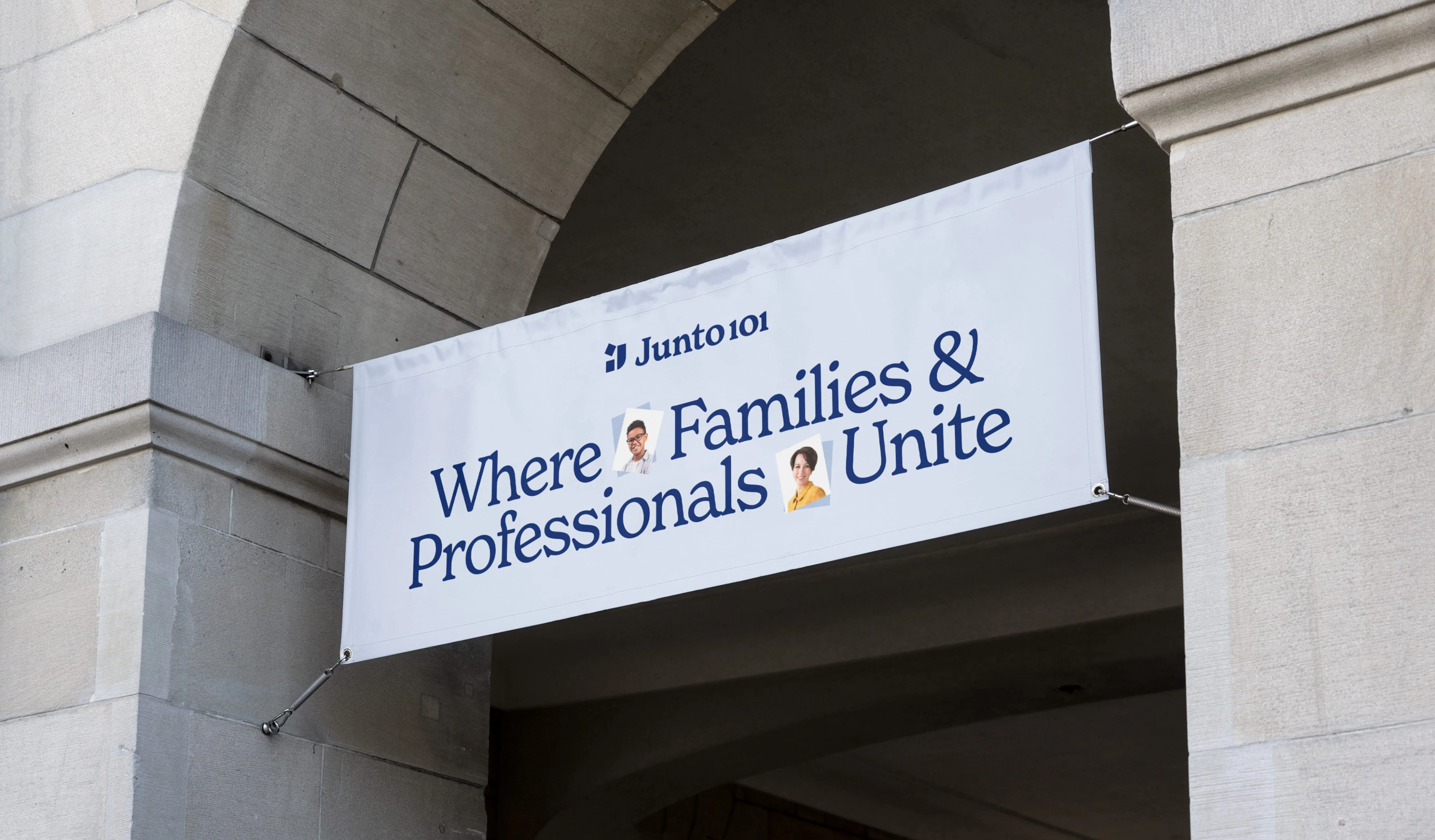
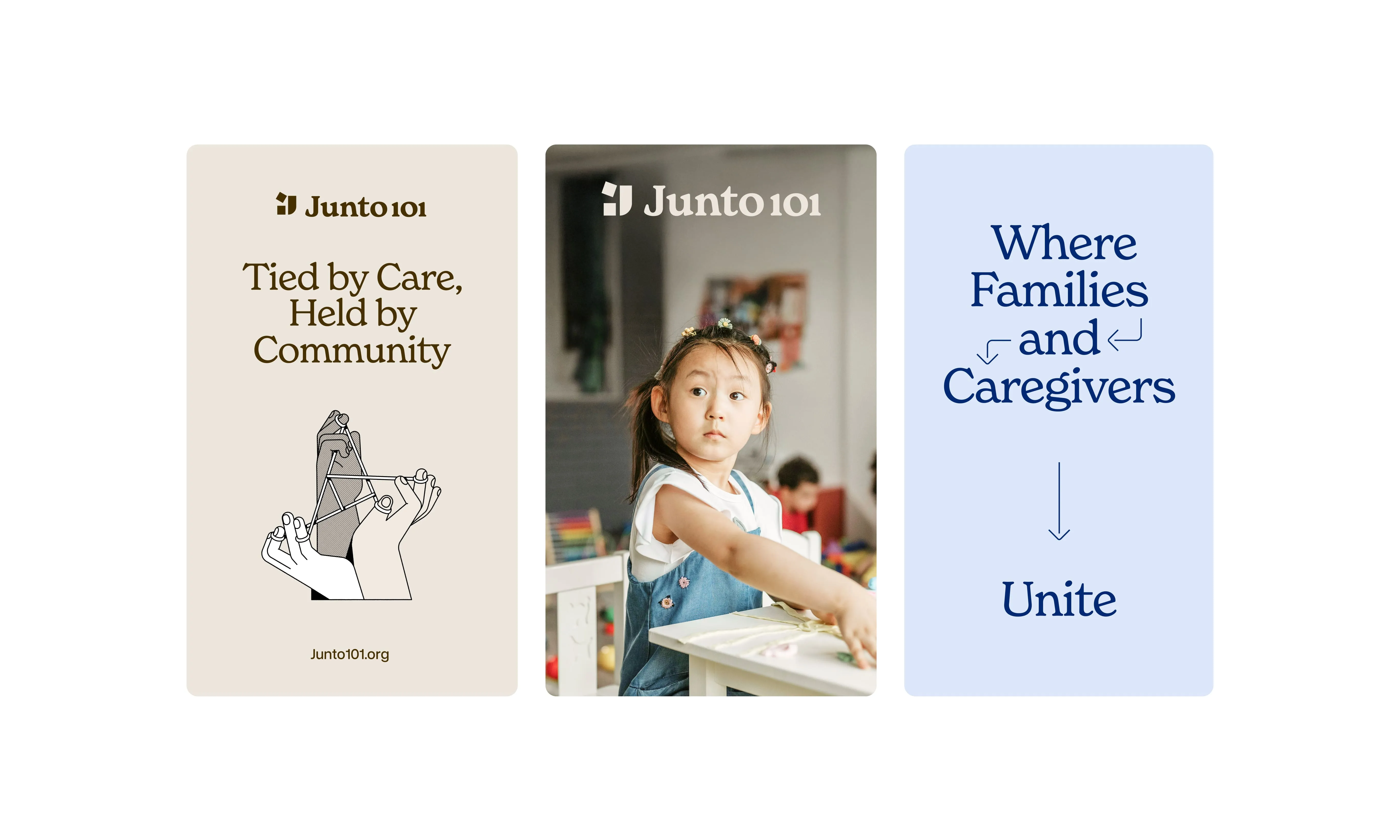
Strong accent colors are paired with softer complementary shades, creating a welcoming and soothing atmosphere that reflects the brand's values
of support, empathy, and warmth.
The palette is balanced by a classic black and white foundation, ensuring clarity and flexibility across every digital and physical touchpoint.
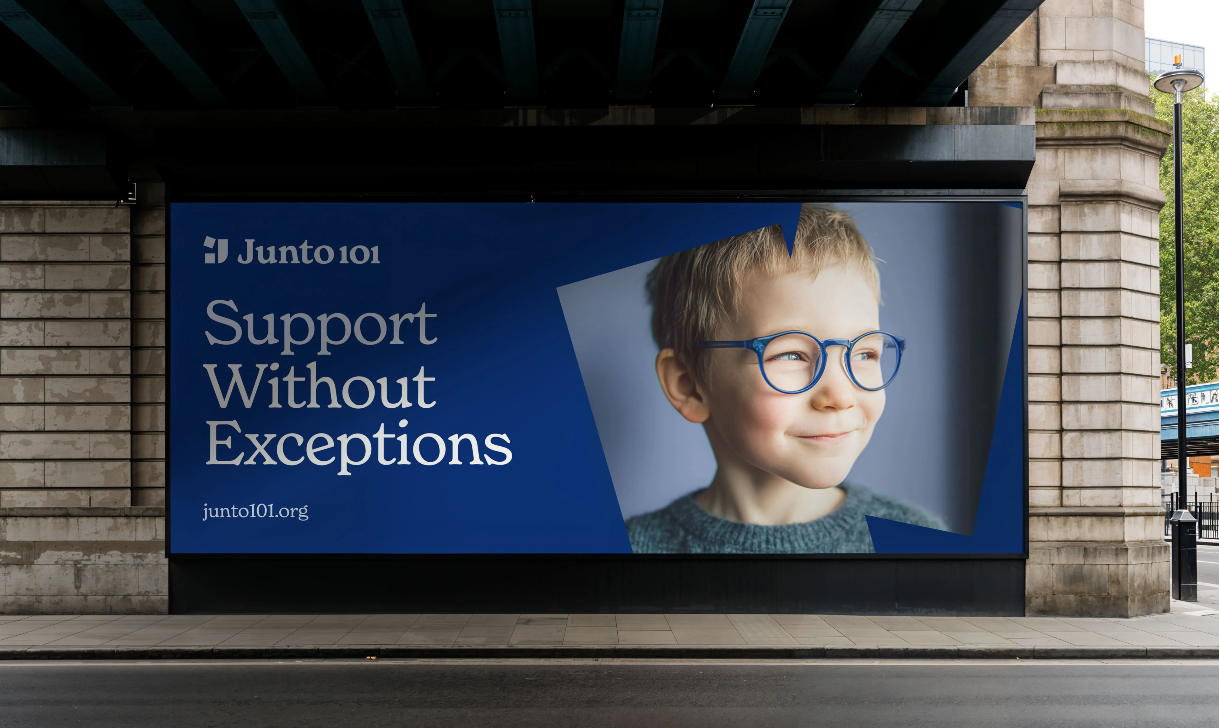
.avif)
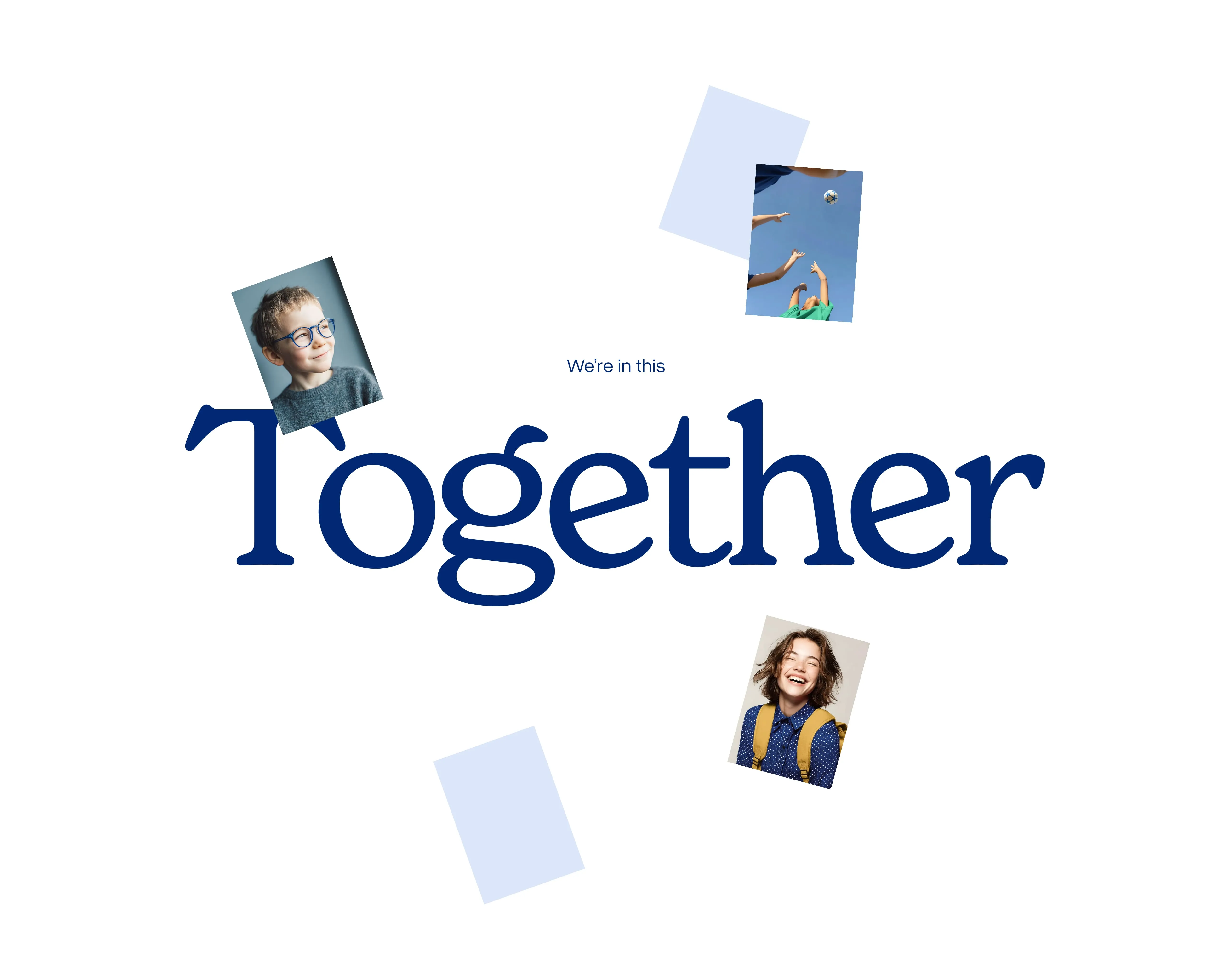
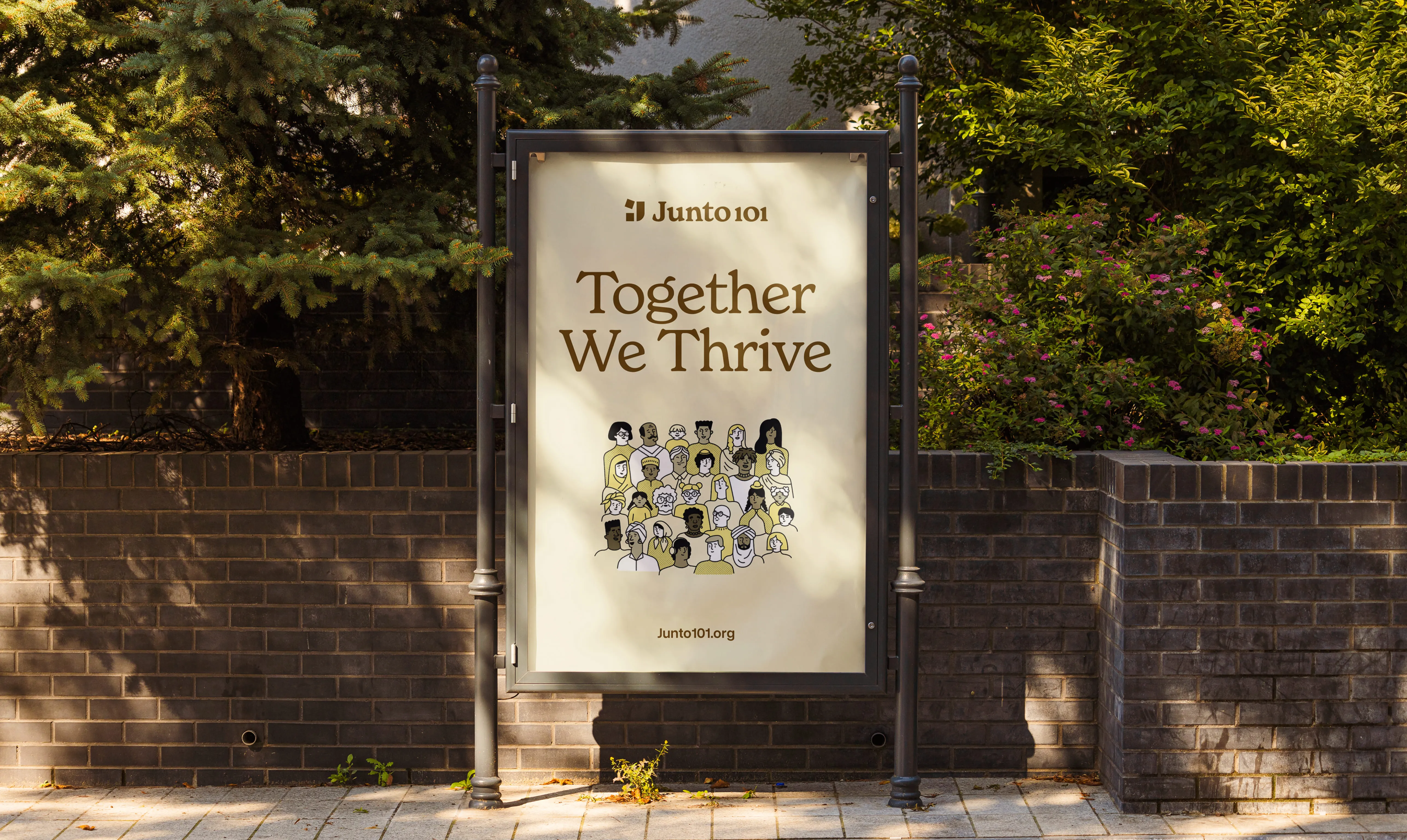
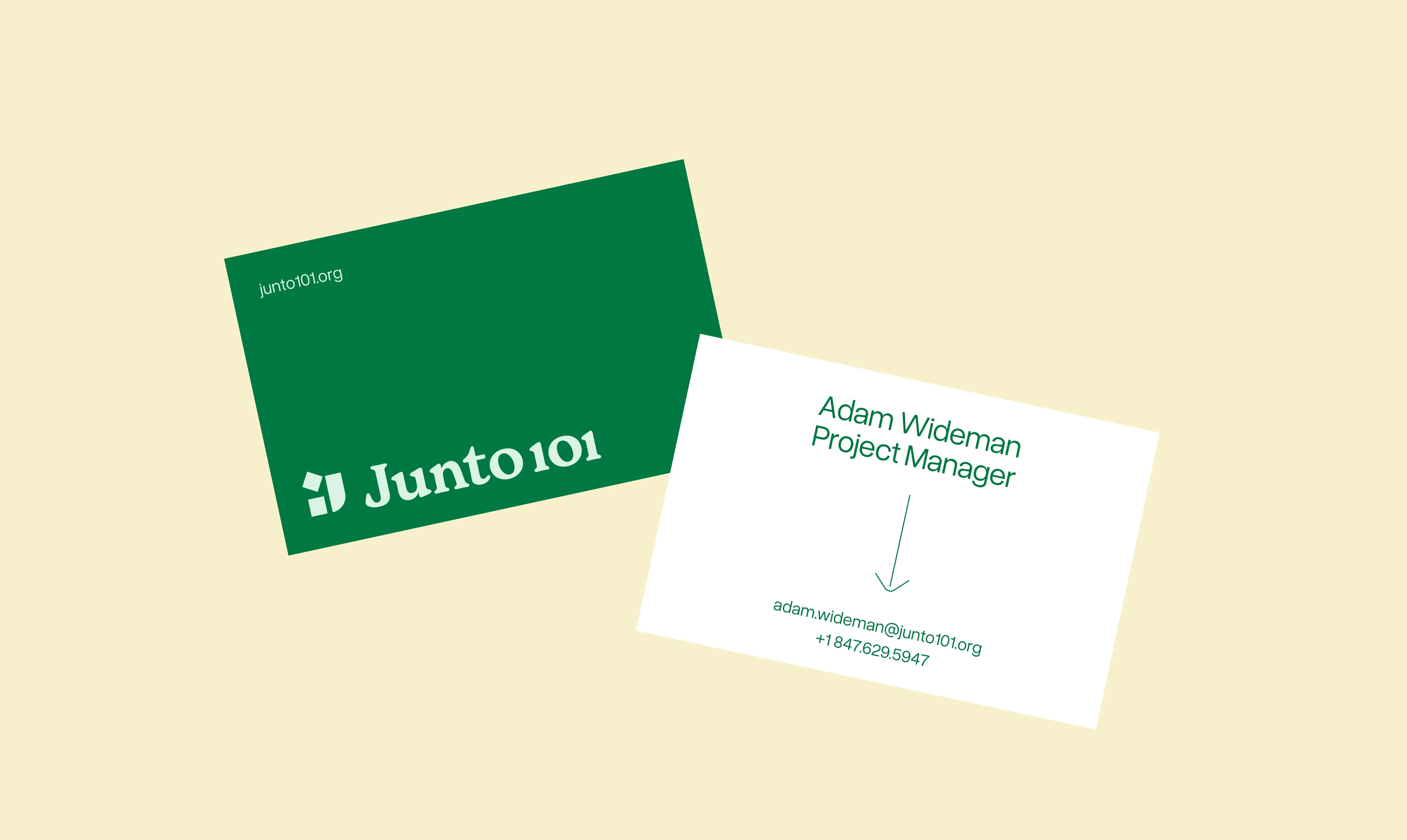
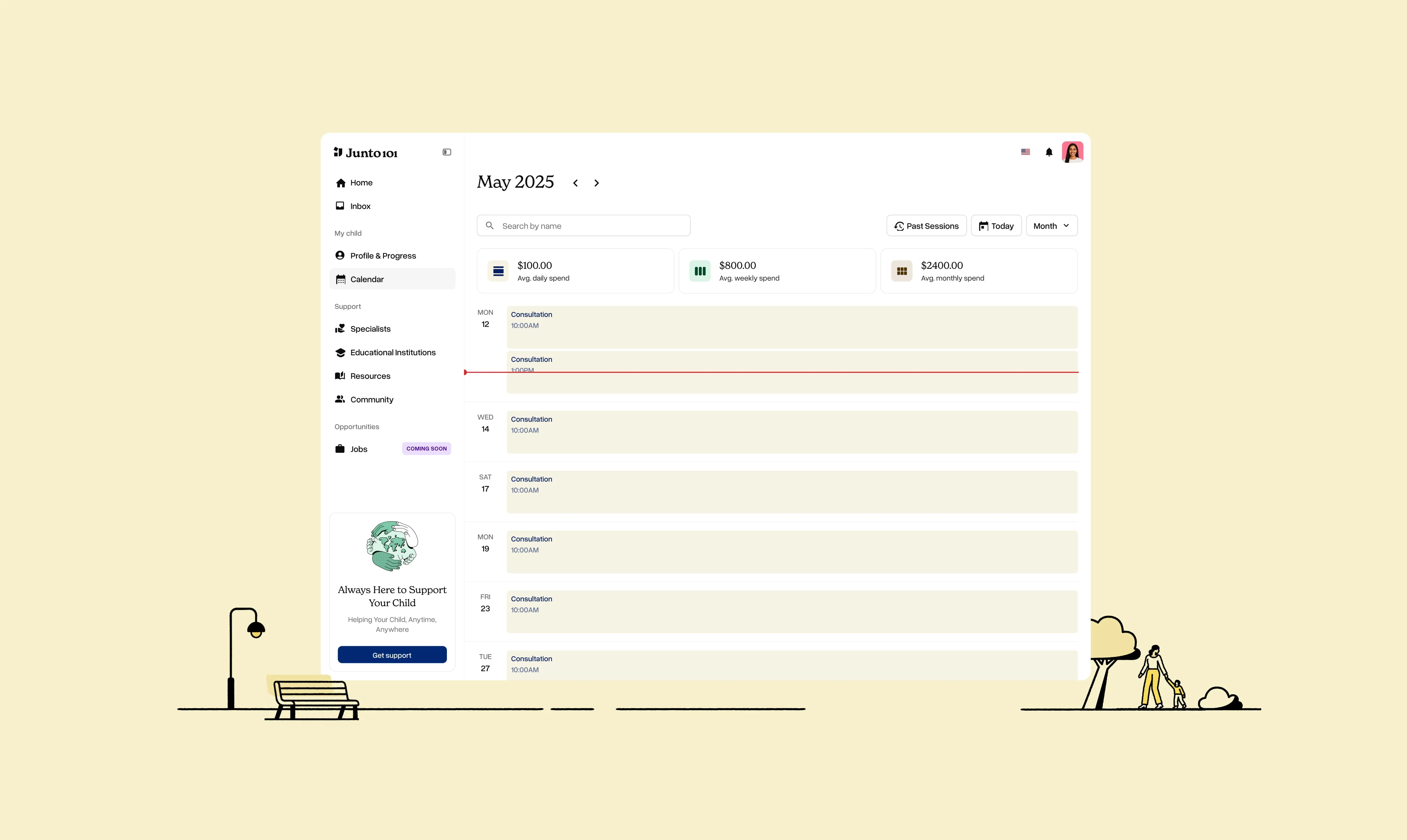
Junto101 now has a brand that truly reflects its mission: warm, inclusive, and built for community. This wasn't just about designing a logo and picking an appealing palette. It was about giving a meaningful platform the visual voice it needs to fulfill its purpose - and one it deserves.



.webp)
