Hoooray!We've got the details.
Don’t wait for our reponse. Choose the best time for a chat with us and let's talk.


Mecha, architects
of the next economy
Mecha acquires and transforms legacy industrial businesses into high-tech, automated leaders.
Mecha had a strong name in a category that didn’t exist yet. A private equity company, buying legacy industrial businesses and rebuilding them using robotics. No obvious visual references, or established playbook, and three different audiences to target at once.
Introduction
Mecha is a private equity and robotics firm, acquiring legacy industrial businesses (such as recycling, logistics, or wellness), and rebuiling them into high-tech, automated leaders. The brand has to speak to investors, business owners, and engineering talent, all at once. In a category without established visual conventions.
Workshops
It started with strategic workshops: a deep dive into the core of the business, its audiences, stakeholders, and buyer personas. We defined the problem - most capital firms selling an AI story are just selling a narrative. Mecha buys cash-flowing factories and puts robots on the floor. Their positioning had to make that difference clear in one line, and hold up as their portfolio grew.
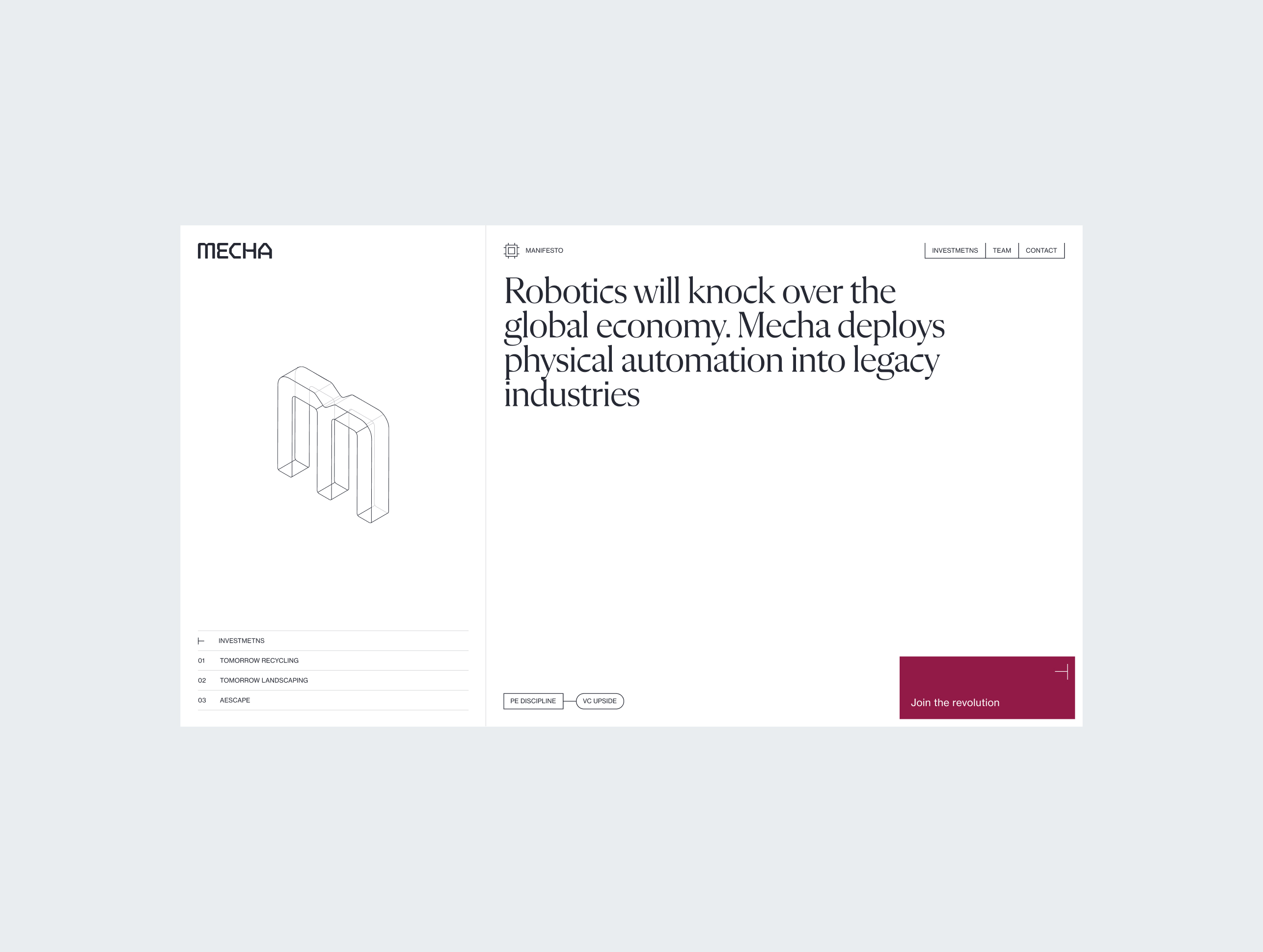
“Non-fiction revolution.” That’s where we landed, following it up with the headline: “Robotics will upend the global economy.”
The non-fiction revolution.
Many capital firms fixate on AI narratives. Mecha actually follows through, by acquiring cash-flowing businesses and integrating robotics into their ops. Science fiction becomes economic reality; demonstrated on factory floors instead of in pitch decks.

Visuals
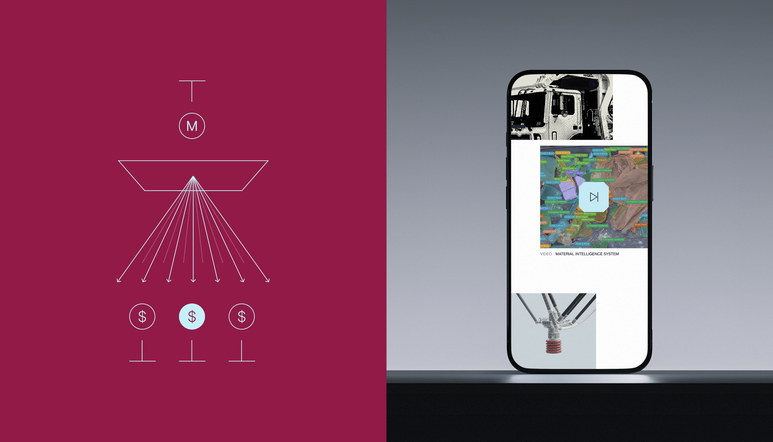
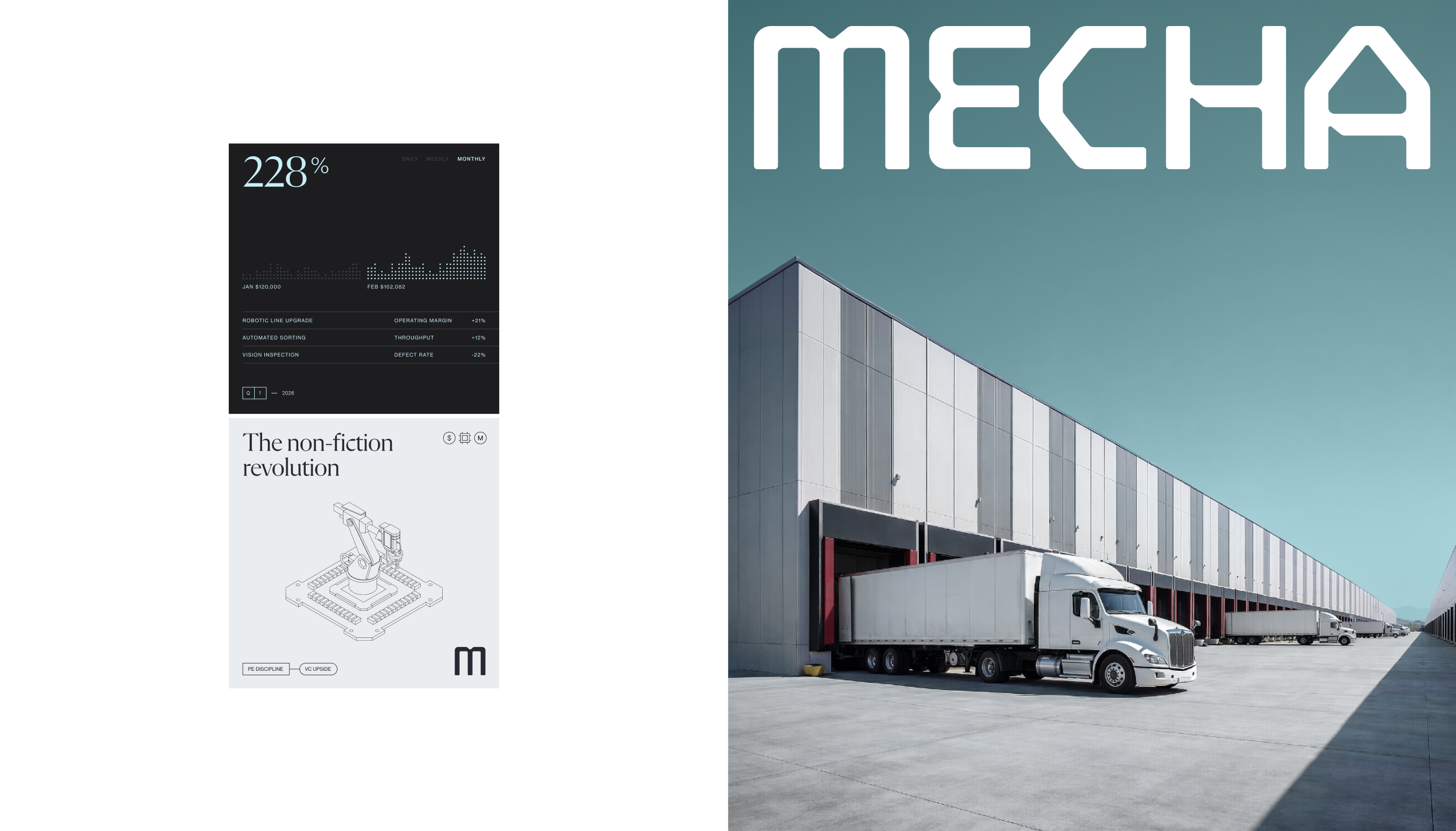
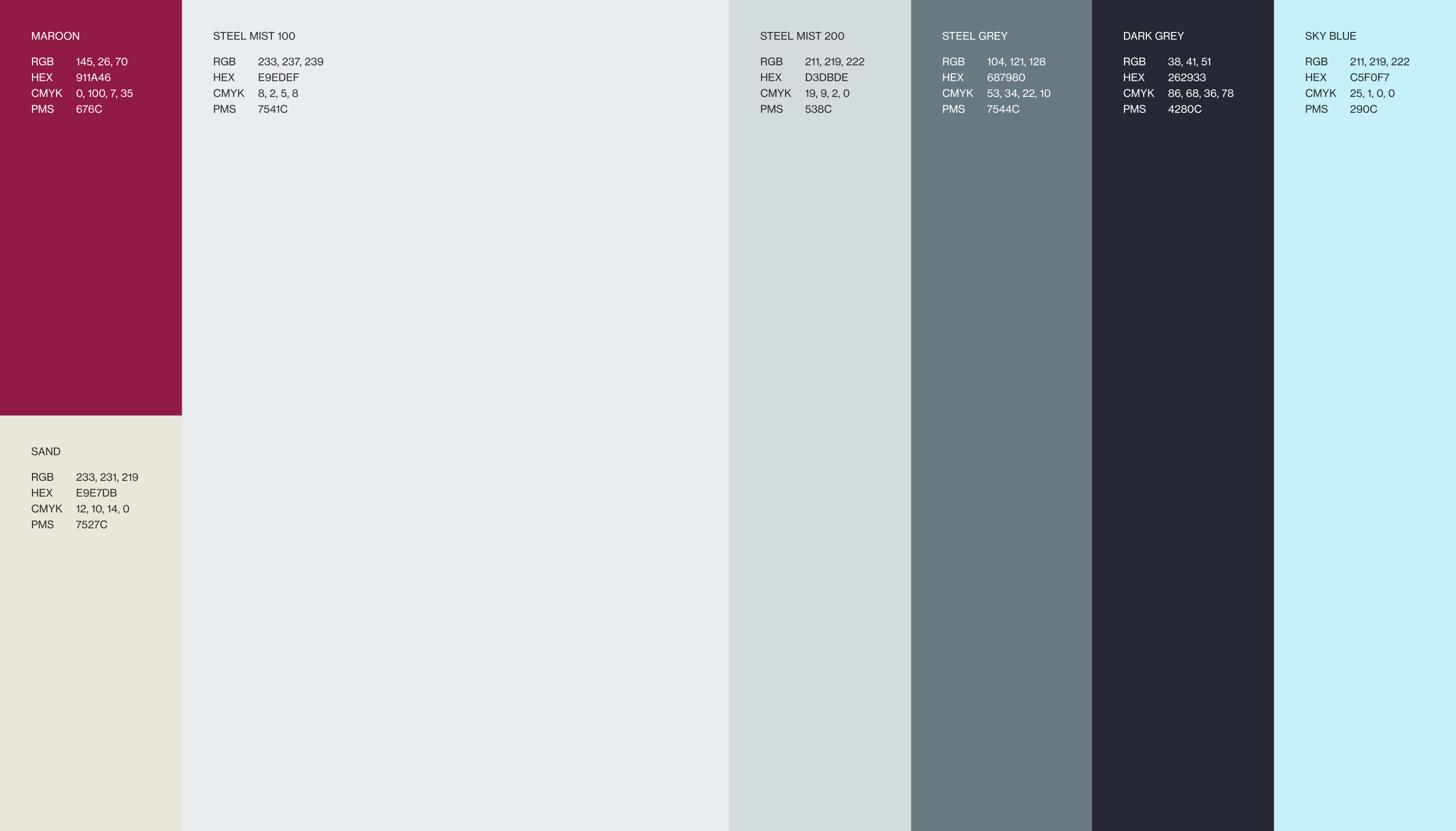
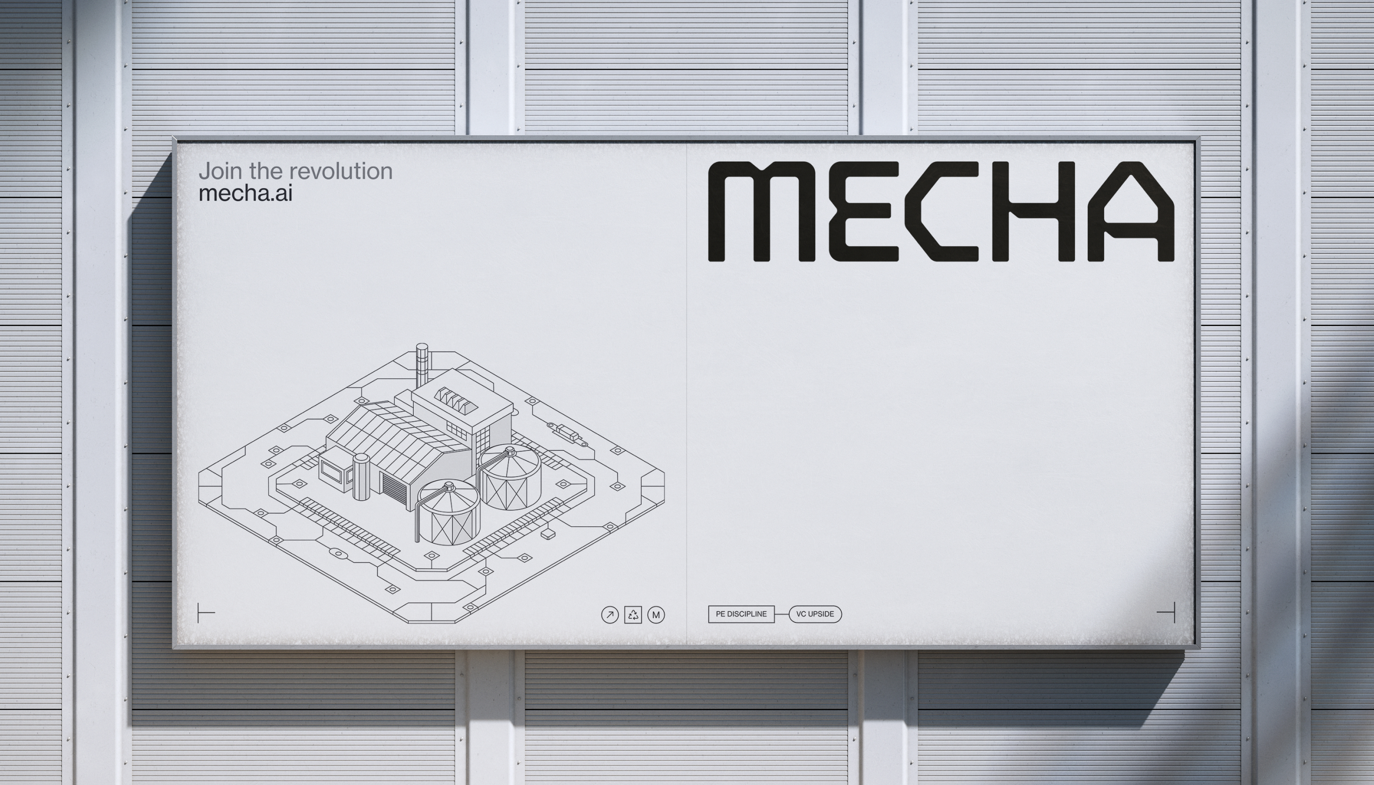
The visual directions followed directly from the strategic decisions, merging the restraint of venture capital with an industrial, robotic edge. PE discipline here, VC ambition there.
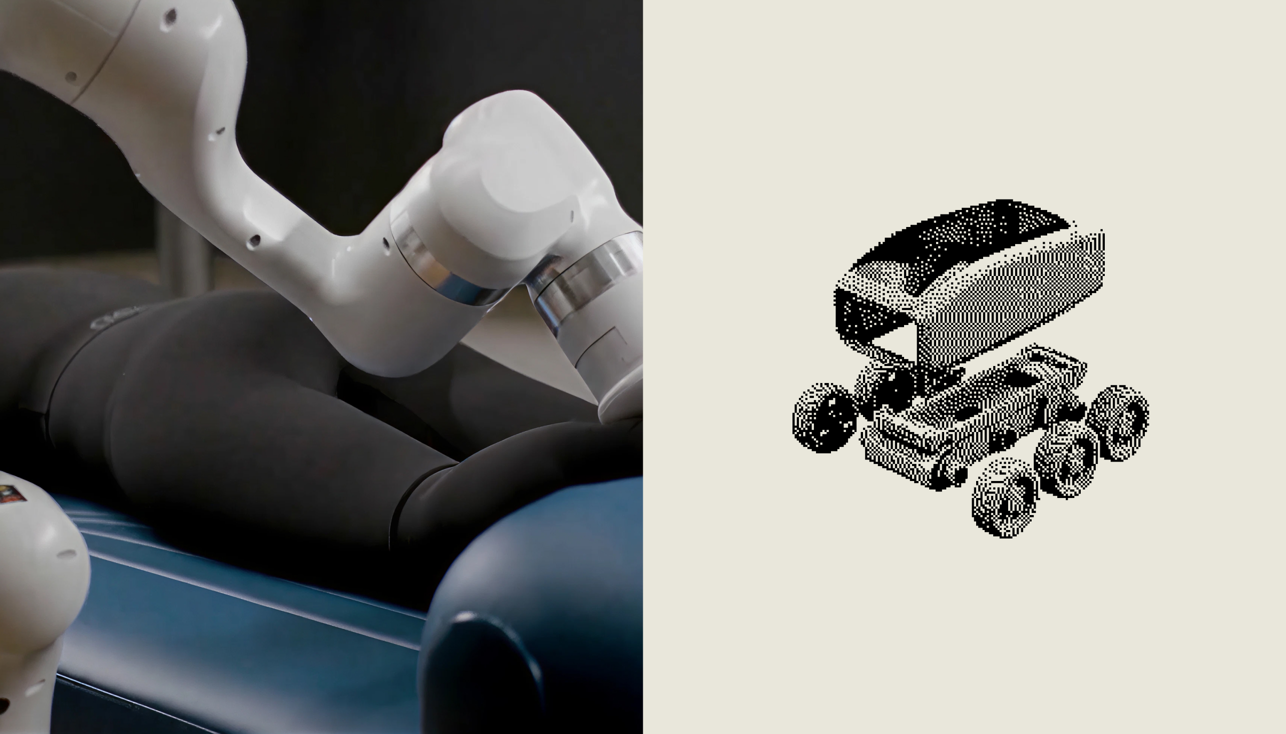
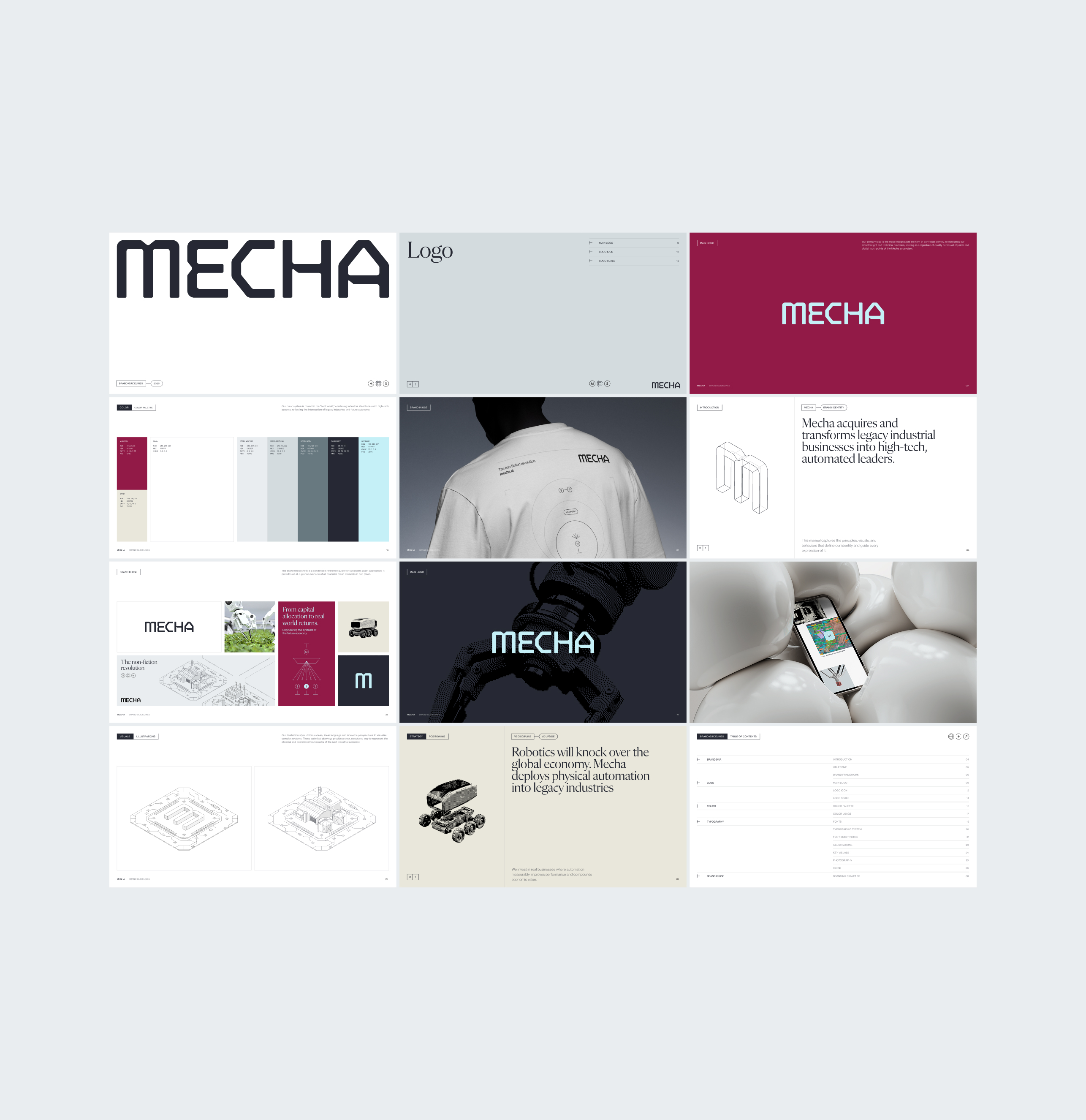
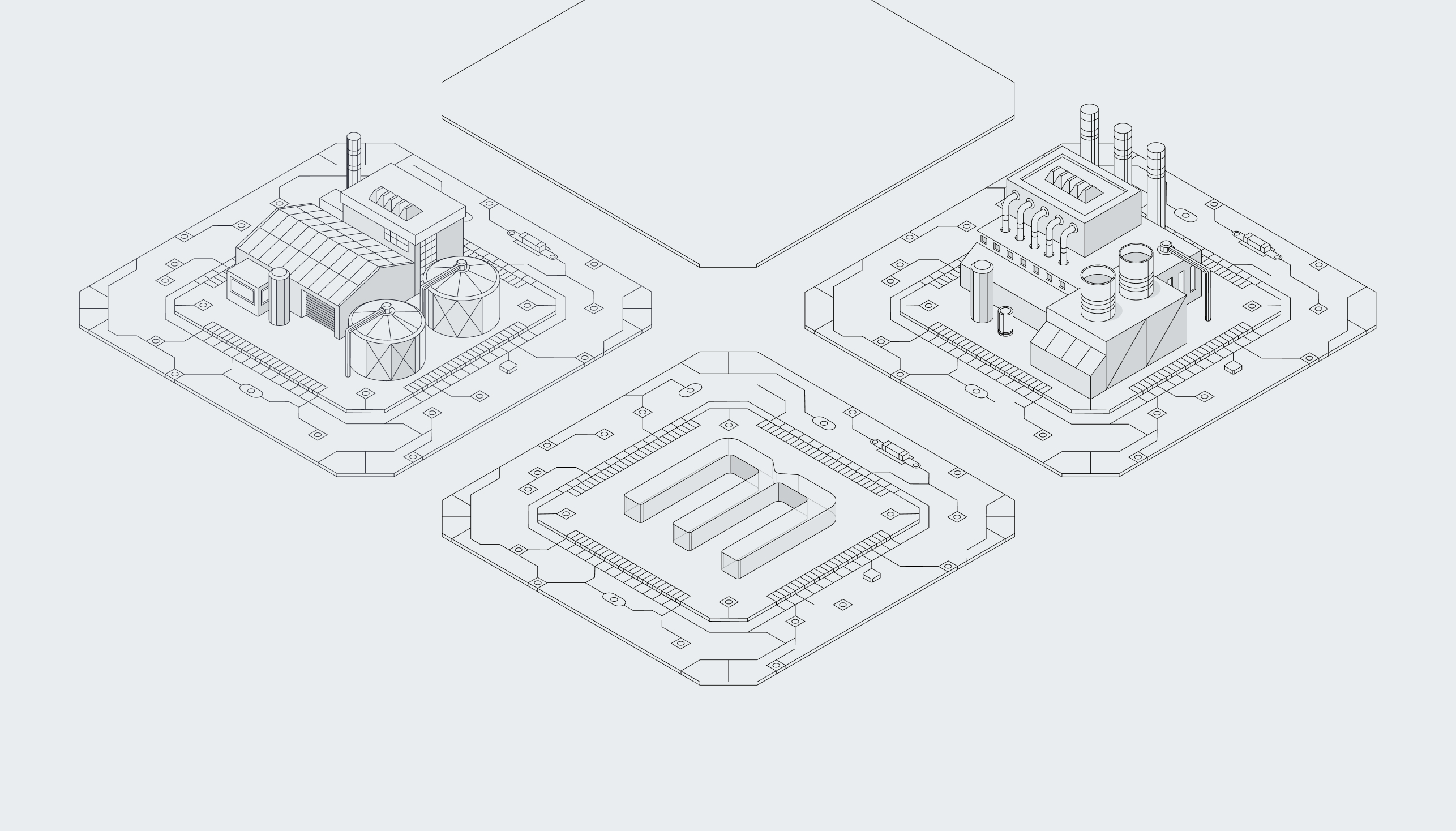
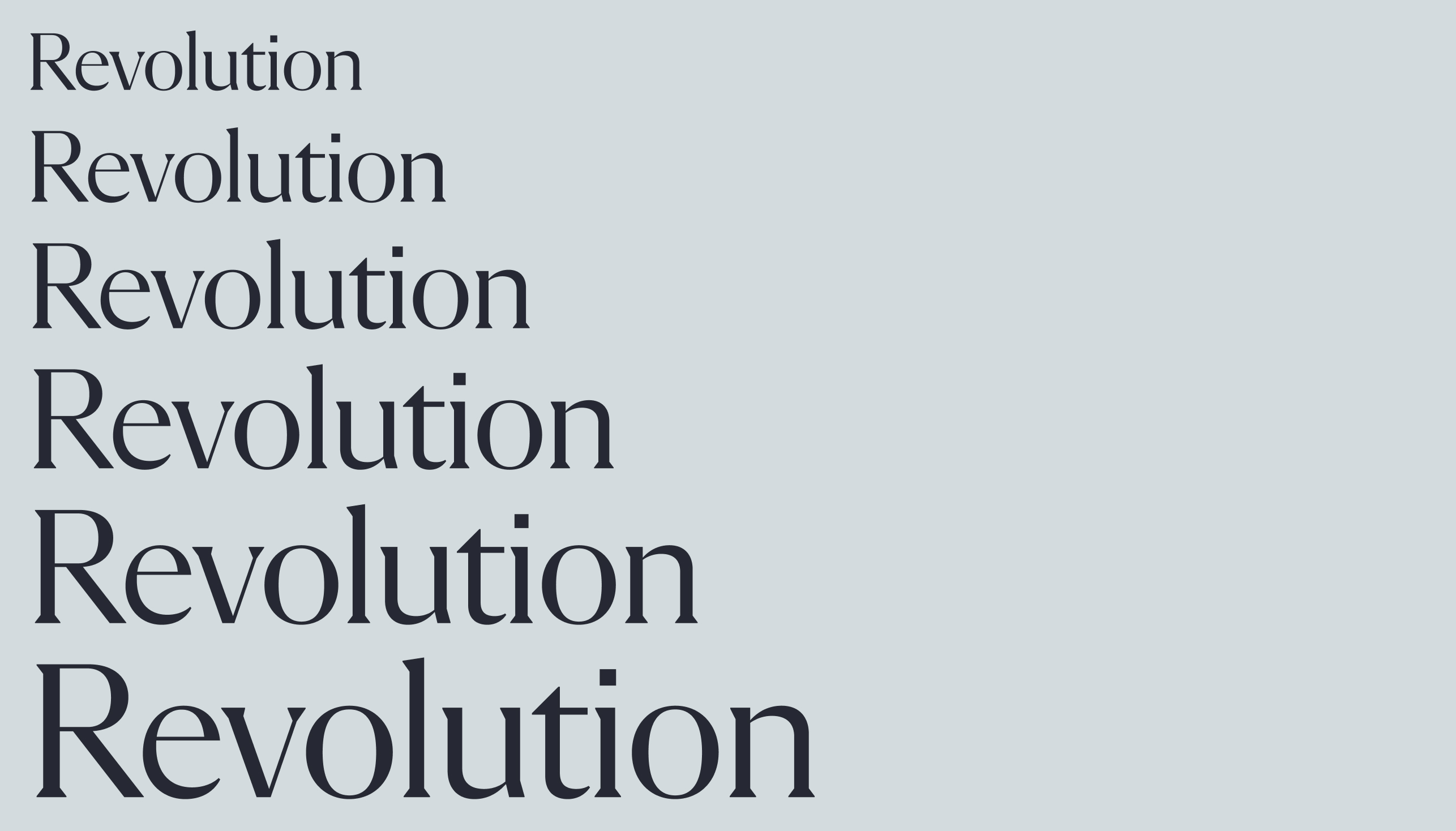
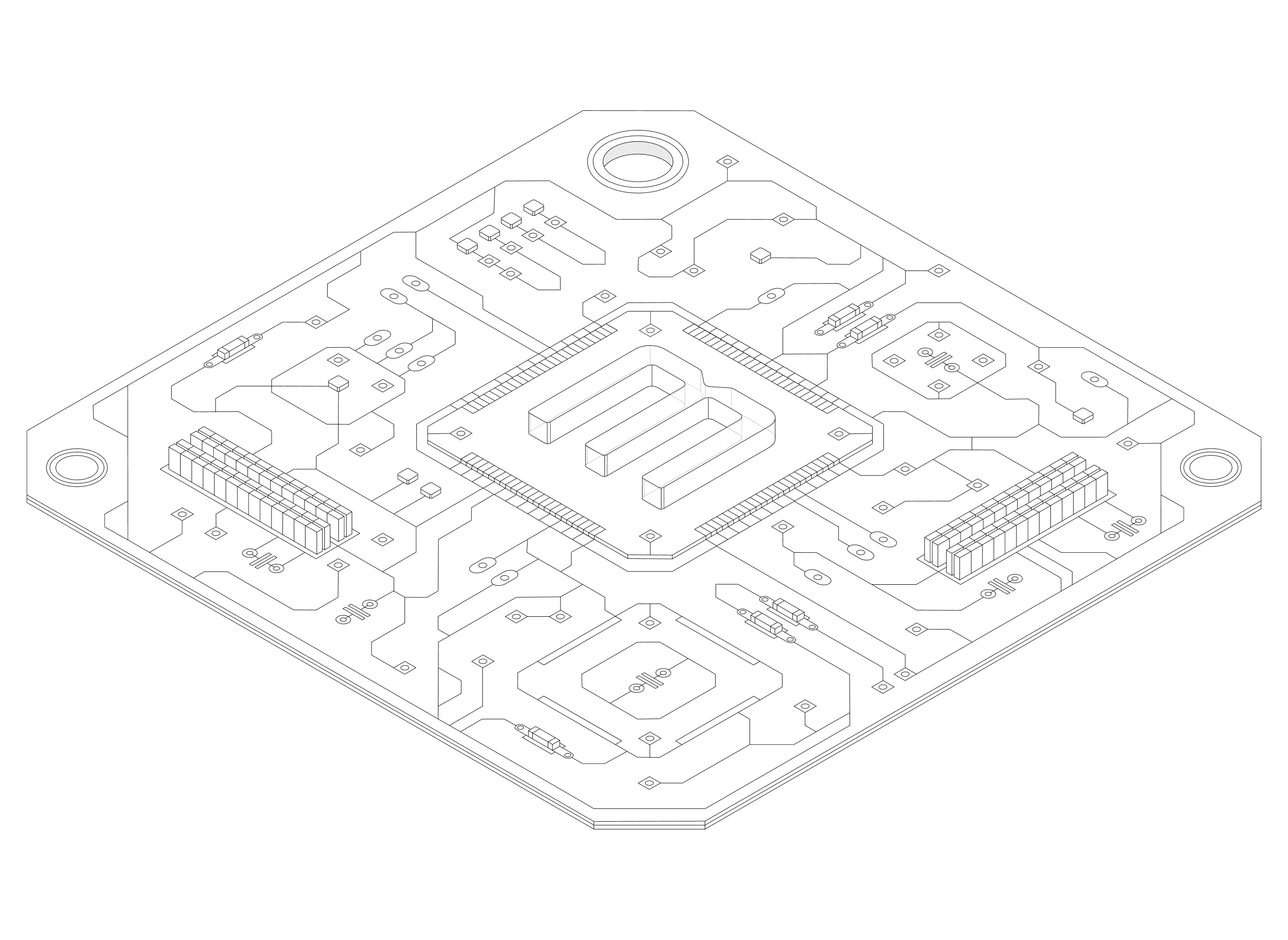
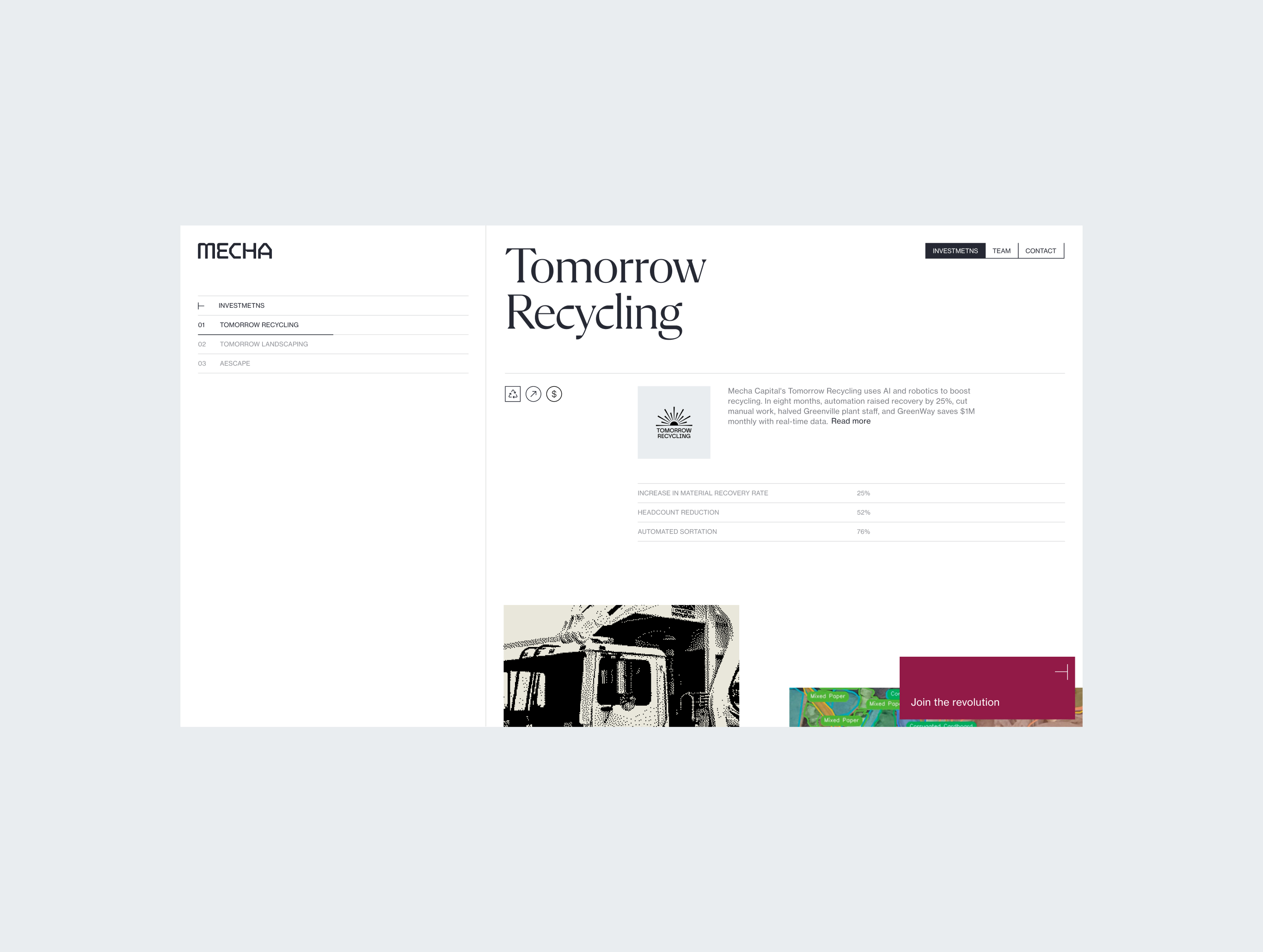
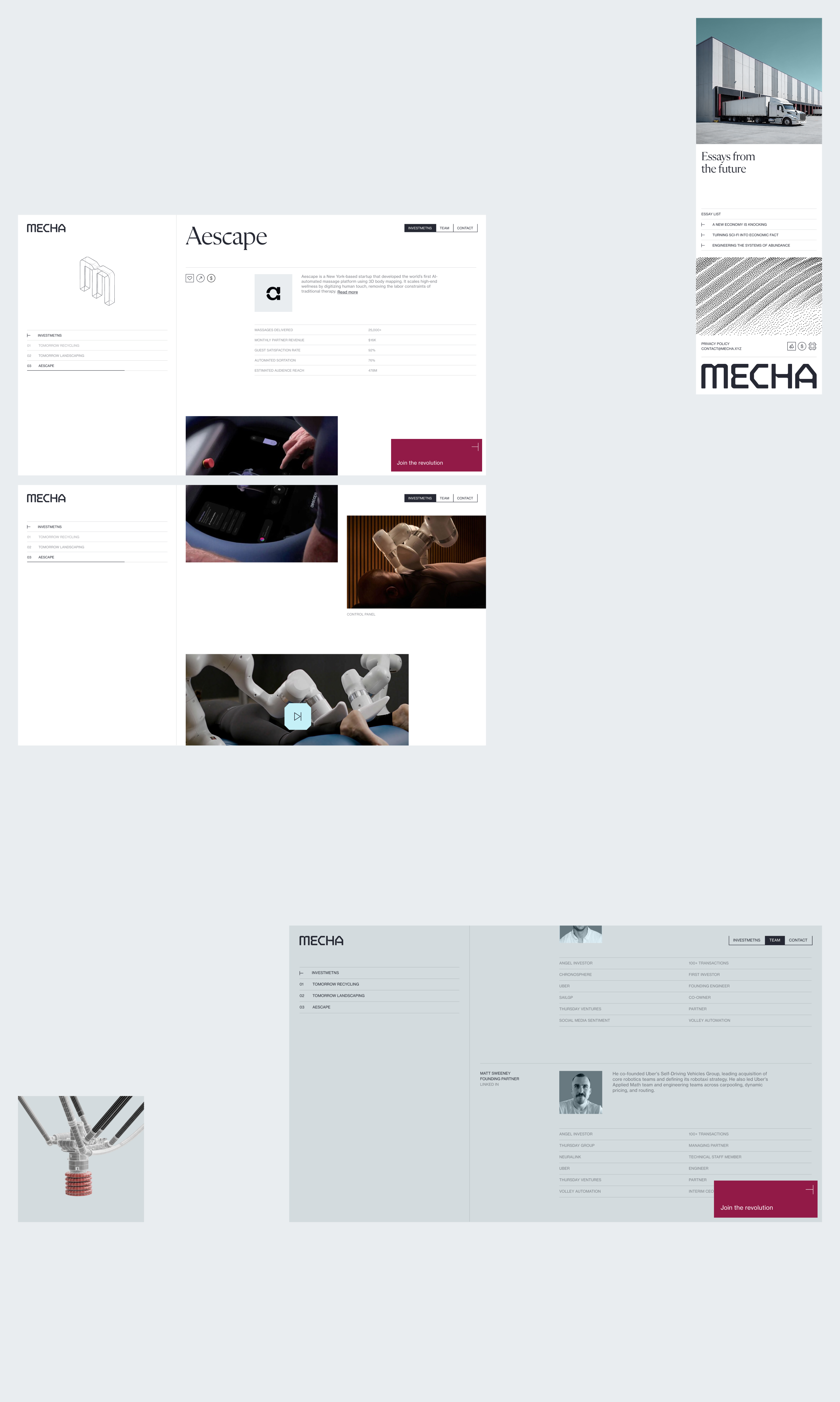
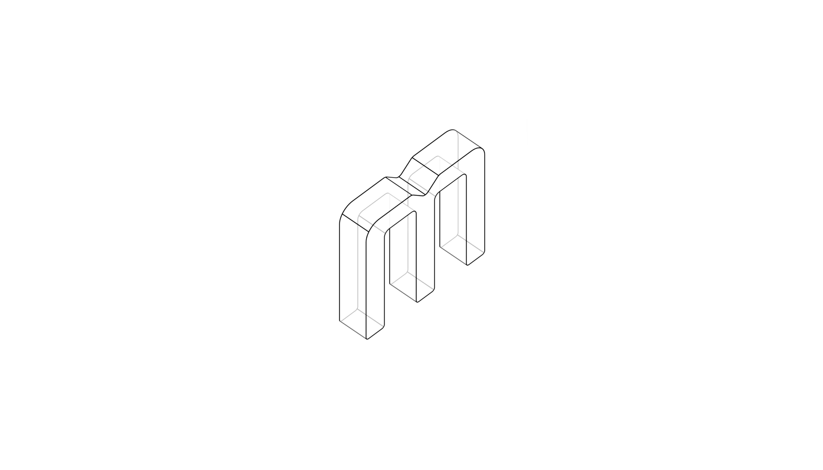
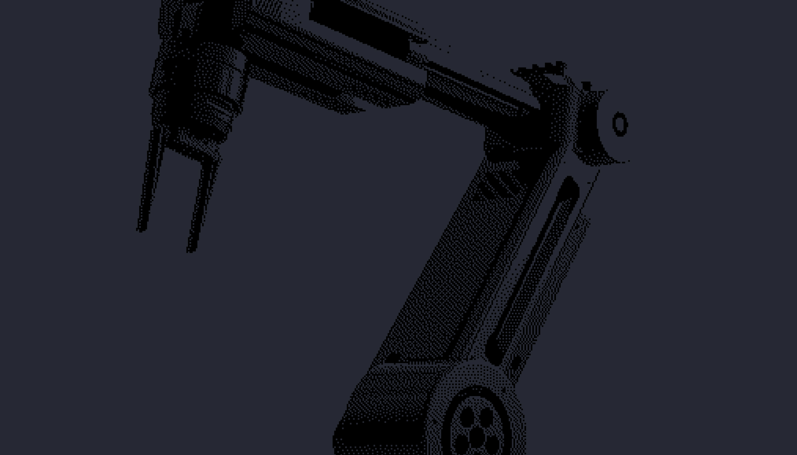
The result is academic. Minimal, and precise, with isometric technical illustrations, dithered imagery of real machines. The editorial serif (Flecha) pairs with clinical grotesque (Neue Haas Grotesk), to round off the look.

Summary
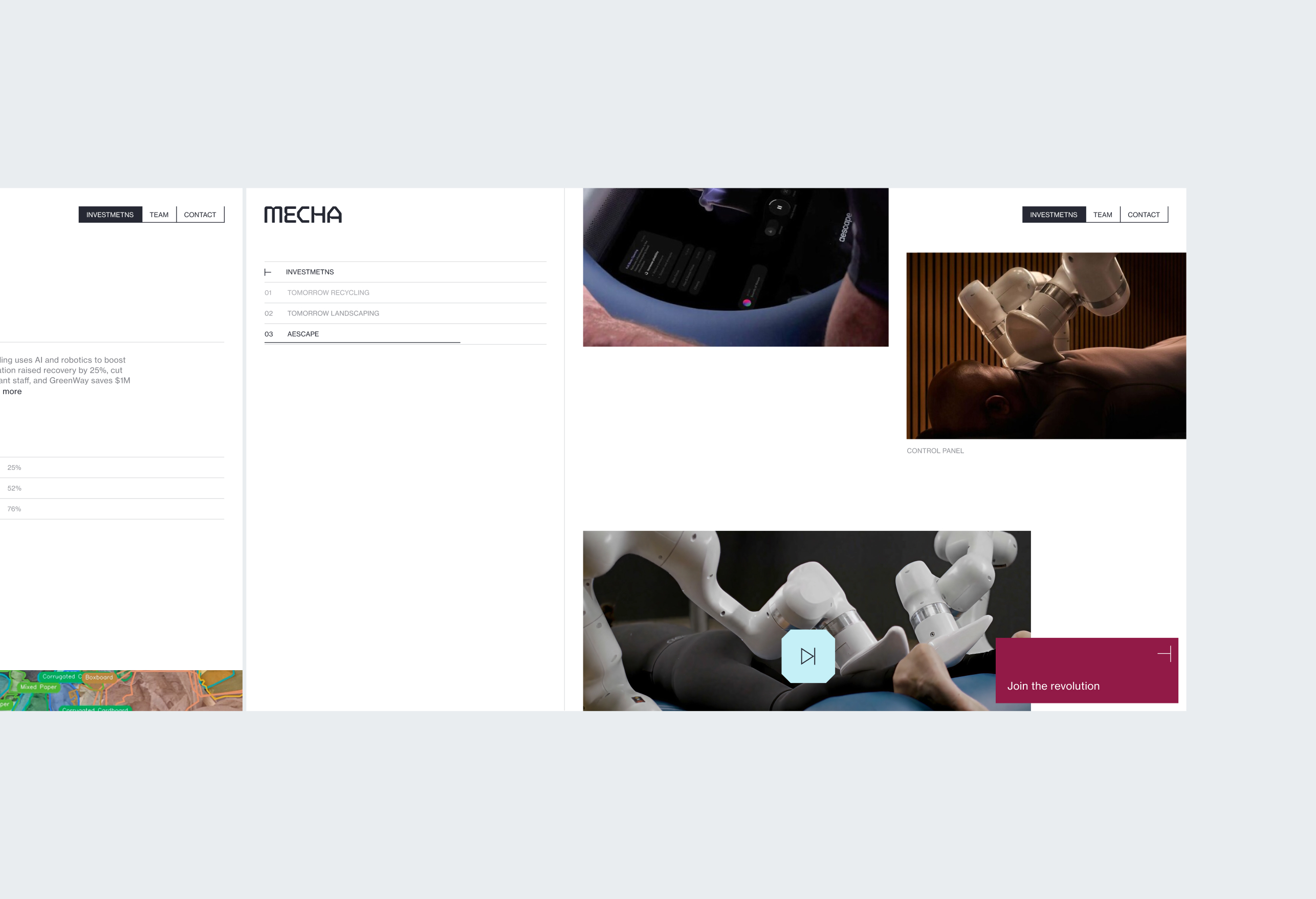
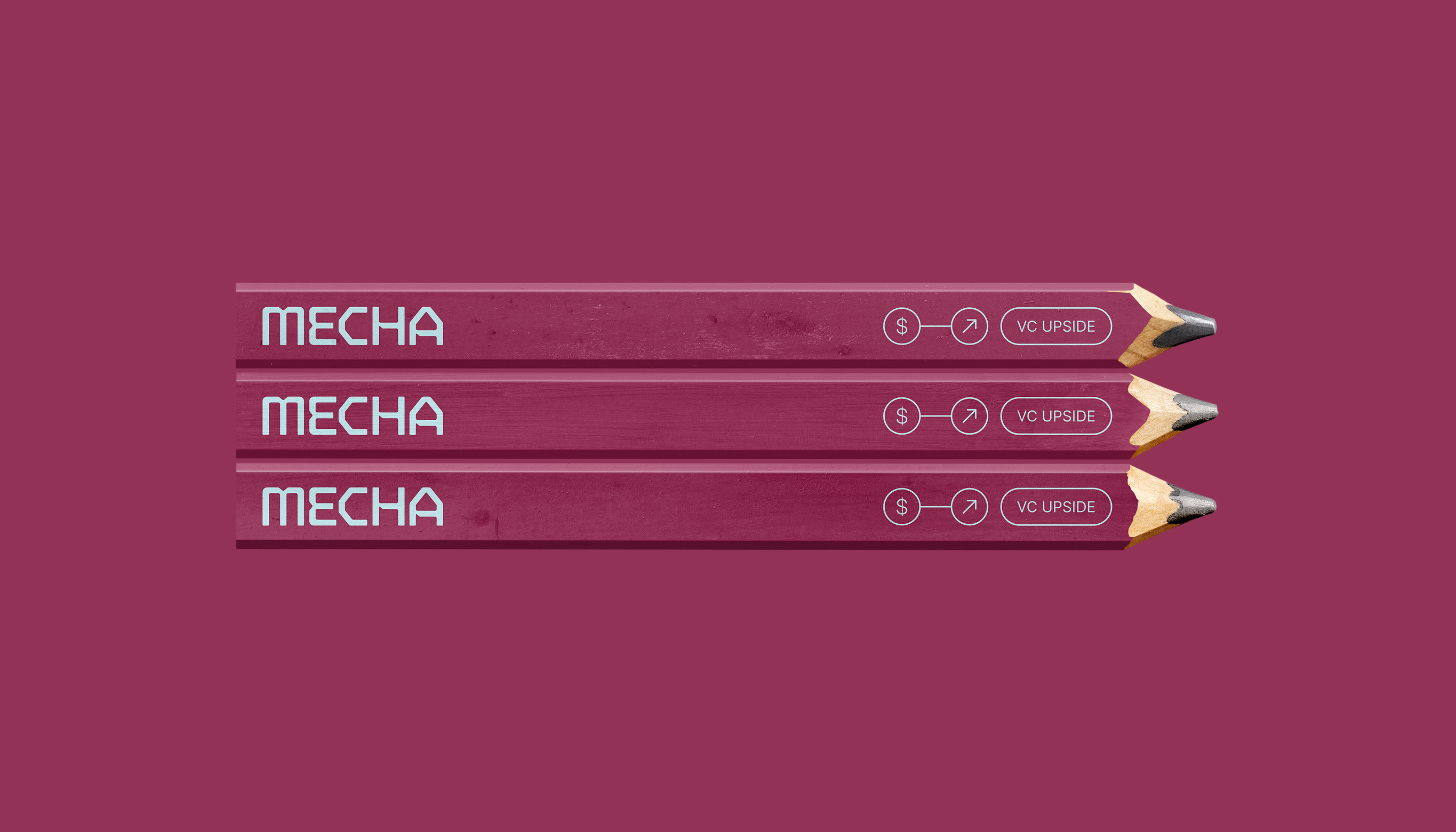
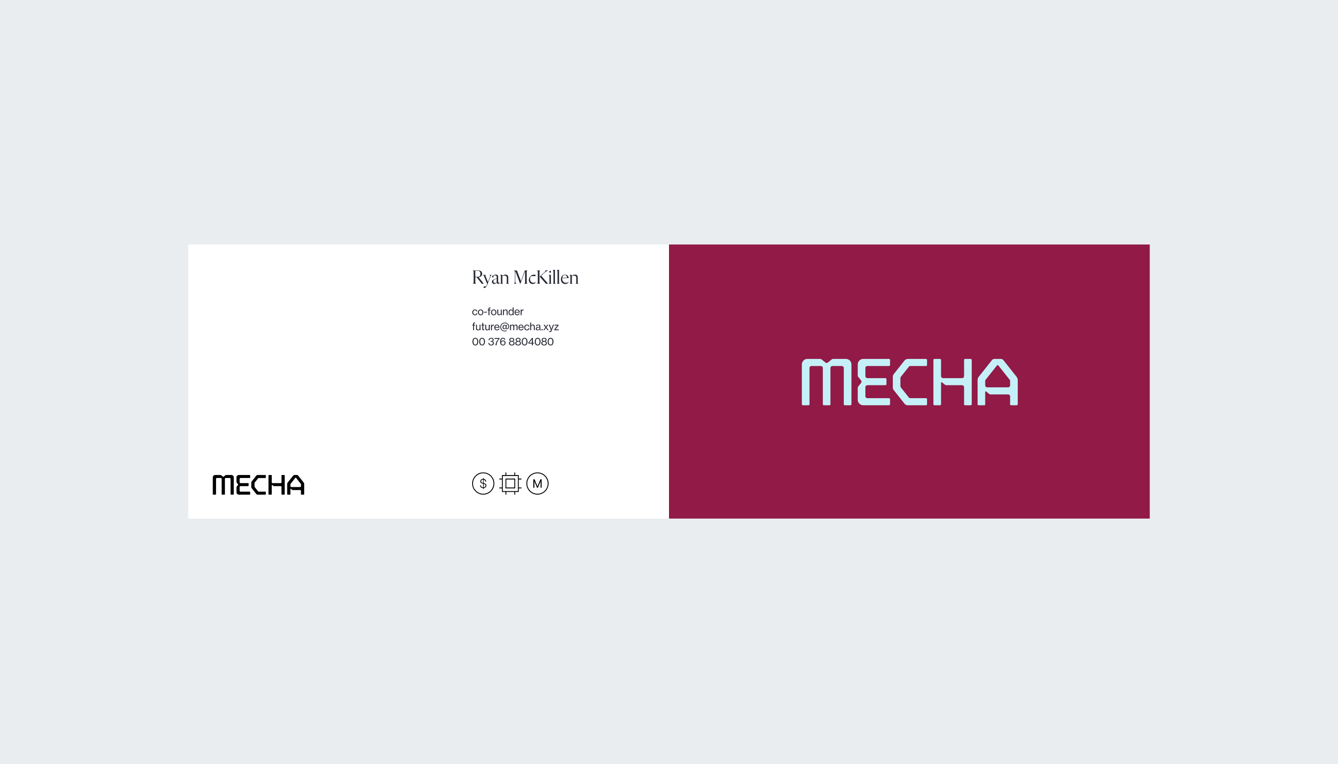
Mecha had the name. We designed everything around it: strategy, positioning, messaging, wordmark, visual system, Brand Guidelines, pitch deck, LinkedIn assets, and the website.
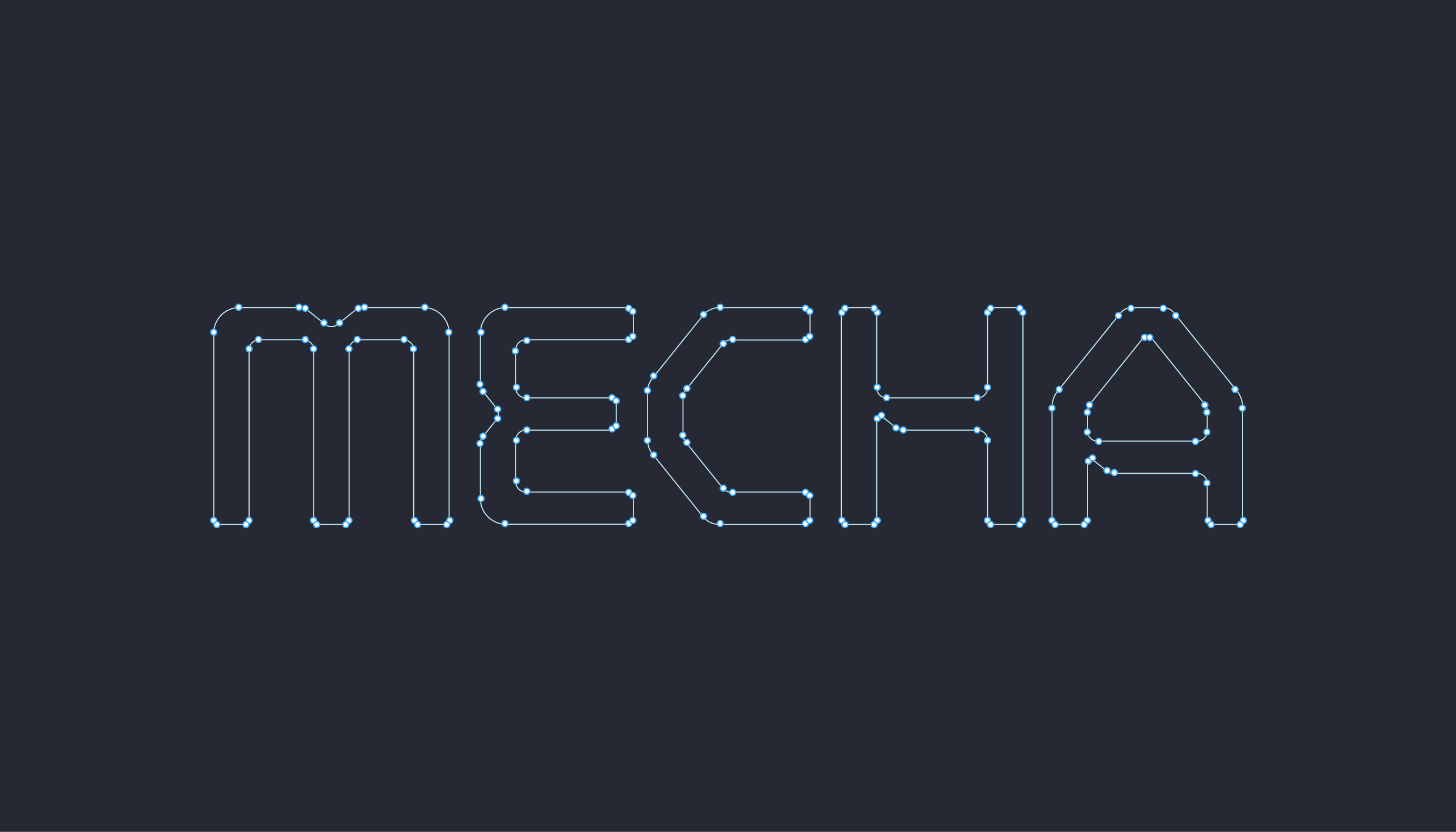
Photography built trust. Isometric illustration made future investments tangible, dithering connected vision to proof, and typography introduced academic seniority. The wordmark encoded Mecha’s robotic DNA; the modular website gave the portfolio room to grow.
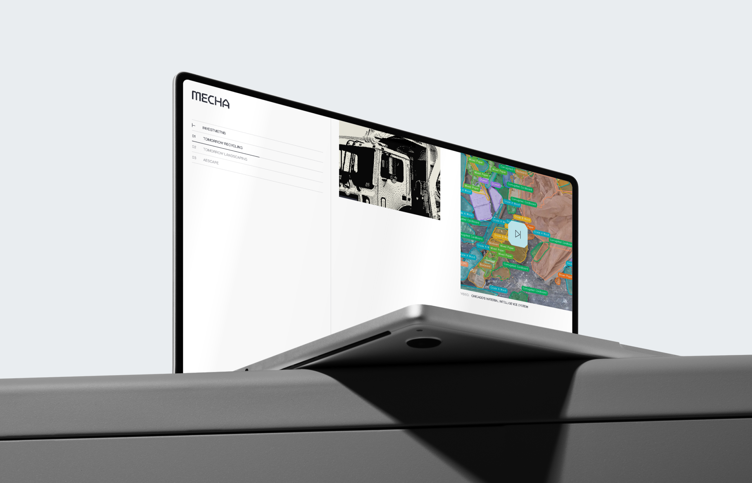
Now, the Mecha team presents investments before they launch, document once they’re operational, add more without breaking the system. Visual language stays the same each time, all assets tied together.



.webp)
