Hoooray!We've got the details.
Don’t wait for our reponse. Choose the best time for a chat with us and let's talk.
Oops! Something went wrong while submitting the form.
Schedule a call:

Edgar Czop
Sales Account Executive
Don’t wait for our reponse. Choose the best time for a chat with us and let's talk.


Since 2012, N2W has been the leading cloud-native backup and disaster recovery platform for AWS. #1 in the AWS Marketplace, now expanding into Azure.
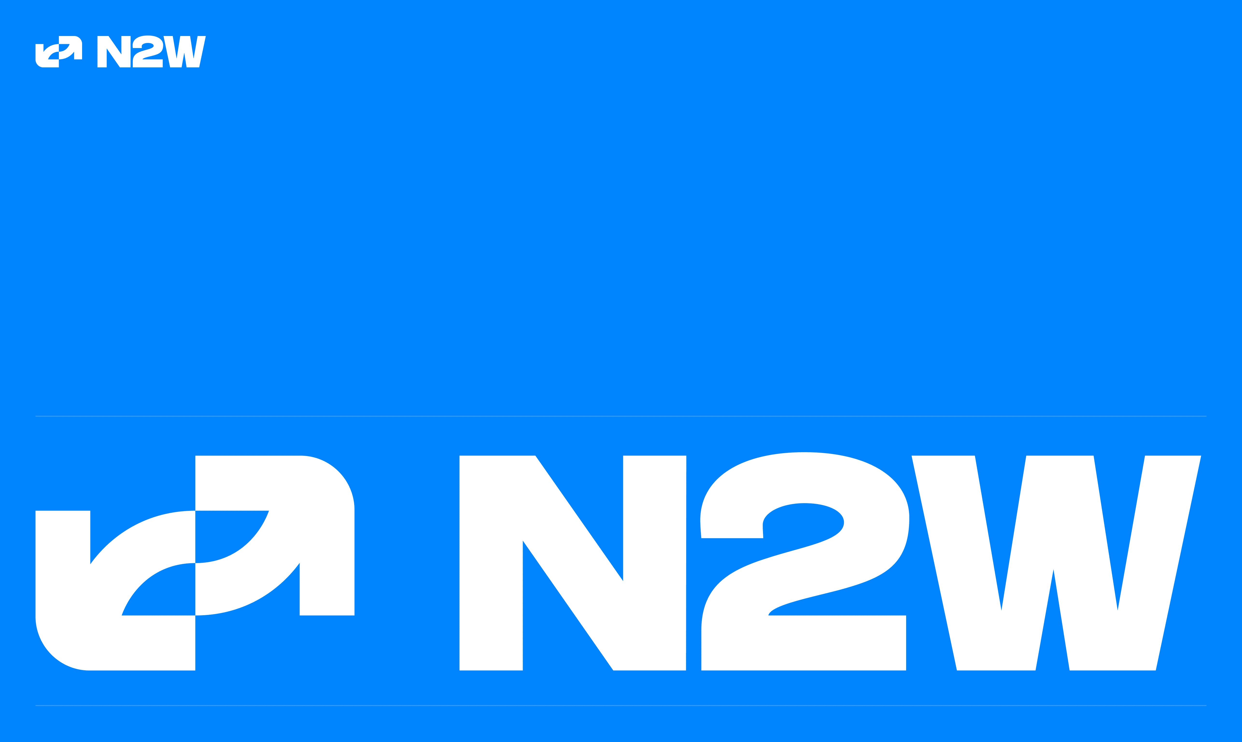
Since 2012, N2W has been the go-to cloud-native backup and disaster recovery platform for AWS. They’re now expanding into Azure, after already claiming the top spot in the AWS Marketplace. As the product matured into a true multi-cloud platform, the old branding no longer matched the team's ambition, or the trust engineers place in it every day.
N2W had already earned category leadership, but the old identity didn't reflect it. The rebrand needed to shed the corporate stiffness and land the name change from N2WS to N2W cleanly.
Our challenge was to make the brand feel as friendly as talking to a colleague - without losing a single ounce of the trust engineers place in it.

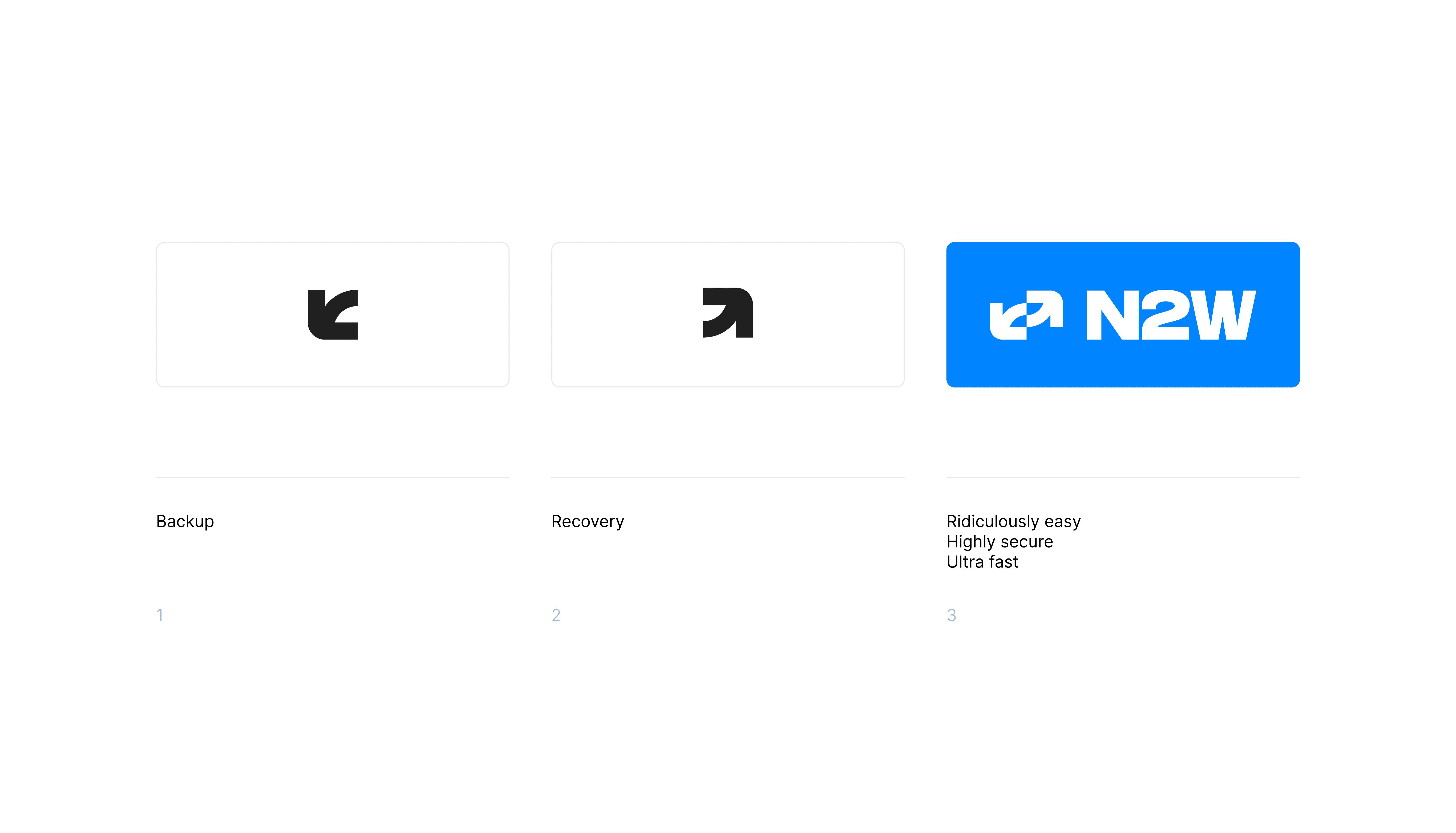
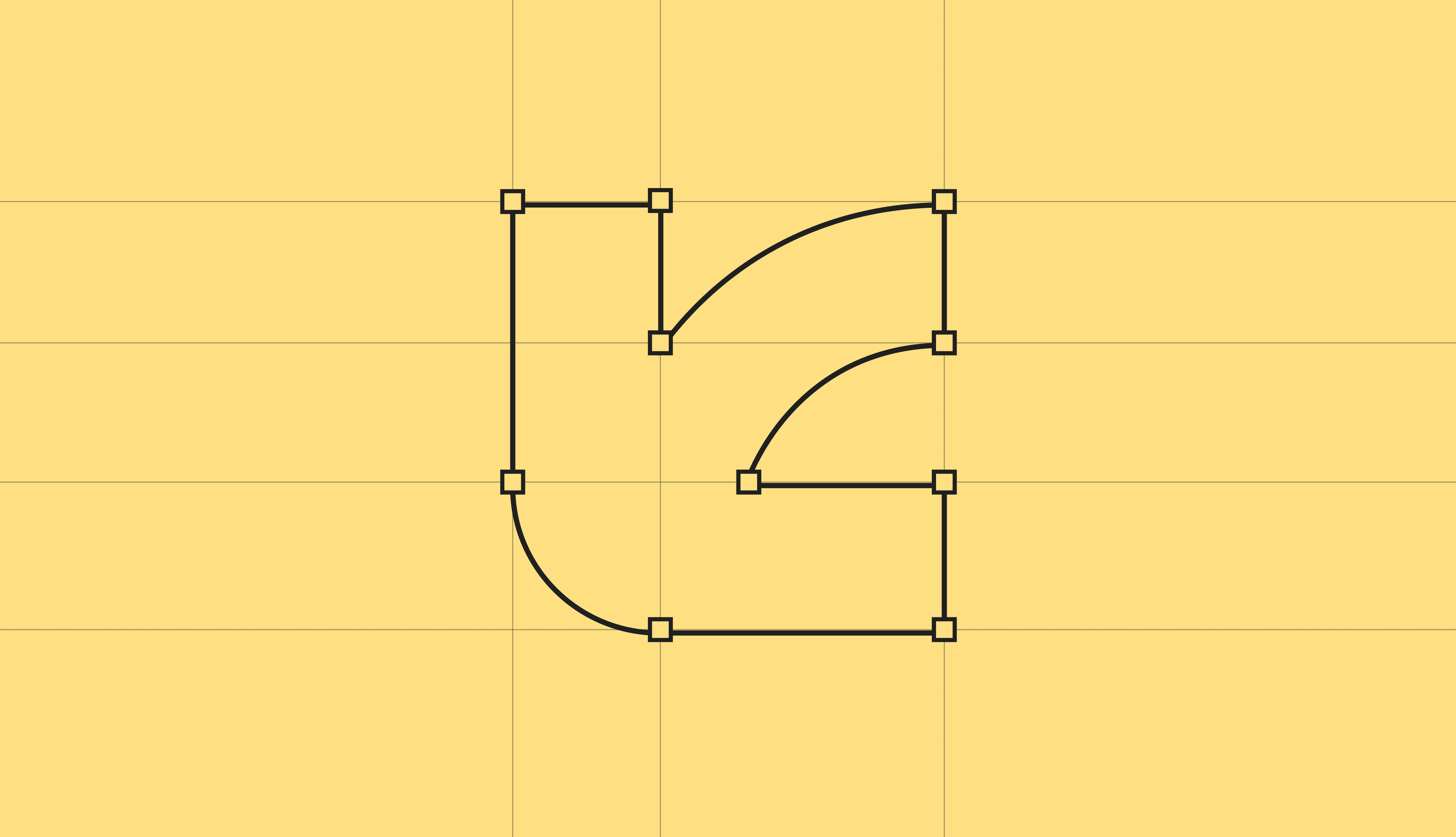
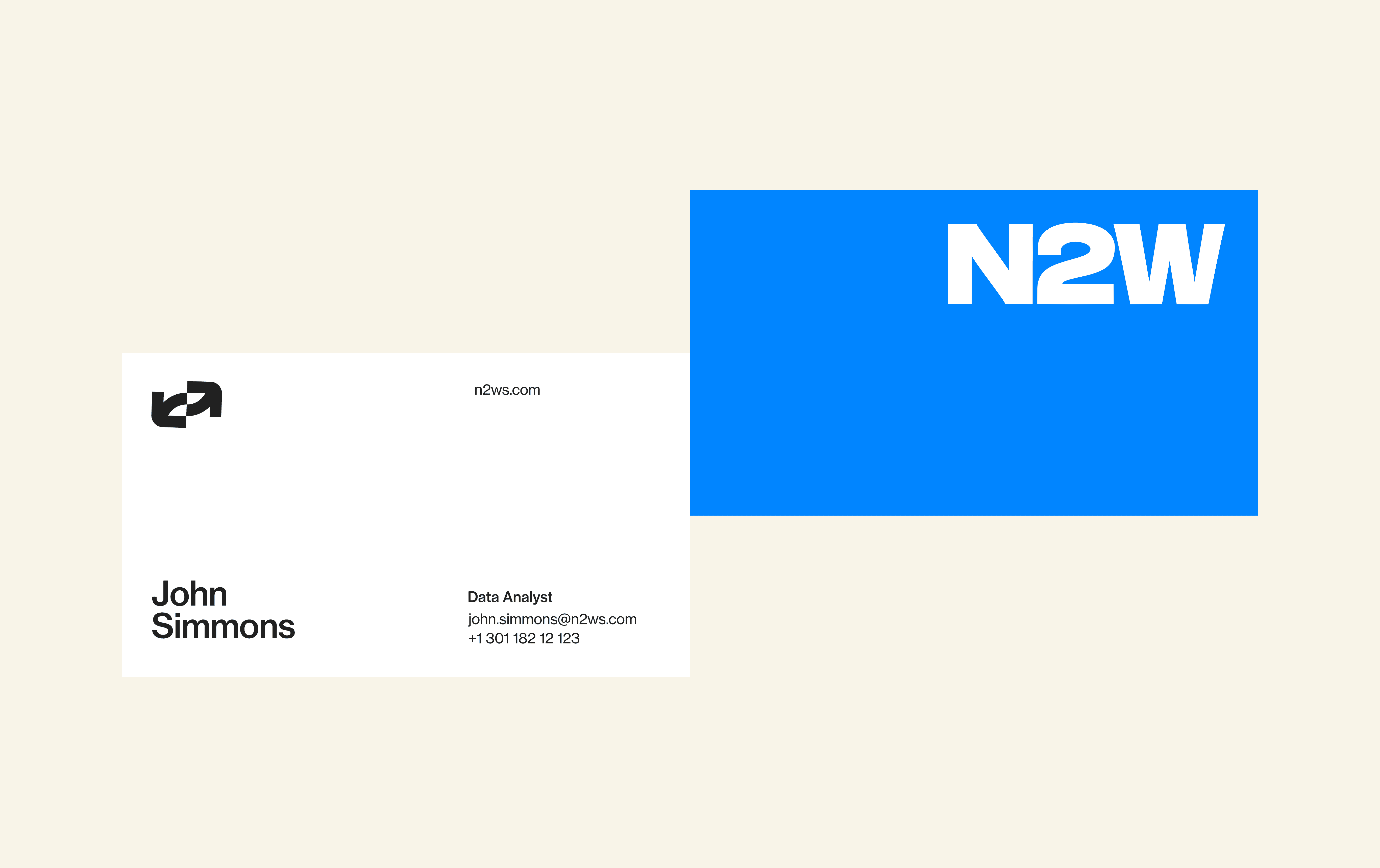
The main logo is a lockup of the icon and the "N2W" wordmark. The icon is built around two arrows, forming
a dynamic and cyclical loop: one for backing up data, one for restoring it.
On a deeper level, the interlocking arrows also represent N2W's simplicity: a straightforward, secure platform that makes protecting and restoring critical data feel effortless and ultra-efficient.
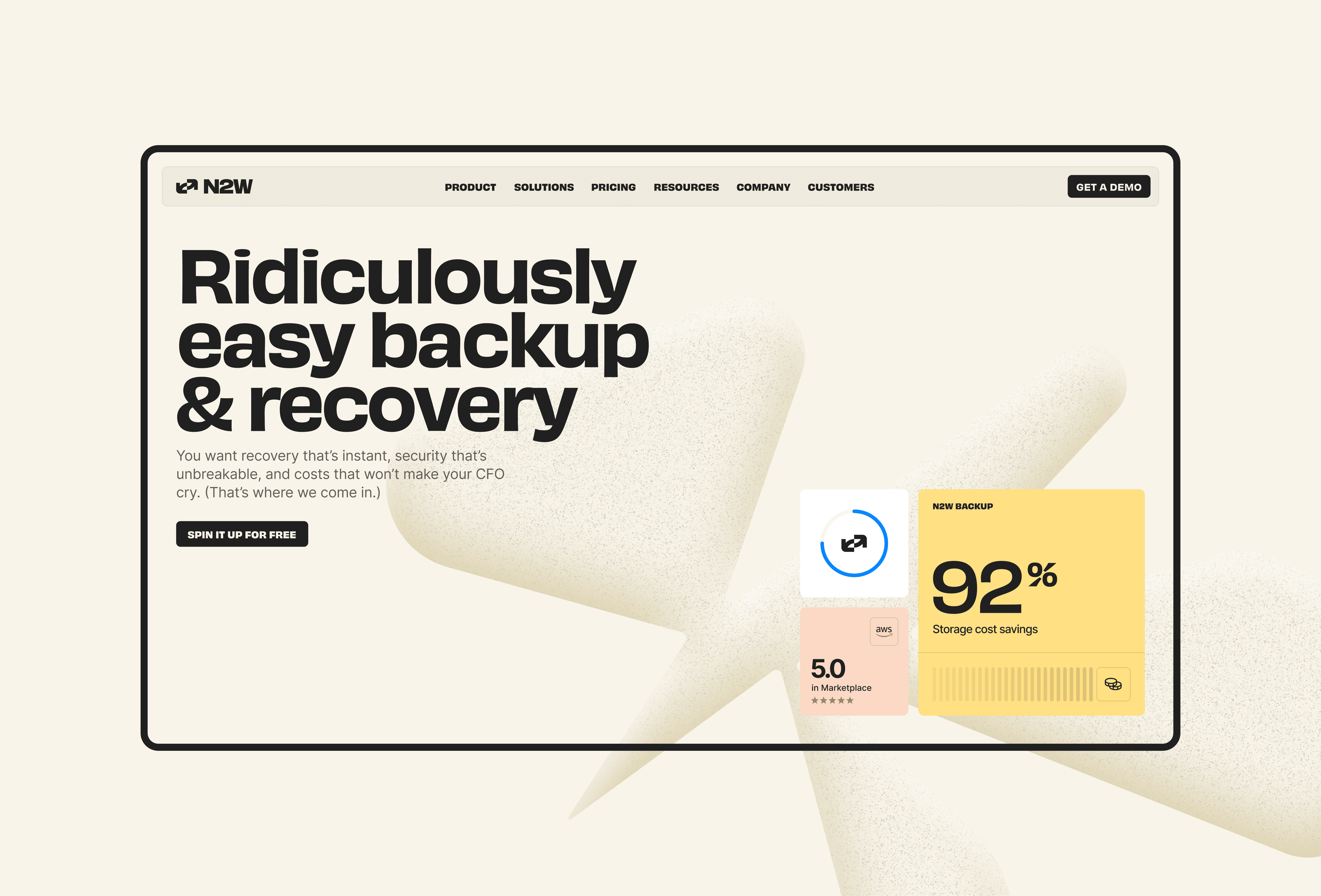
The N2W color palette pairs vivid energy with everyday clarity. Bold N2W Blue brings focus and trust, while sunny yellow adds optimism and momentum. Soft peach tones give the identity warmth and a human touch, balanced by crisp white and black that keep everything legible and grounded. The overall balance makes the brand feel bright, capable, tactile, and refreshingly uncomplicated.
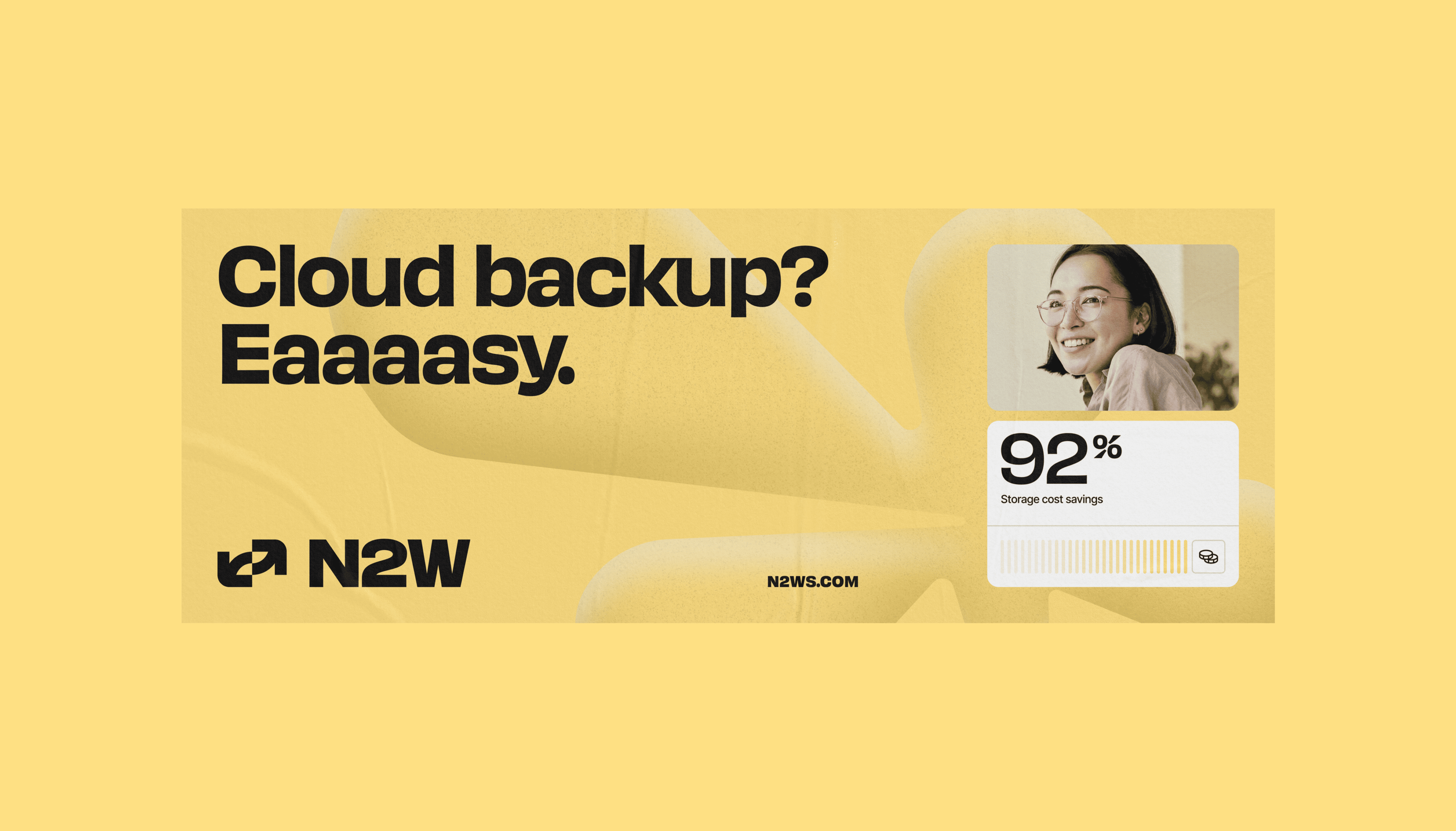
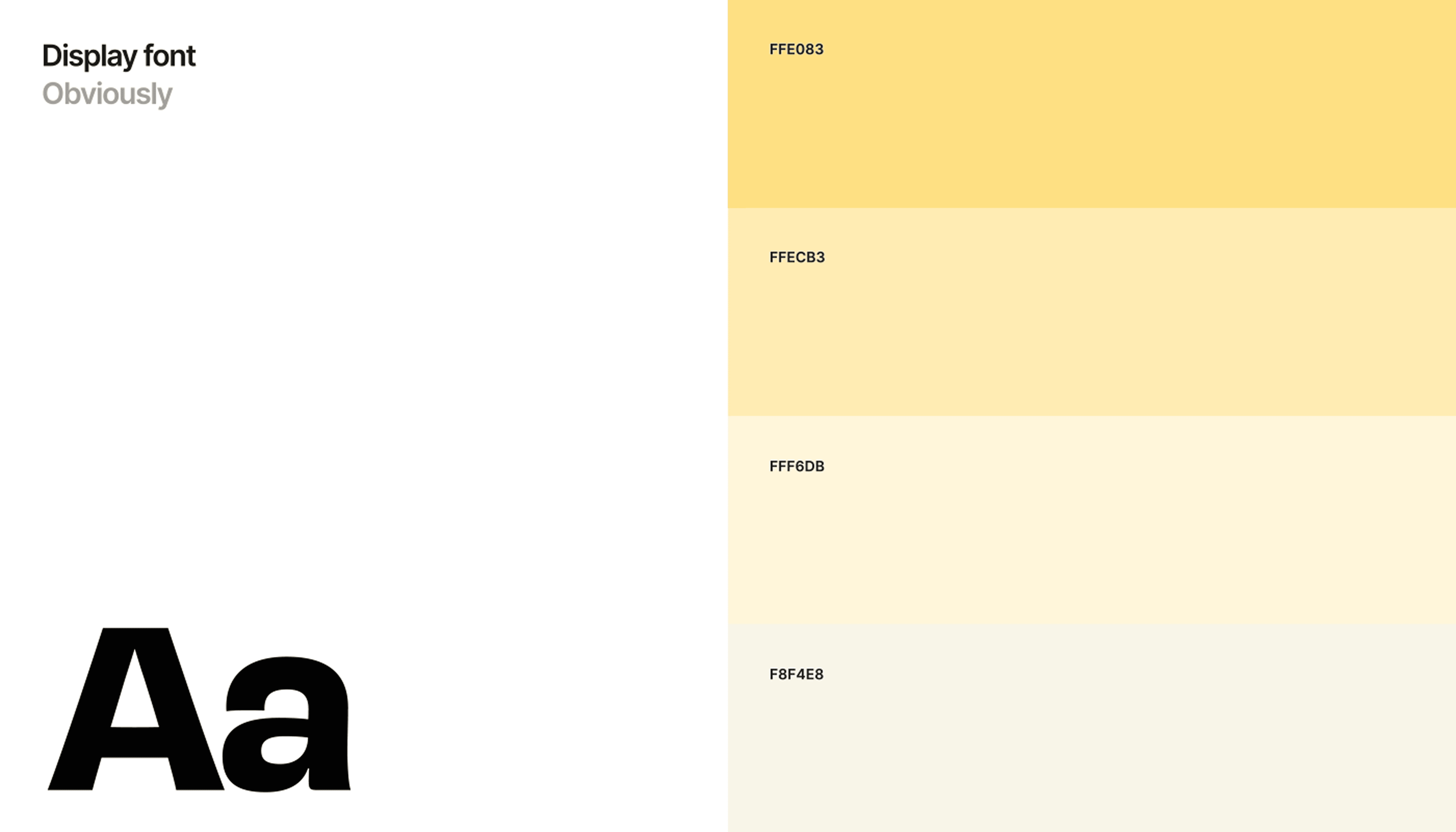
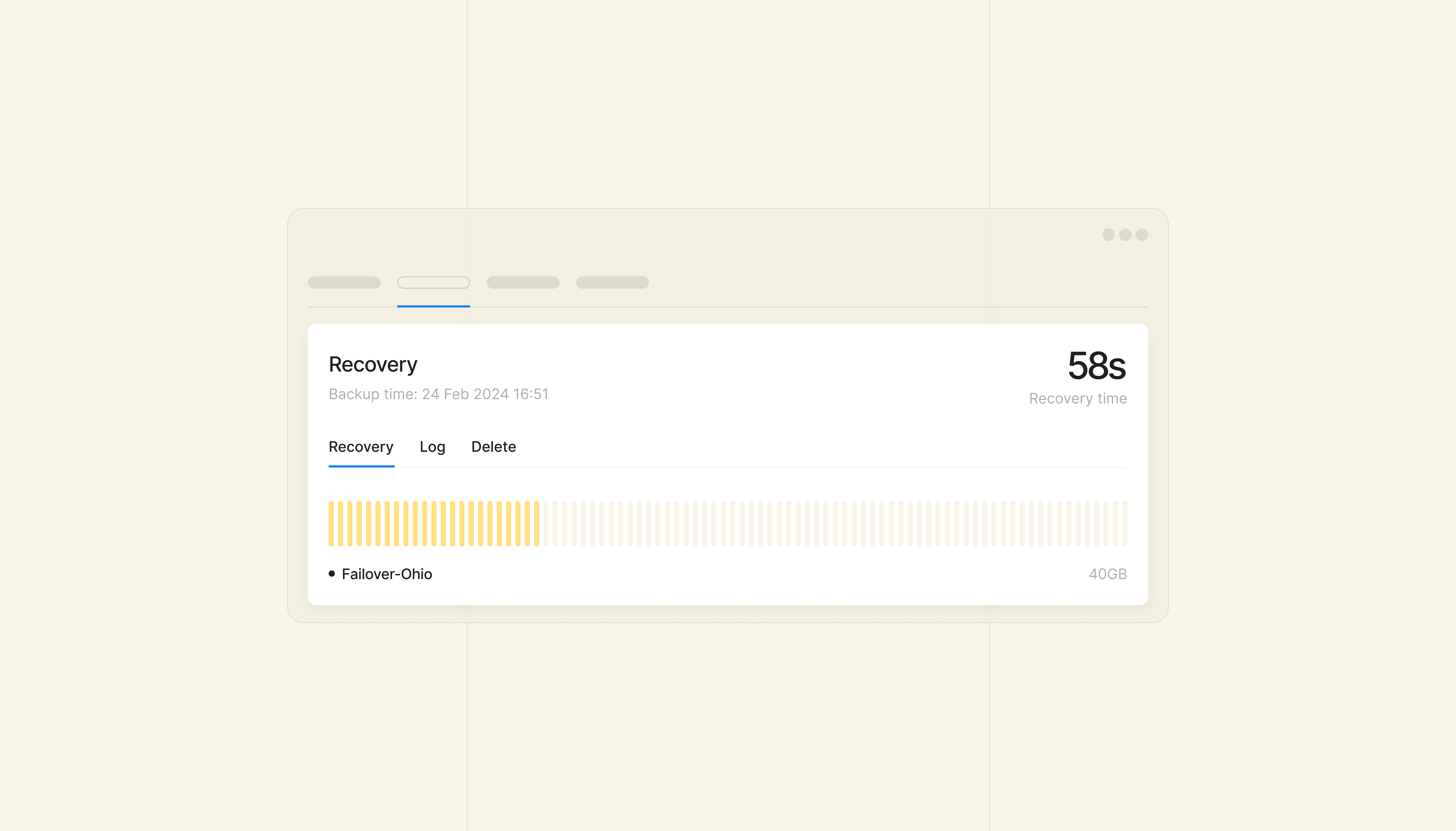
The brand system balances structure with personality.
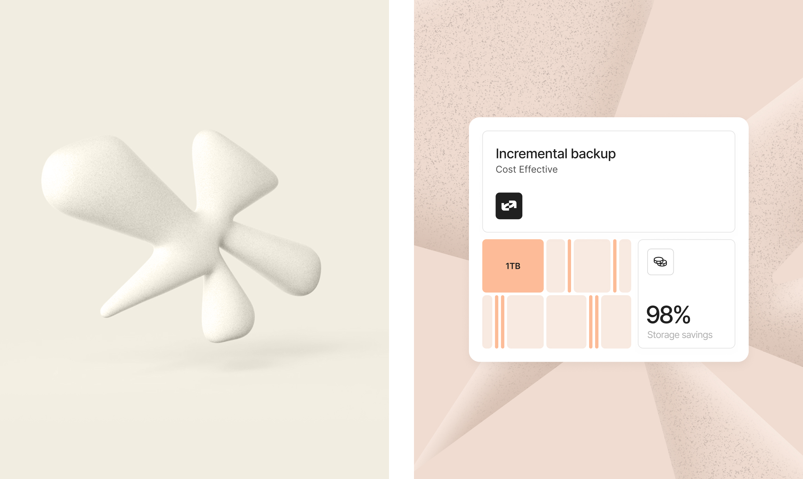
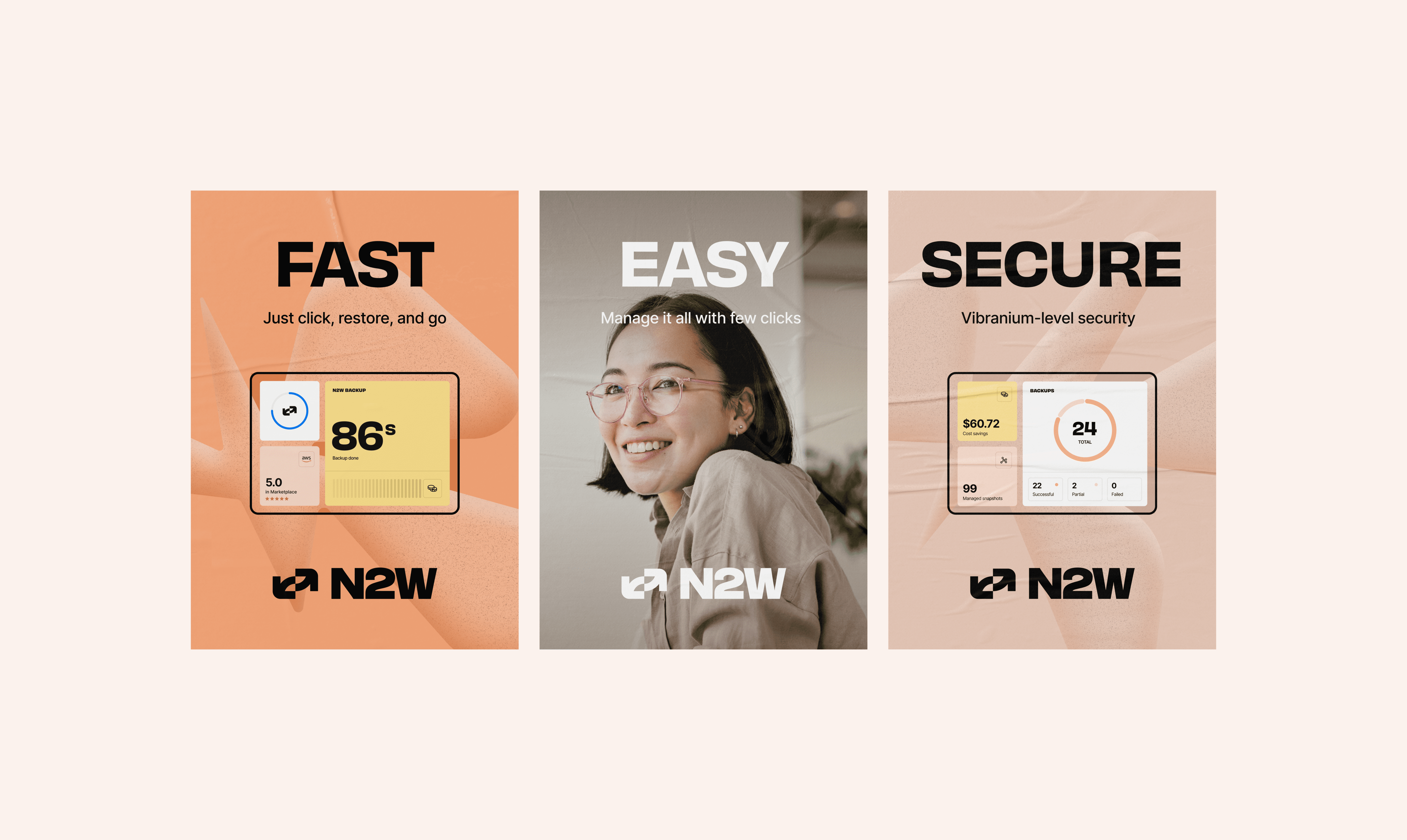
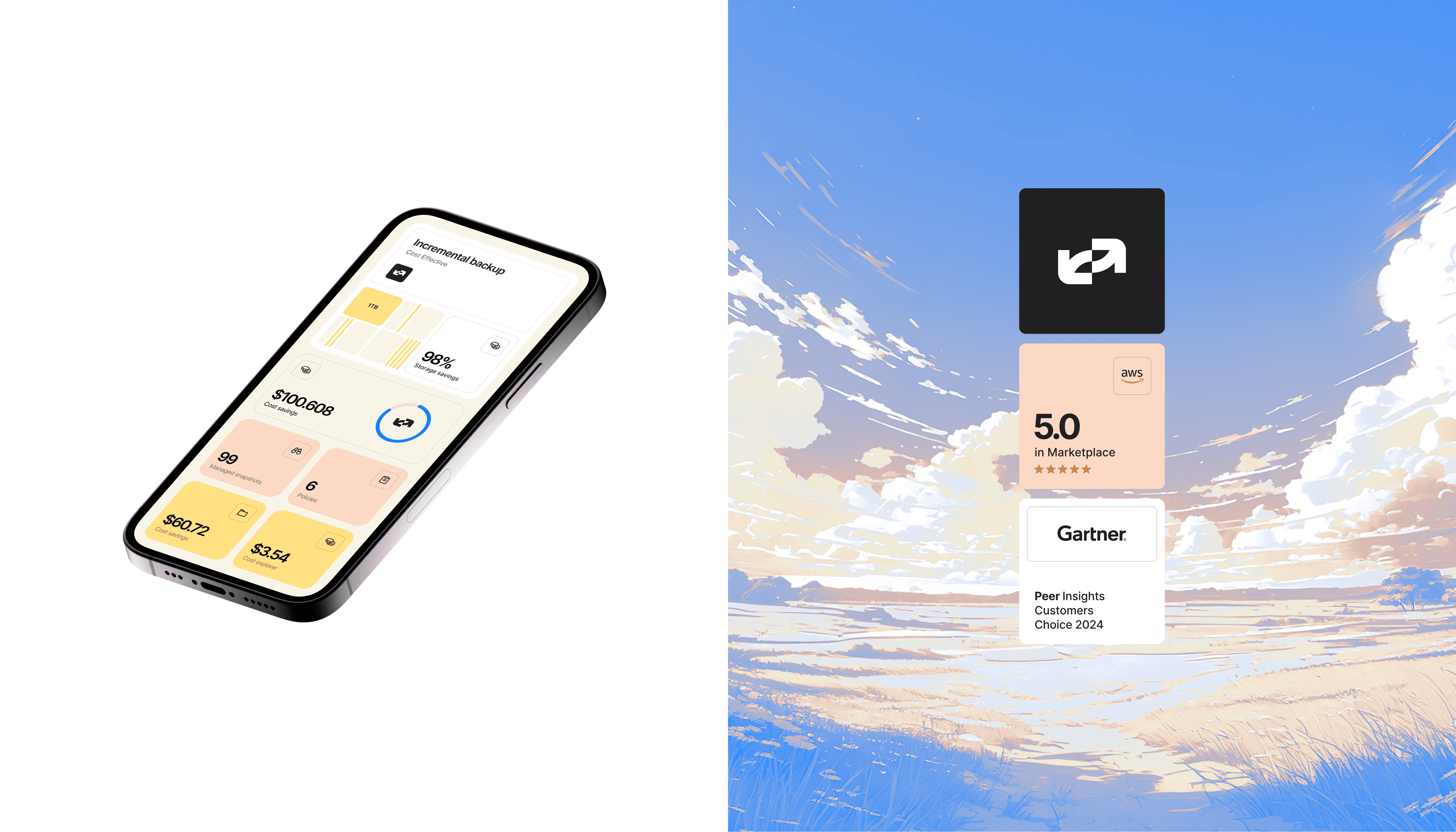
We built the identity around bold key visuals, pairing real IT professionals with soft, pastel-toned clouds in an anime style. This is a nod to where the data actually lives, and to N2W's friendlier, more playful side.
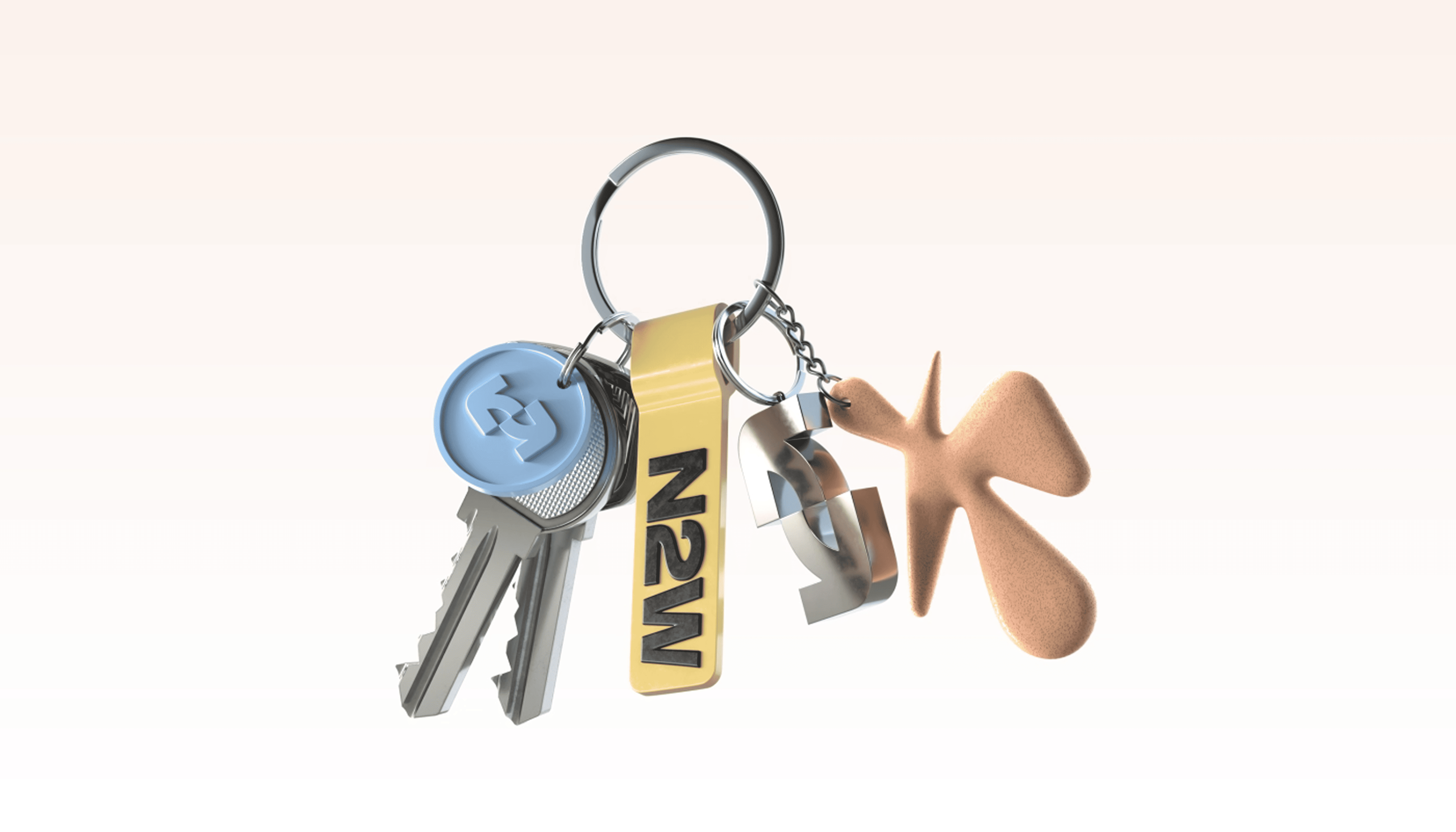
Alongside that sits a key visual system reminiscent of
a fluffy cloud shape. It’s designed to move, being in constant flux, lending itself especially well to animation.
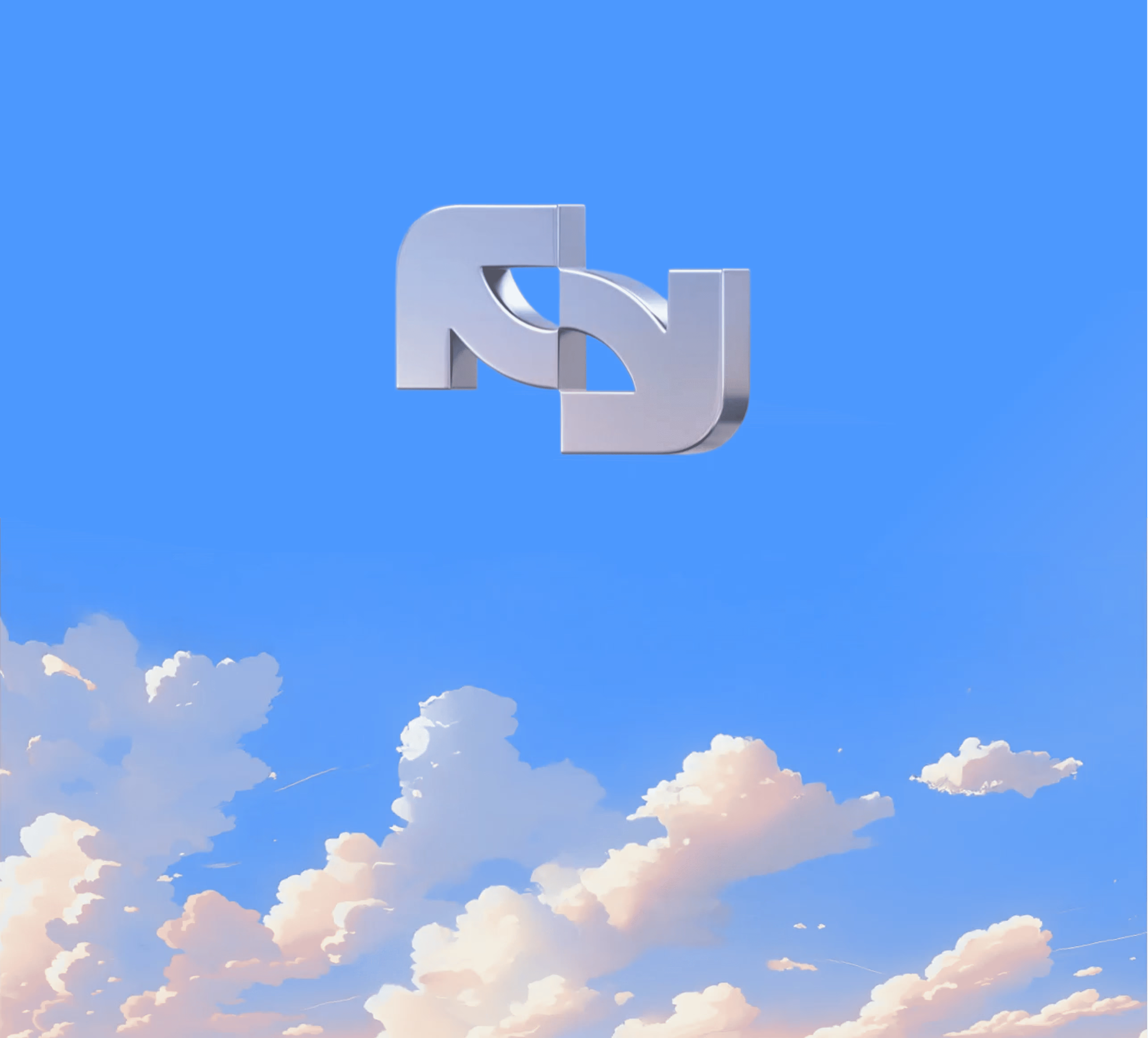
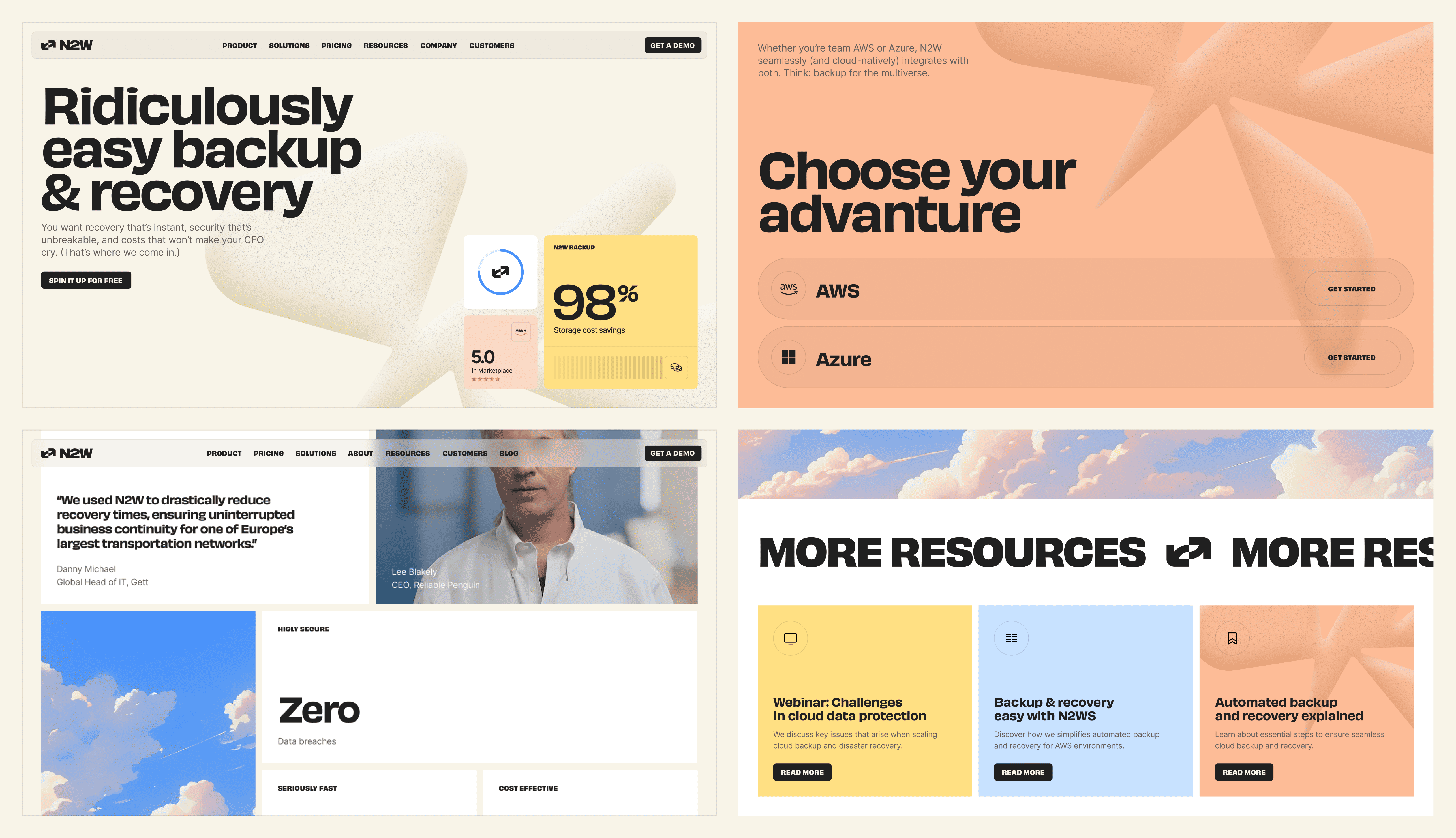

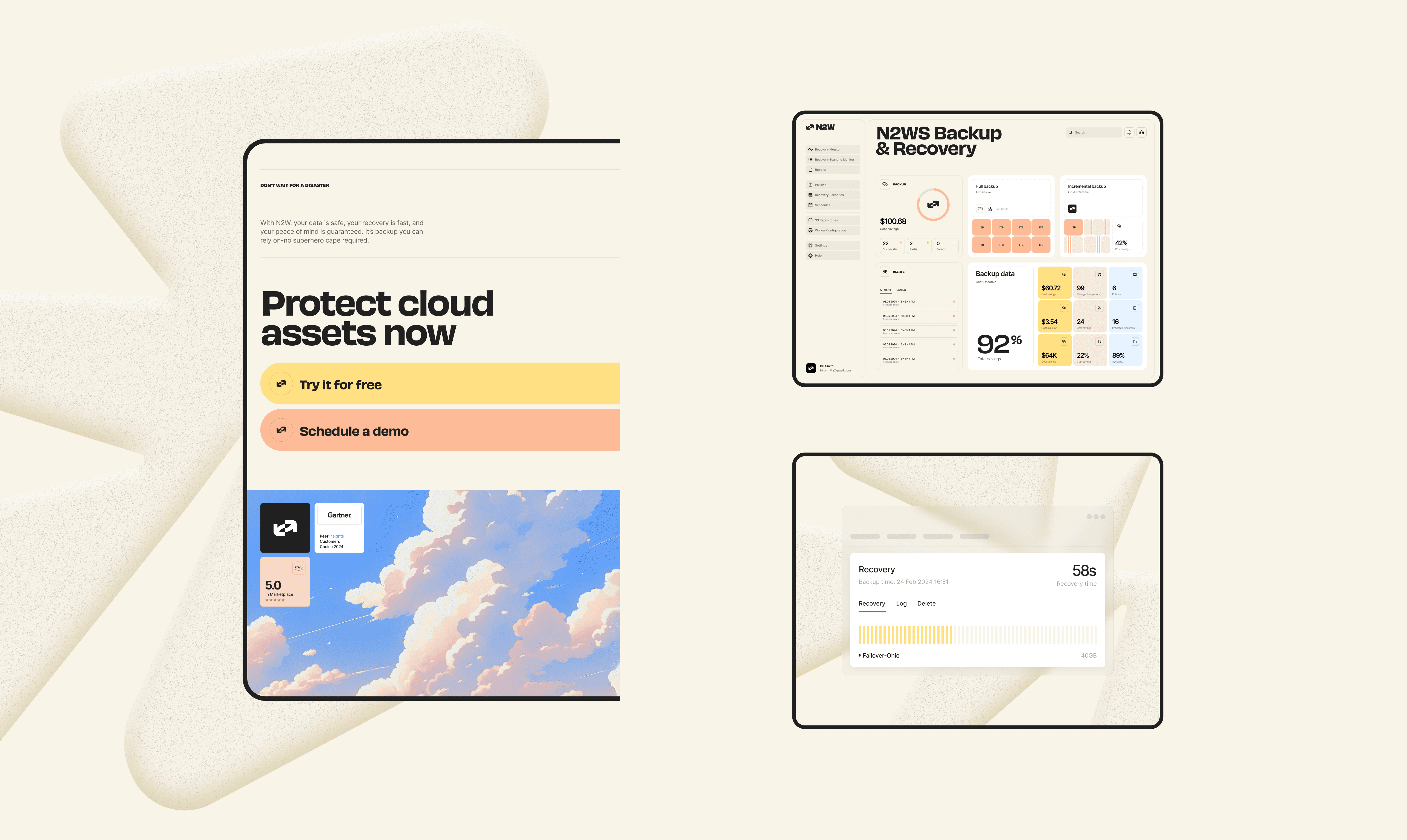
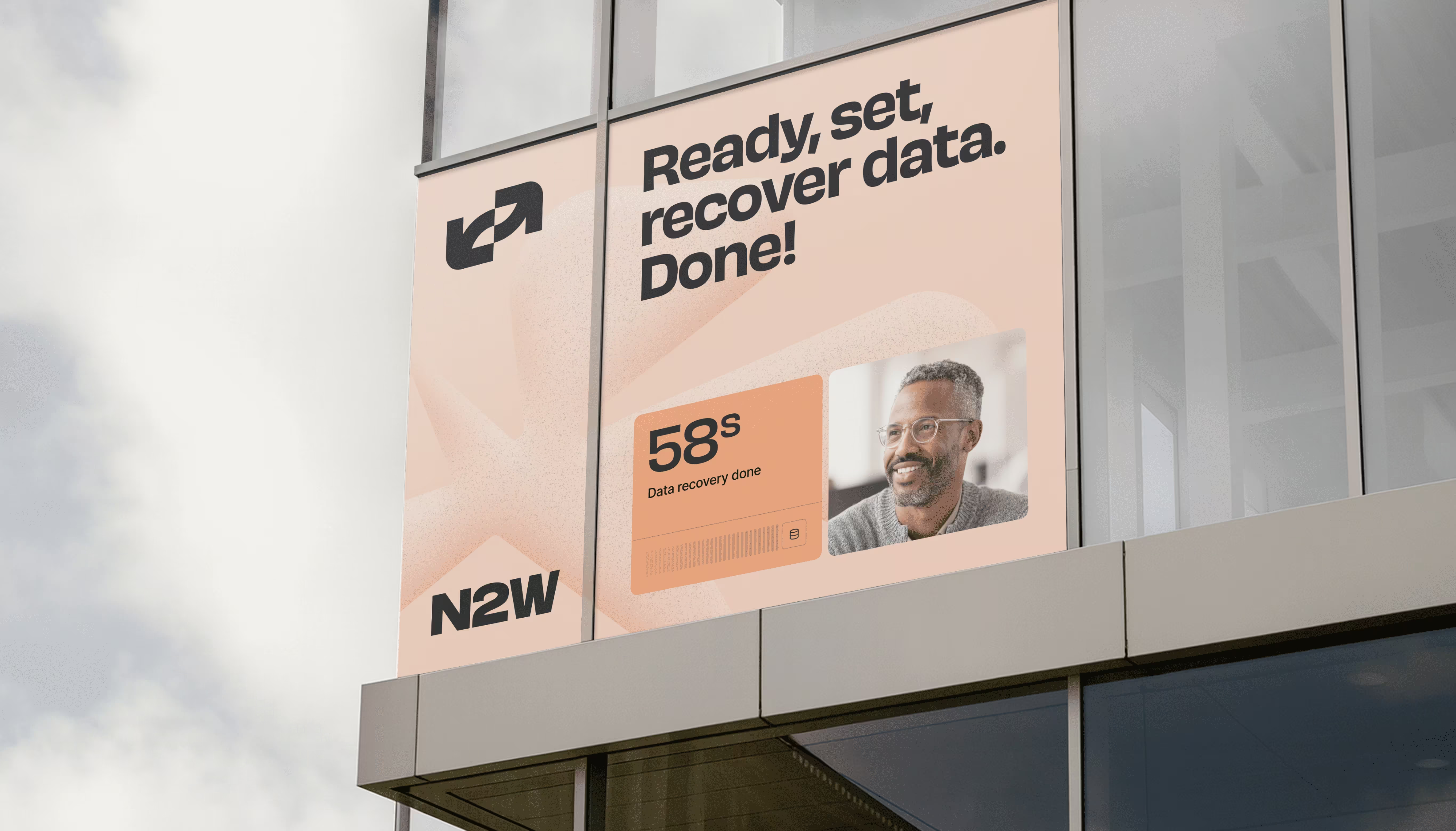
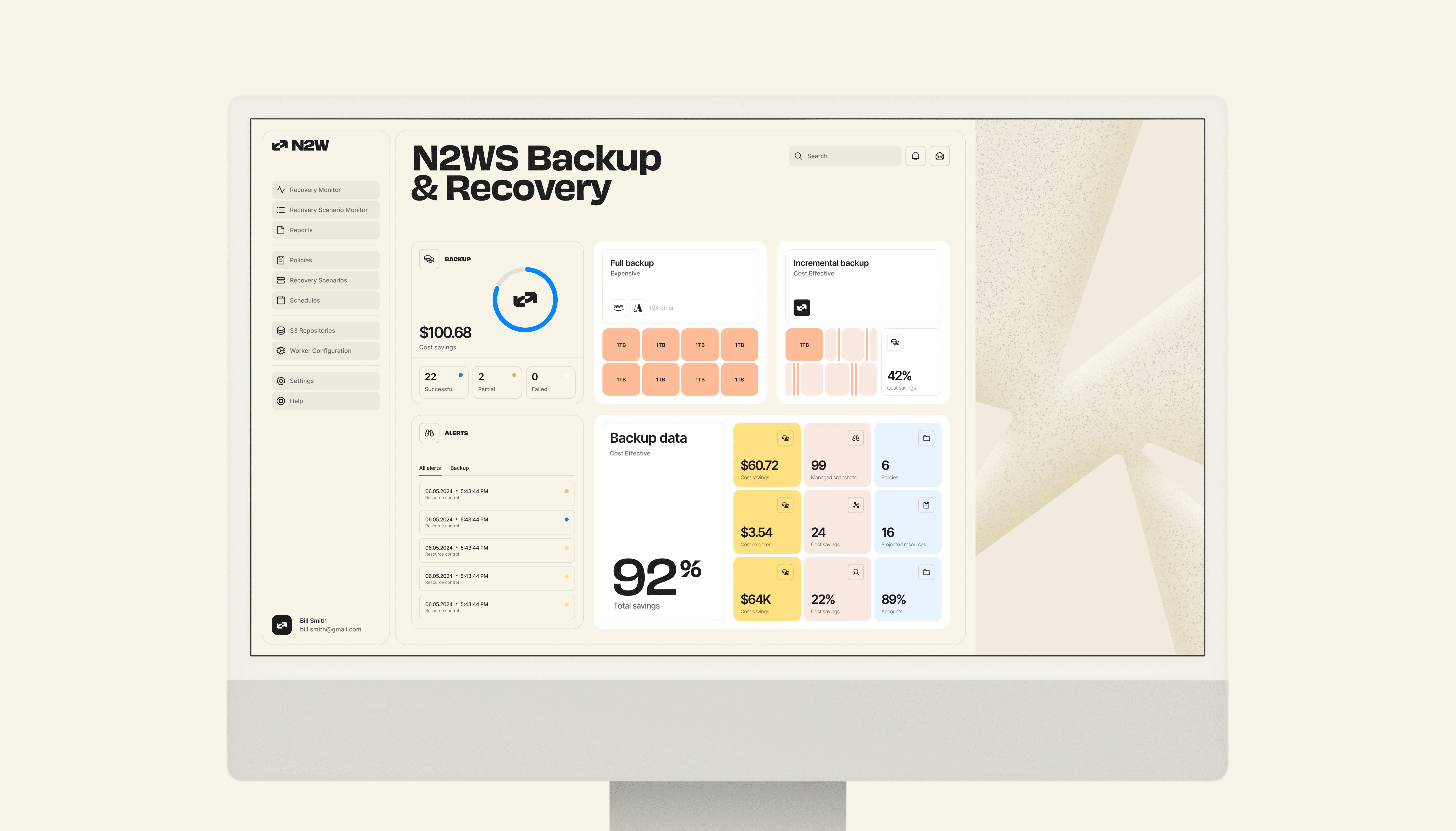
N2W’s new visual identity and website signal a maturing of the product, all the while keeping their originality and character.The result is a brand that matches Offer's promise: less friction, more trust.
The goal was always preparing for scale, which is why it’s thrilling to see that since launch, demo signups have increased by 40%. That’s a powerful signal of renewed interest and strong growth potential.



.webp)
